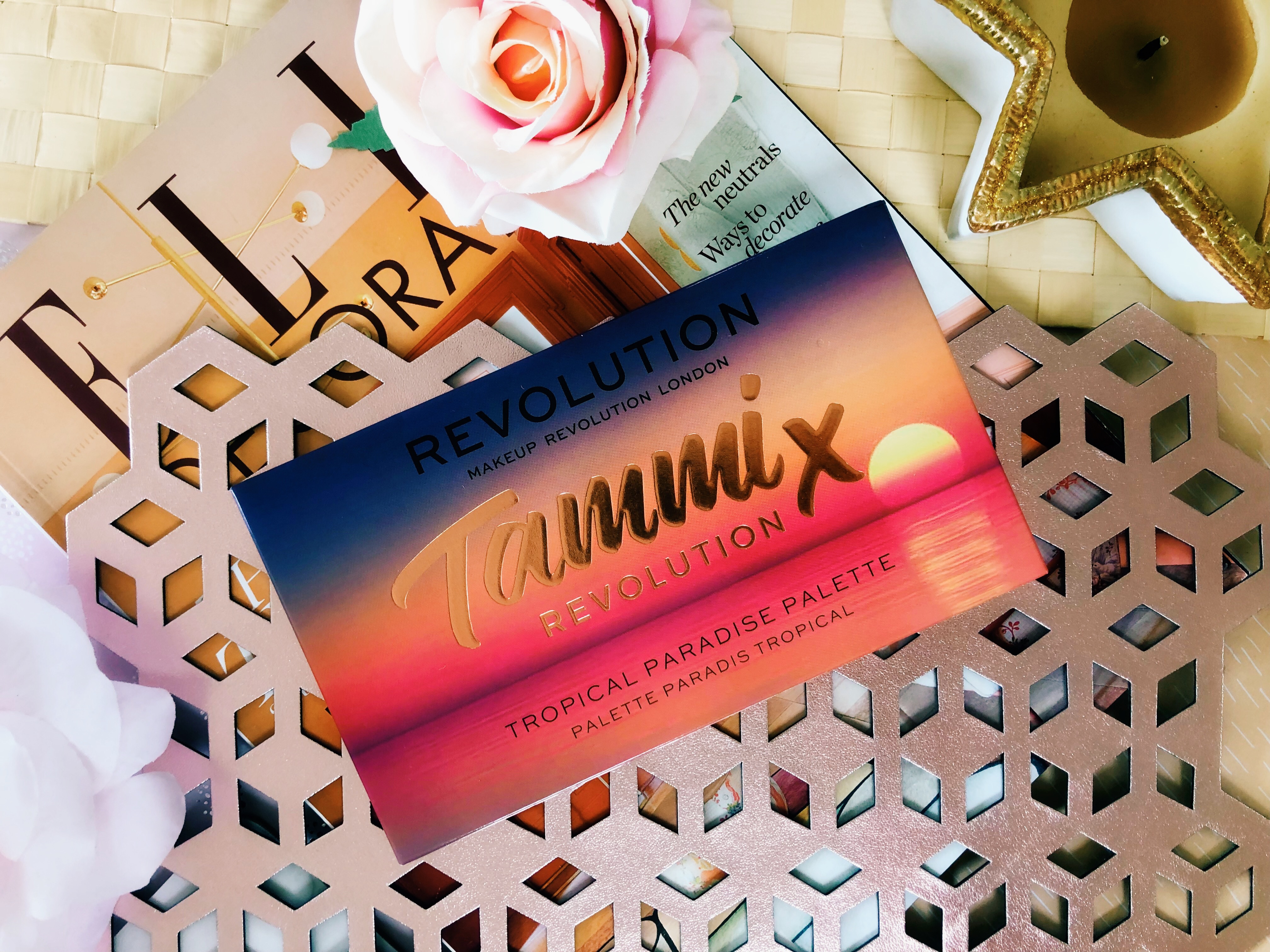
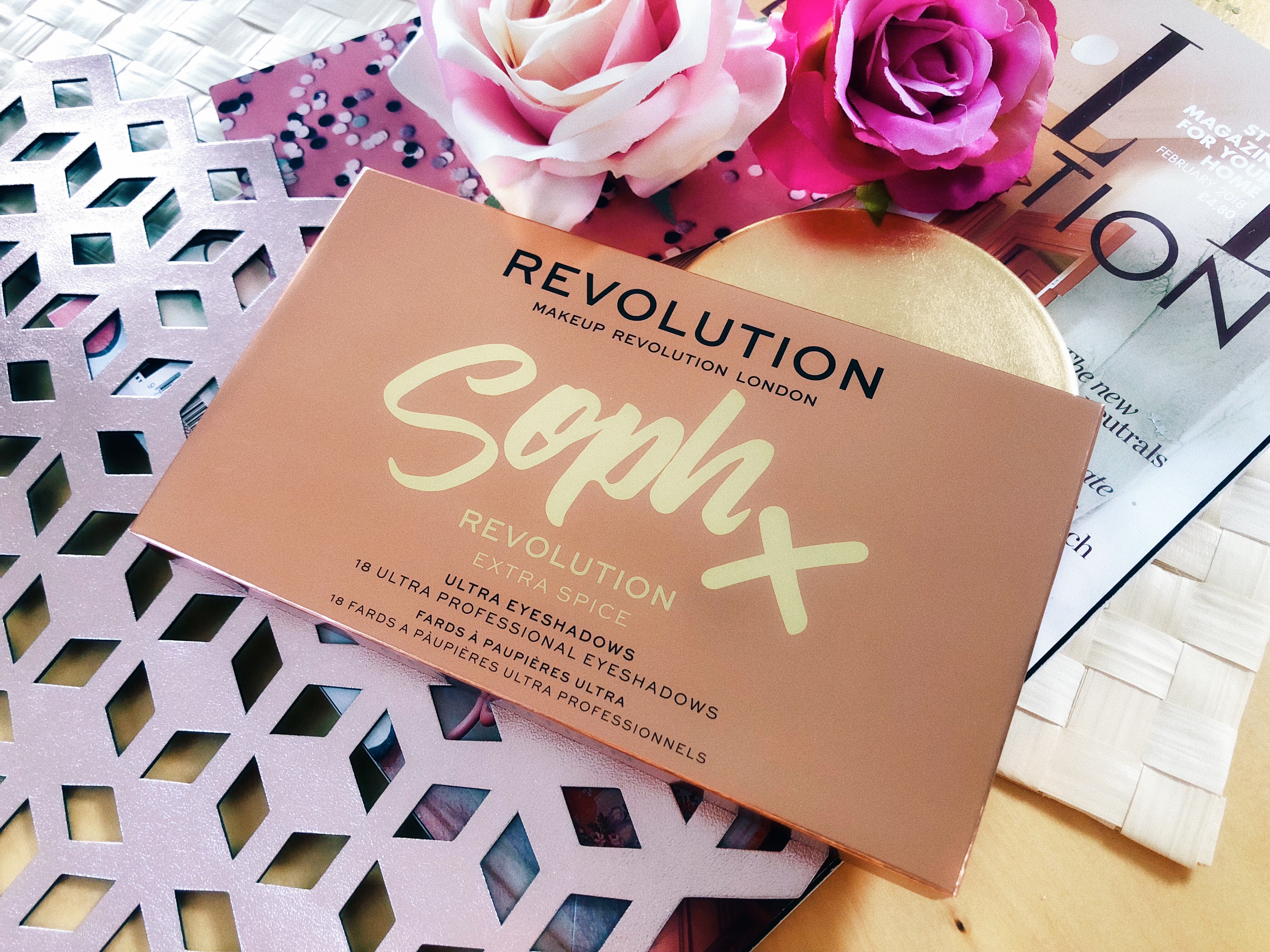
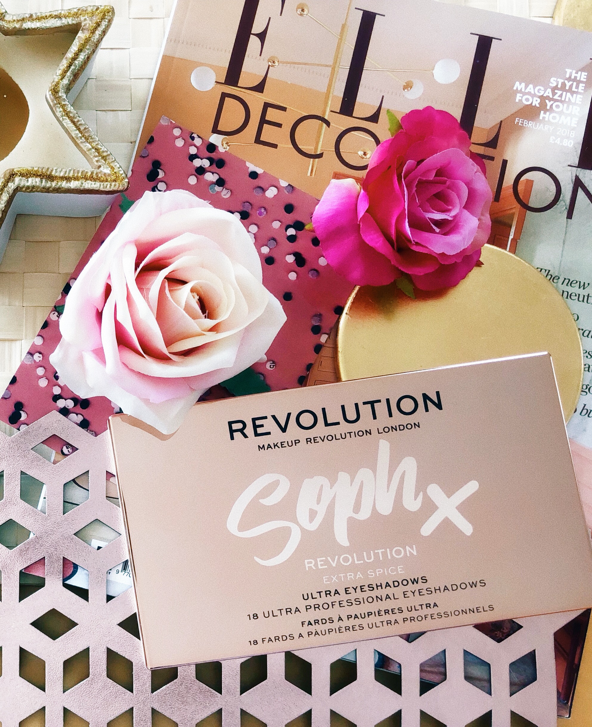
Hey Everyone,
I hope you’re all doing well! I’m back with another Primark makeup review! They have recently launched a brand new PS makeup range featuring lots of nude shades and subtle shimmers. This includes two gorgeous liquid eyeshadows that I got my hands on in my local store so I thought I would put them to the test and let you know my thoughts… Love Primark makeup? I’ve also reviewed their popular ‘Nudes’ makeup range as well as their ‘Glow’ setting spray, go on, have a read!


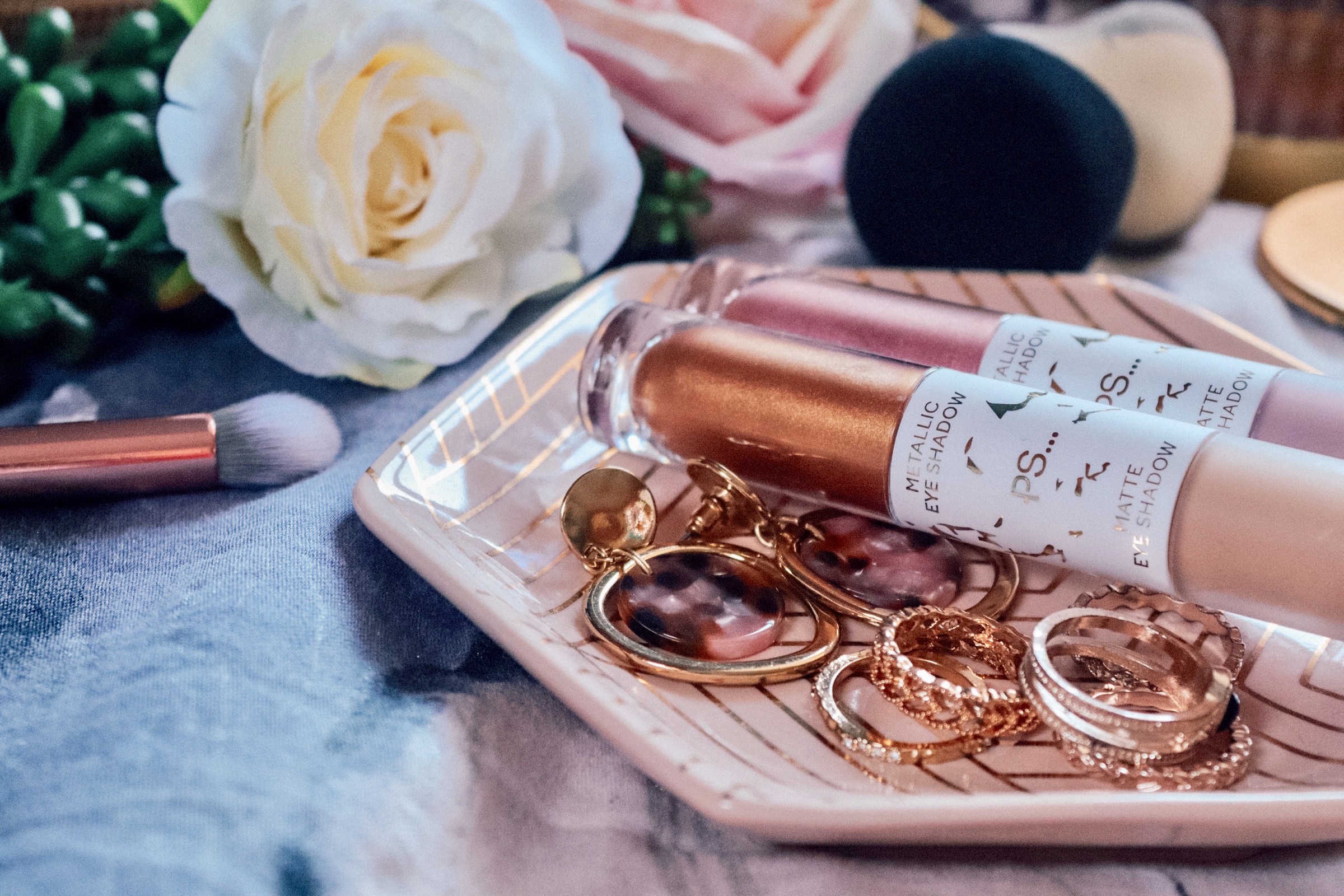
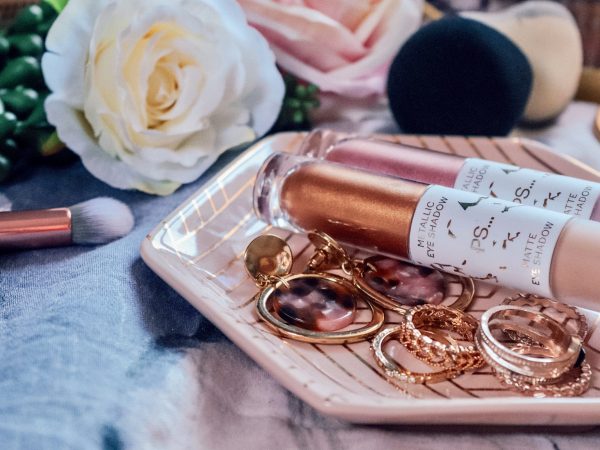
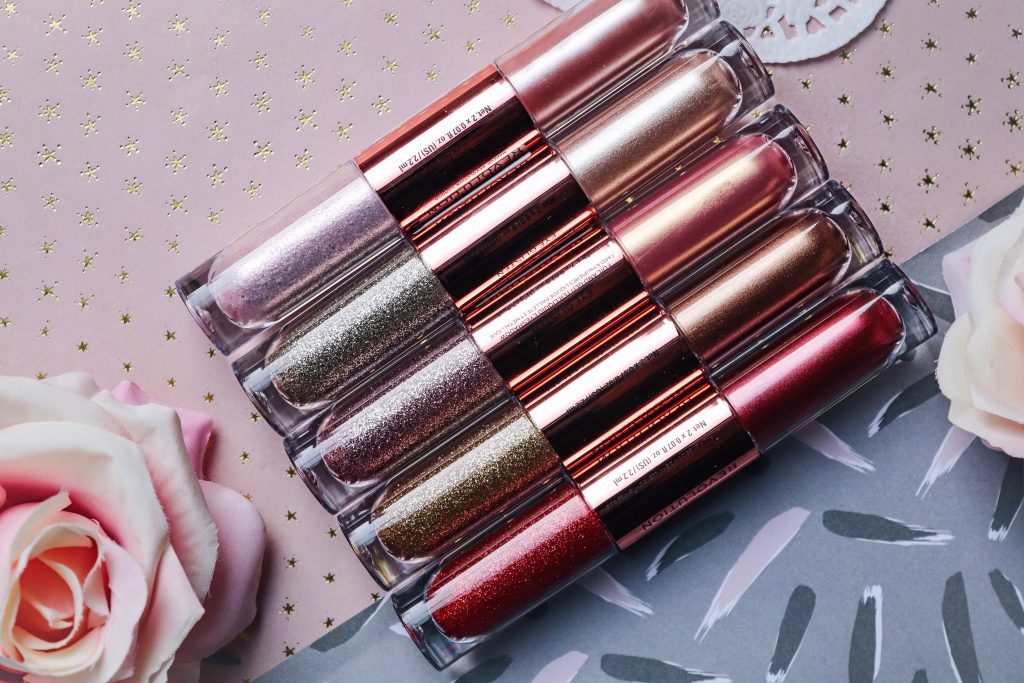
Sadly, the new range only features two of these dual-ended liquid eyeshadows, which is such a shame as I personally would have bought more had there been any! The first eyeshadow includes a gold and a nude shade – a winning combo for any soft-glam makeup lovers. The second includes a metallic pink and a dusky rose matte shade. I love that the shades can be worn together or worn alone.


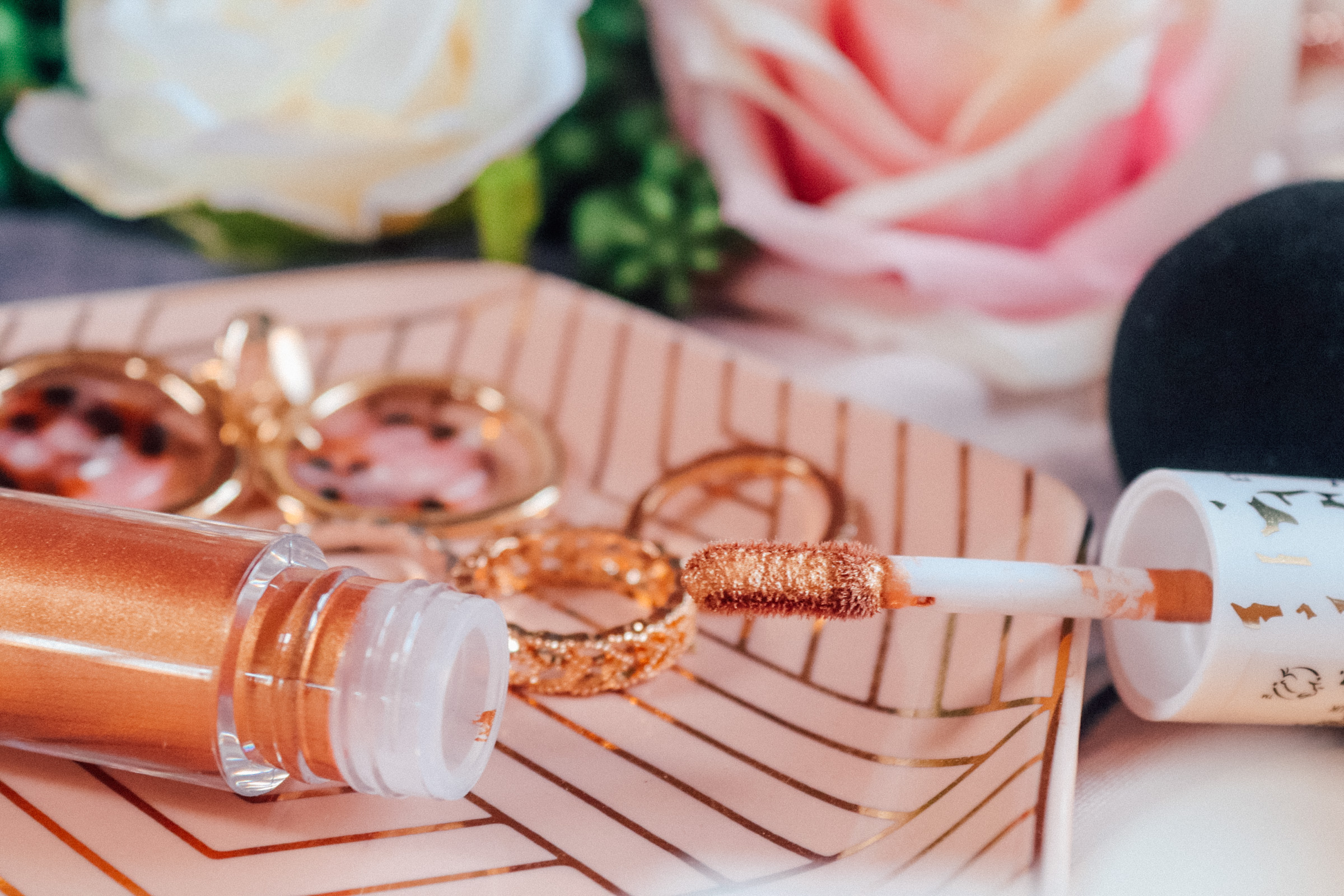
The tubes are split in half; one end is metallic eyeshadow and one end is just matte – both sections containing 2ml of product. Each end also has a flocked wand/doe-foot applicator. I like that they contain two products and yet take up so little space. I will definitely be taking these on holiday with me to save room! The design and the packaging is super pretty too. I love the simple gold foil effect against a white background, it makes the eyeshadows look more expensive than they are. Also, I love that they made the metallic end clear and the matte side frosted – it’s those extra details that really make an impact. There doesn’t need to be any mess involved either. The products aren’t loose and the packaging isn’t going to shatter and turn my carpet into a shimmering pool of regret. Also, these eyeshadows retail at just £3 each which is amazing.


Let’s start with the matte shade shall we? Well, oh my goodness, I was not expecting that! Firstly, the formula is a dream. I had to do a double take when I swatched it. It applied so well and it was super easy to blend and work with. Secondly, can you see that pigment?! It’s completely opaque – sorry, £3 – what?! It dried nice and quickly and once it had, it was there to stay. It actually took some effort to remove which I find reassuring. I don’t want that stuff slipping and sliding around on my lids thank you very much!
The metallic shade is truly gorgeous. I can see myself wearing this shade all the time – on nights out or just for some simple daytime glam. My only issue with it is that it takes a while to dry. If I was in a rush, I wouldn’t want to risk using this. However, if you have the time to wait for it to dry, it’s totally worth it because, I mean, look at it!


This matte pink shade is so pretty! I love wearing pink and purple so I can see myself reaching for this particular shade a lot. It was also very pigmented, completely opaque and really easy to move around and blend. Again, it dried quickly and from that point onwards, it didn’t budge until I removed it with some micellar water. I’m so tempted to apply some holographic eyeshadow topper over this, I think it would look stunning!
Let’s talk about this metallic shade. There’s no denying it’s beautiful, however, I did struggle a little bit with getting it to form a decent layer. When I tried to blend it out it did get a bit patchy. It took some layering to get it where I wanted it. That being said, once I put a little more effort in and took the time to work with it, it looked beautiful. I would definitely wear this shade on a regular basis, especially paired with the matte shade too – what a combo!
So, whats the verdict?
In terms of what I didn’t like, other than a slight struggle with the pink metallic eyeshadow formula, there’s nothing to complain about. It wasn’t as if that was an issue I couldn’t resolve, I just spent a little bit more time applying it and it turned out fine. I would definitely recommend using an eyeshadow primer as a base just to give the product something to stick to.
In terms of what I loved, the matte formula particularly blew me away. I cannot get over how pigmented it is and how easy it is to work with. Although I had a tiny bit of an issue with the formula, both of the metallic shades are really good. When applied correctly, they look lovely. I will definitely be using the gold shade all the time, it’s just so me. Given that Primark didn’t even sell makeup at one point, they’ve come such a long way with their beauty products. I’m extremely impressed with these eyeshadows. The fact that they retail at only £3 each is incredible! The wands make it easy to apply to product, without faffing and having to use lots of different brushes and tools. The shade range is currently pretty poor, but fingers crossed, they’ll bring some more! I really recommend giving them a try, for £3 a pop, I think you’ll be pleasantly surprised.
What do you think of these liquid eyeshadows? Be sure to let me know in the comments and don’t forget to follow me on my socials!
N xxxx
- 5 TIPS FOR SELLING ON DEPOP

- THE FITNESS DIARIES: GETTING STARTED

- VISITING THE FEEL GOOD CLUB IN MANCHESTER


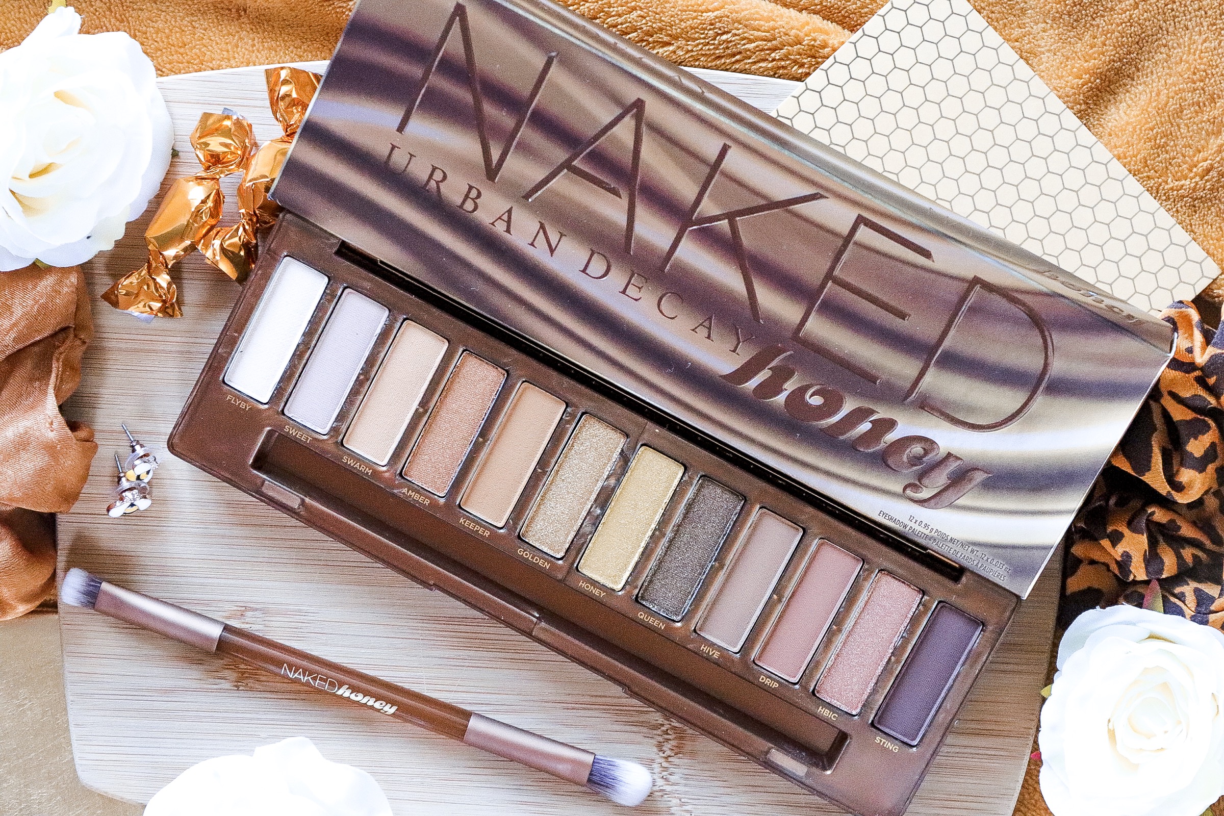


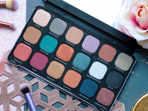

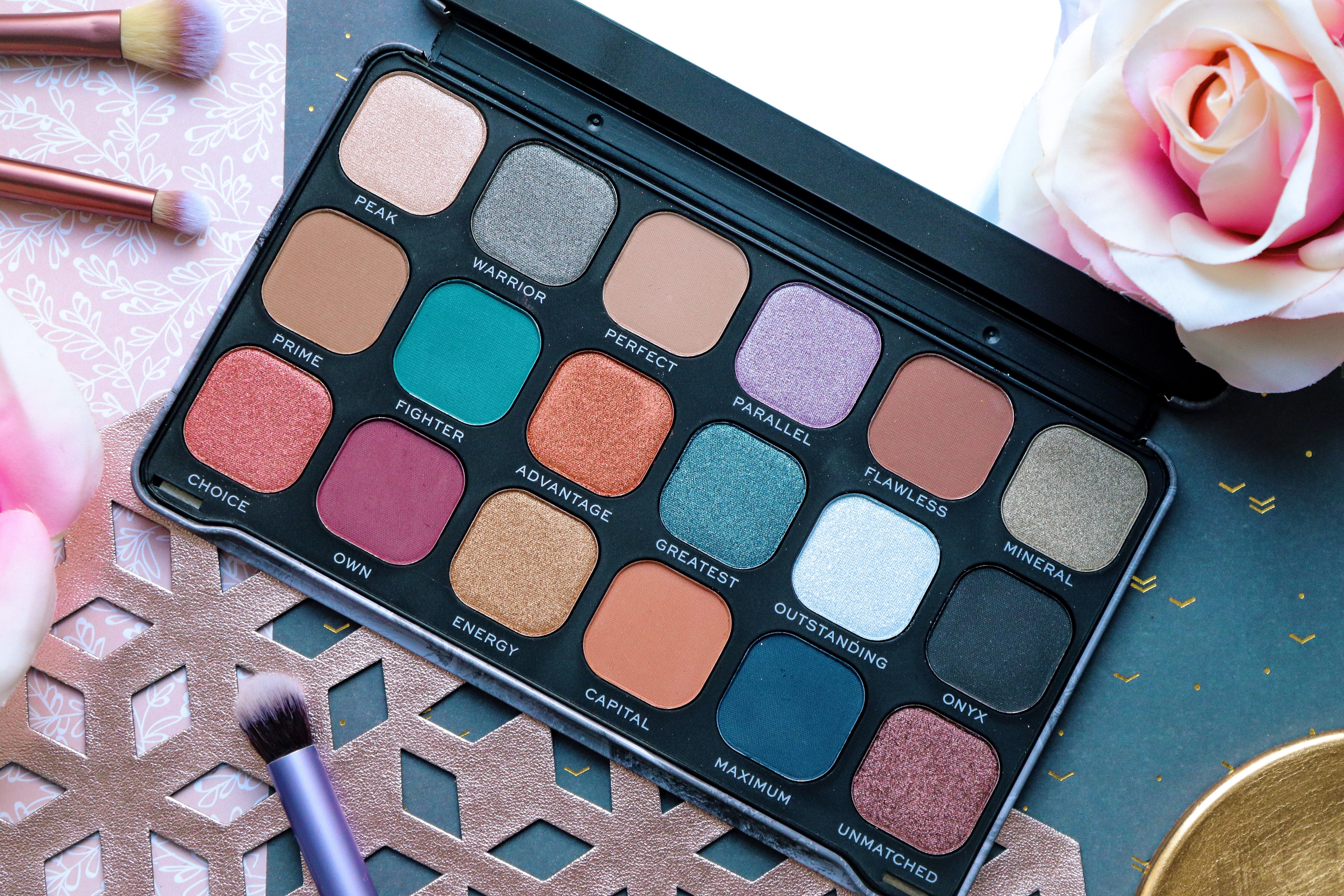


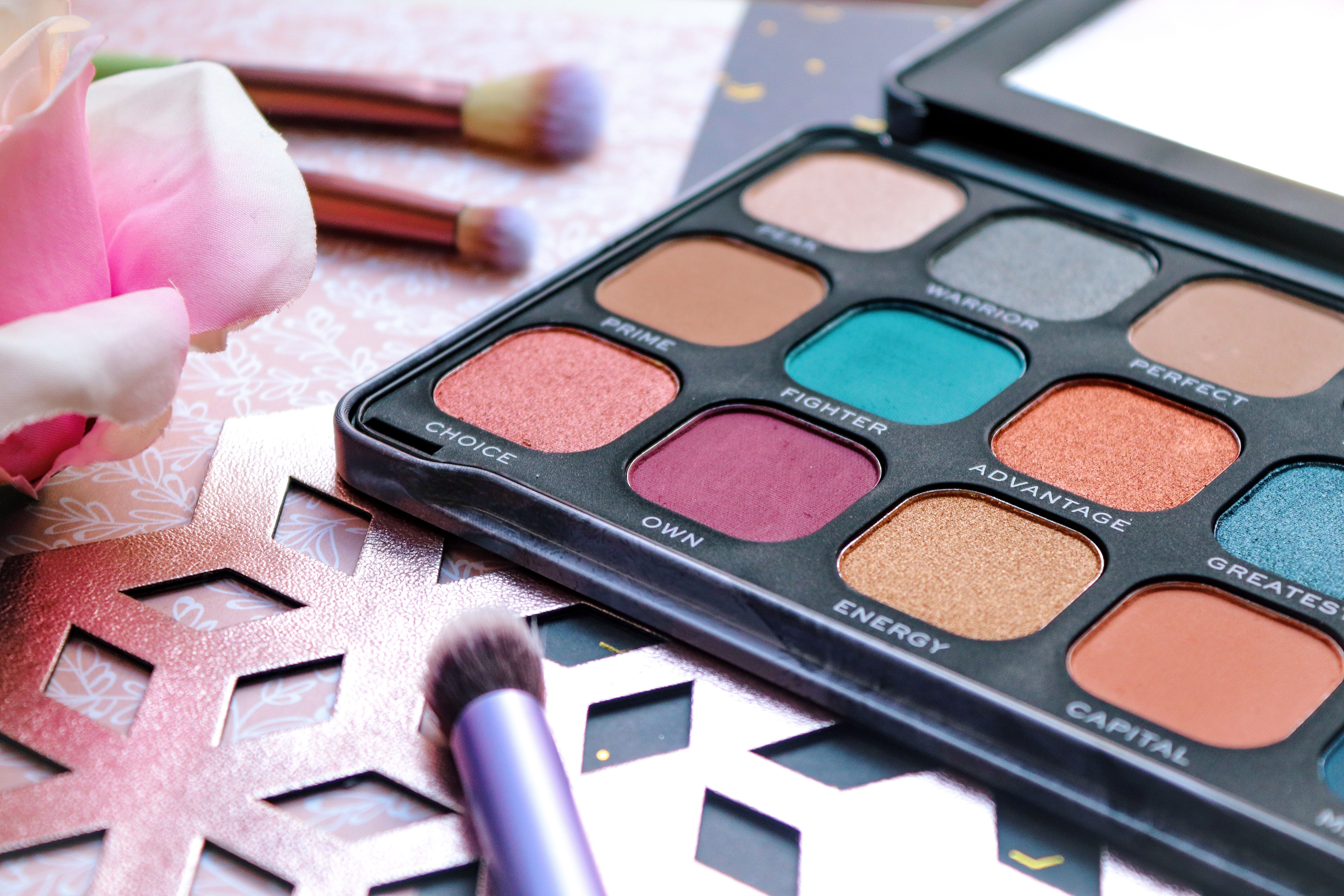


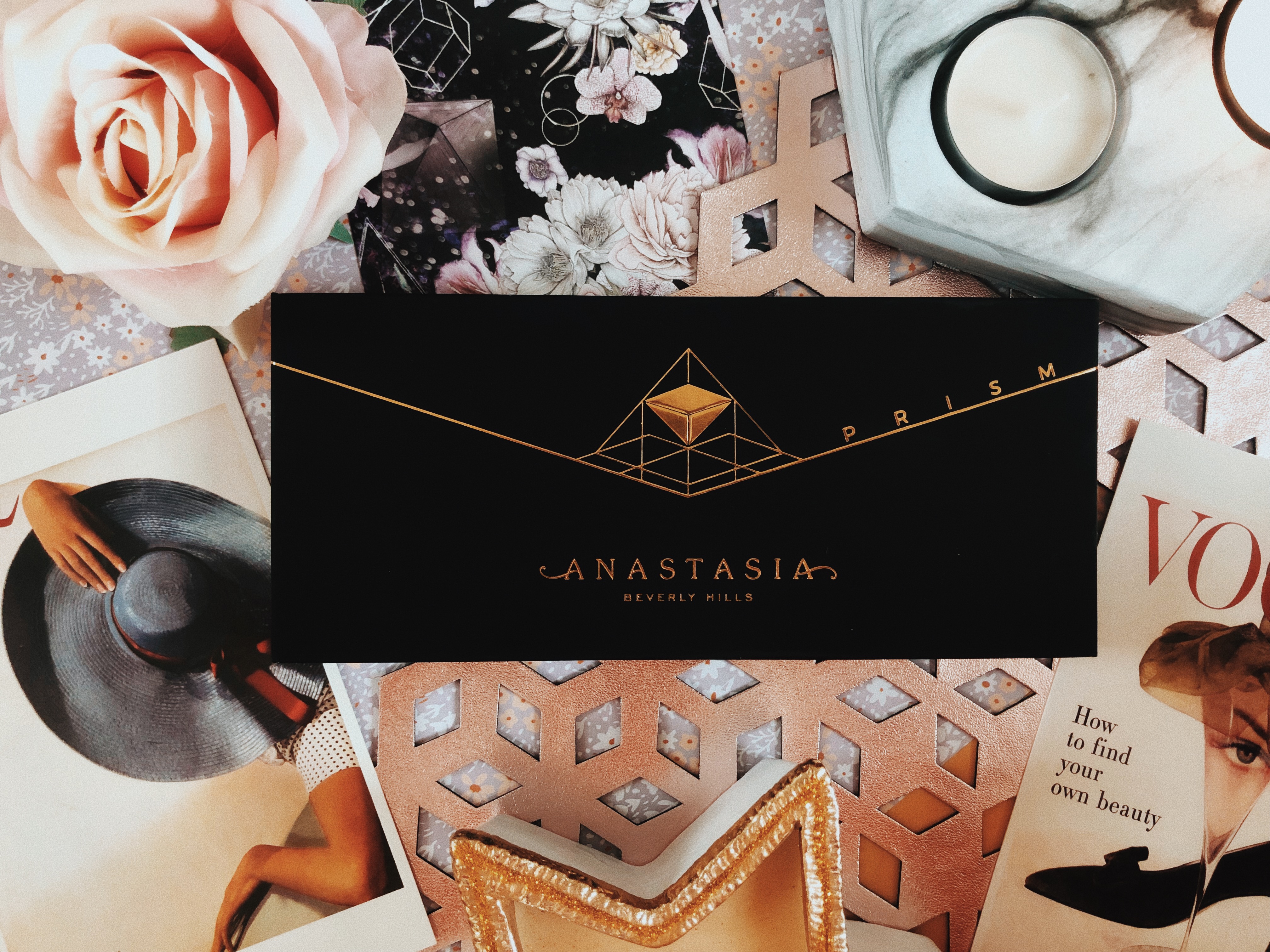

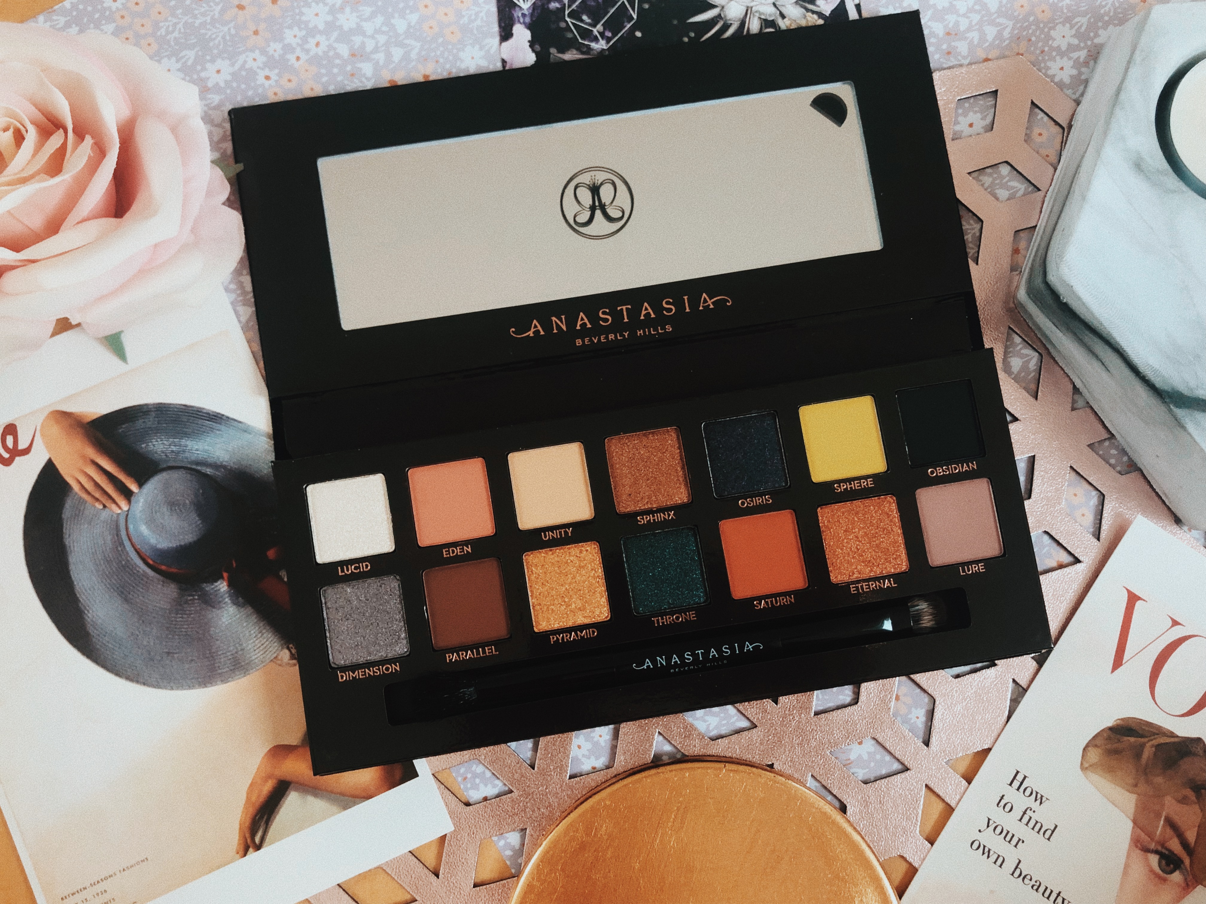


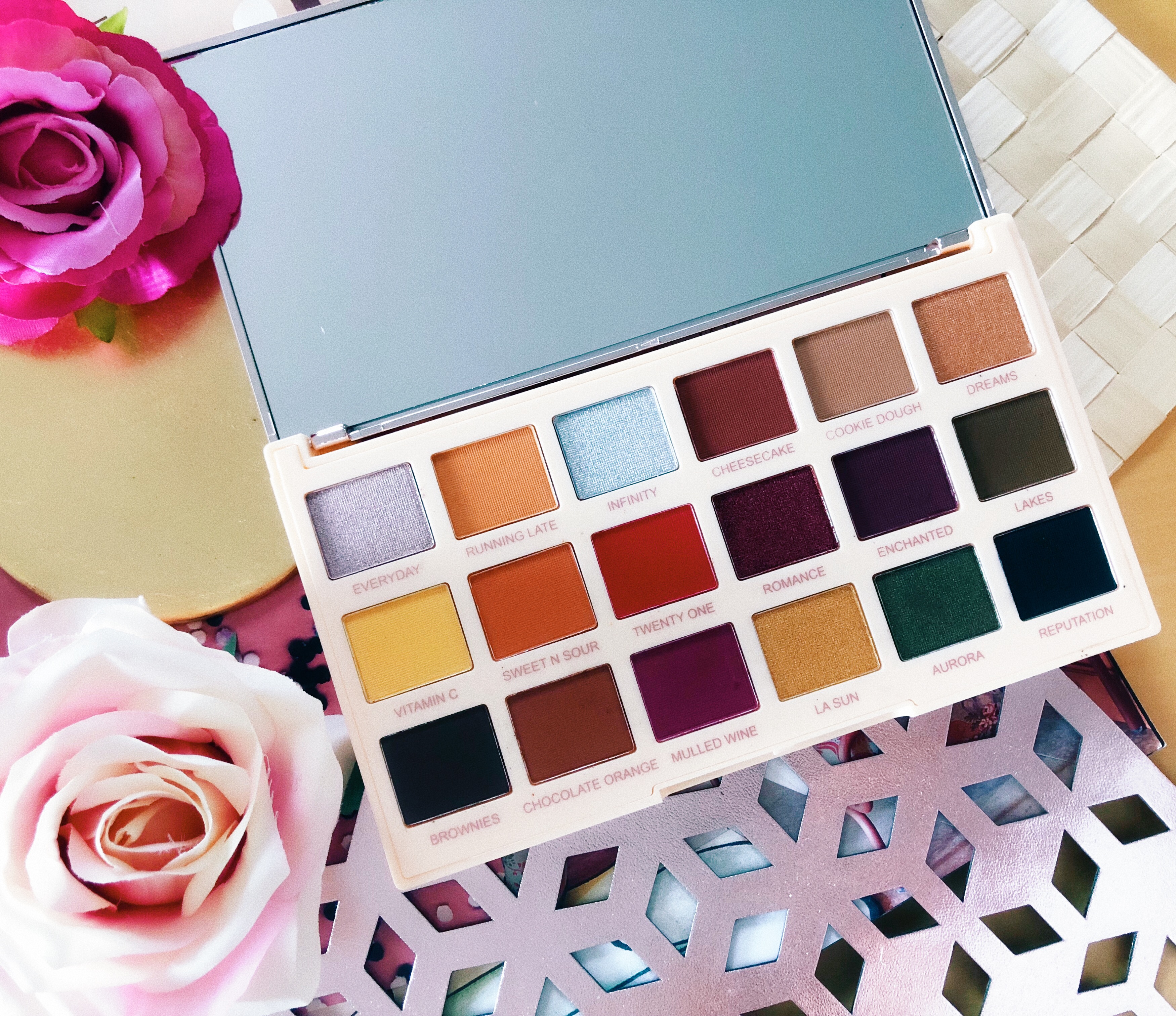


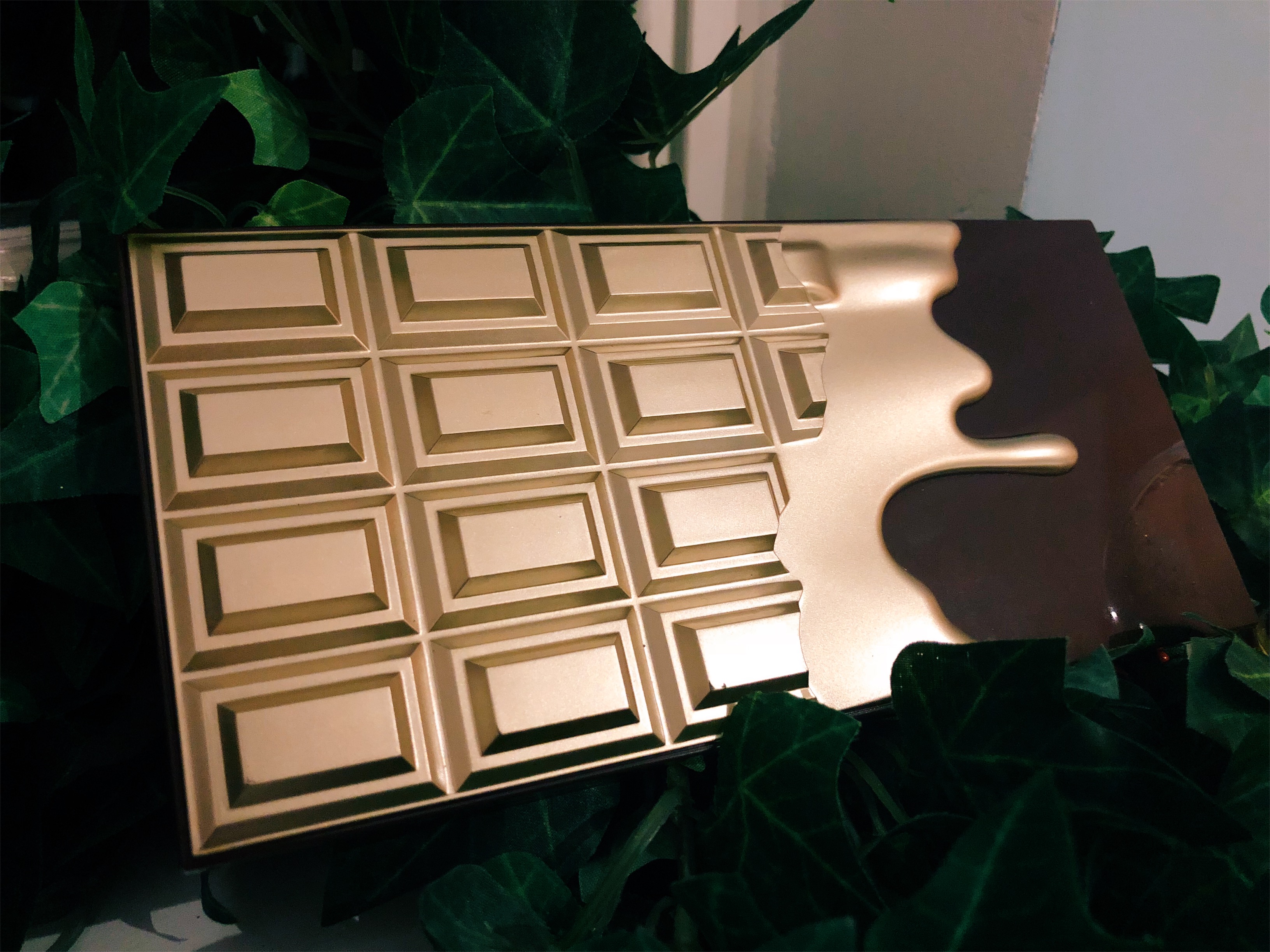
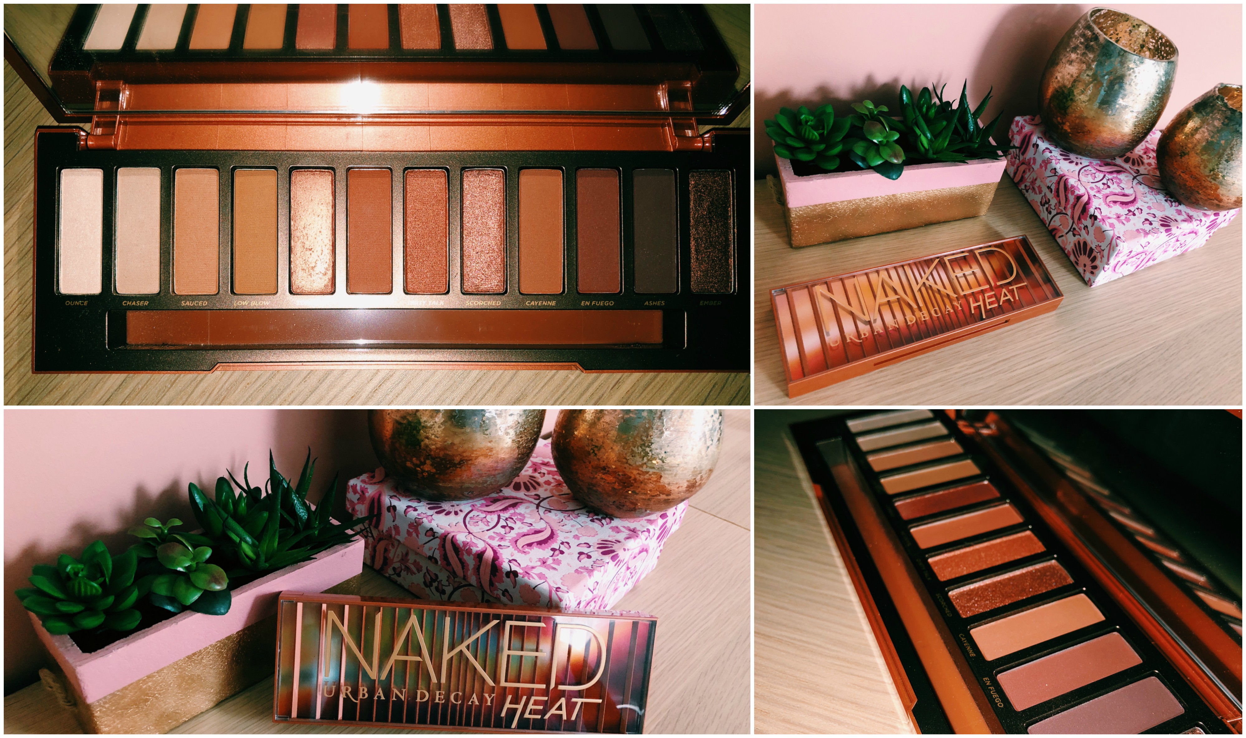
 The actual palette itself is a matte nude, pastel peach colour with more rose gold lettering on it. It’s slim and lightweight and it’s also got a very generously sized mirror making it a brilliant palette to travel with or for on the go use.
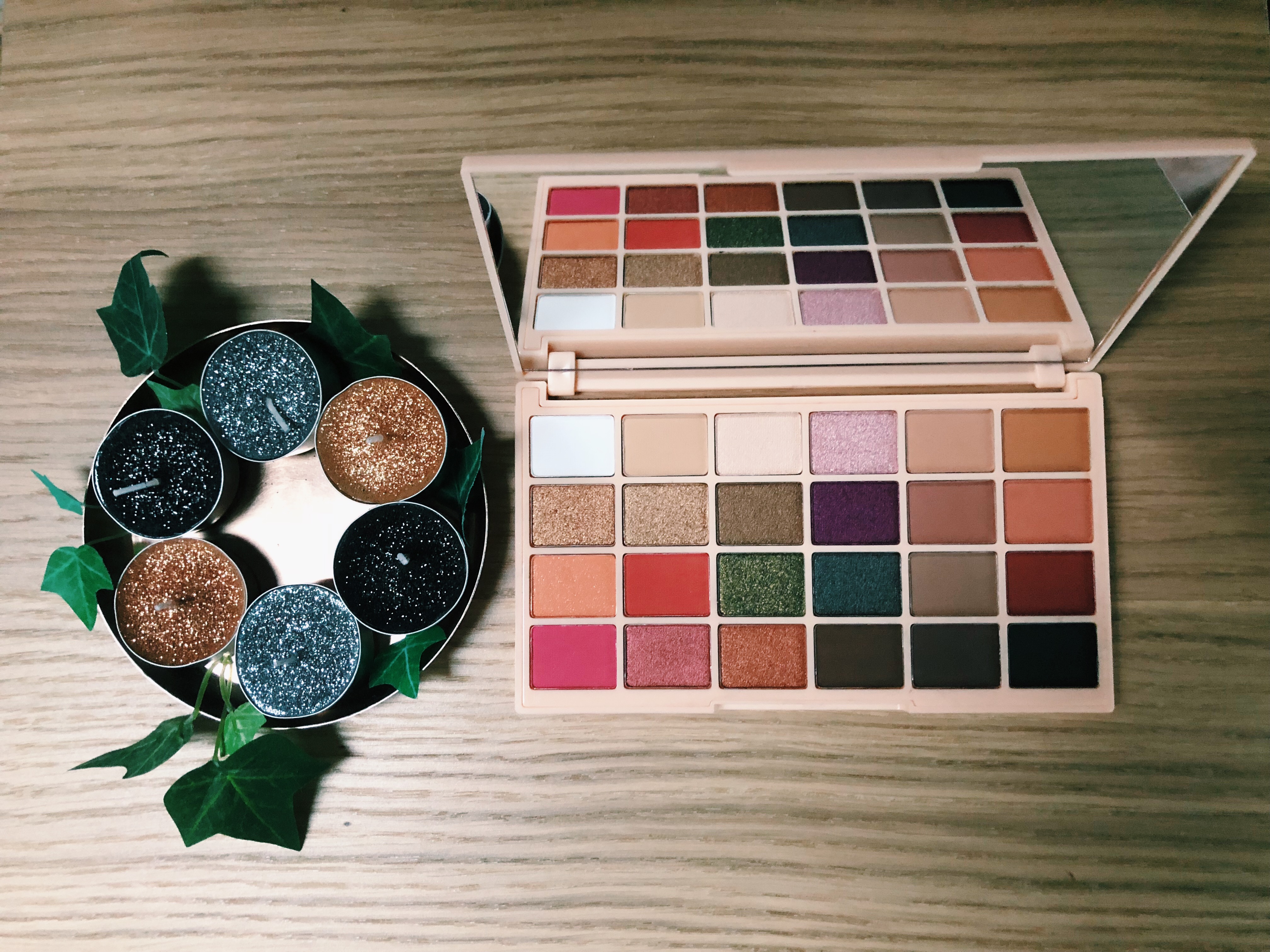

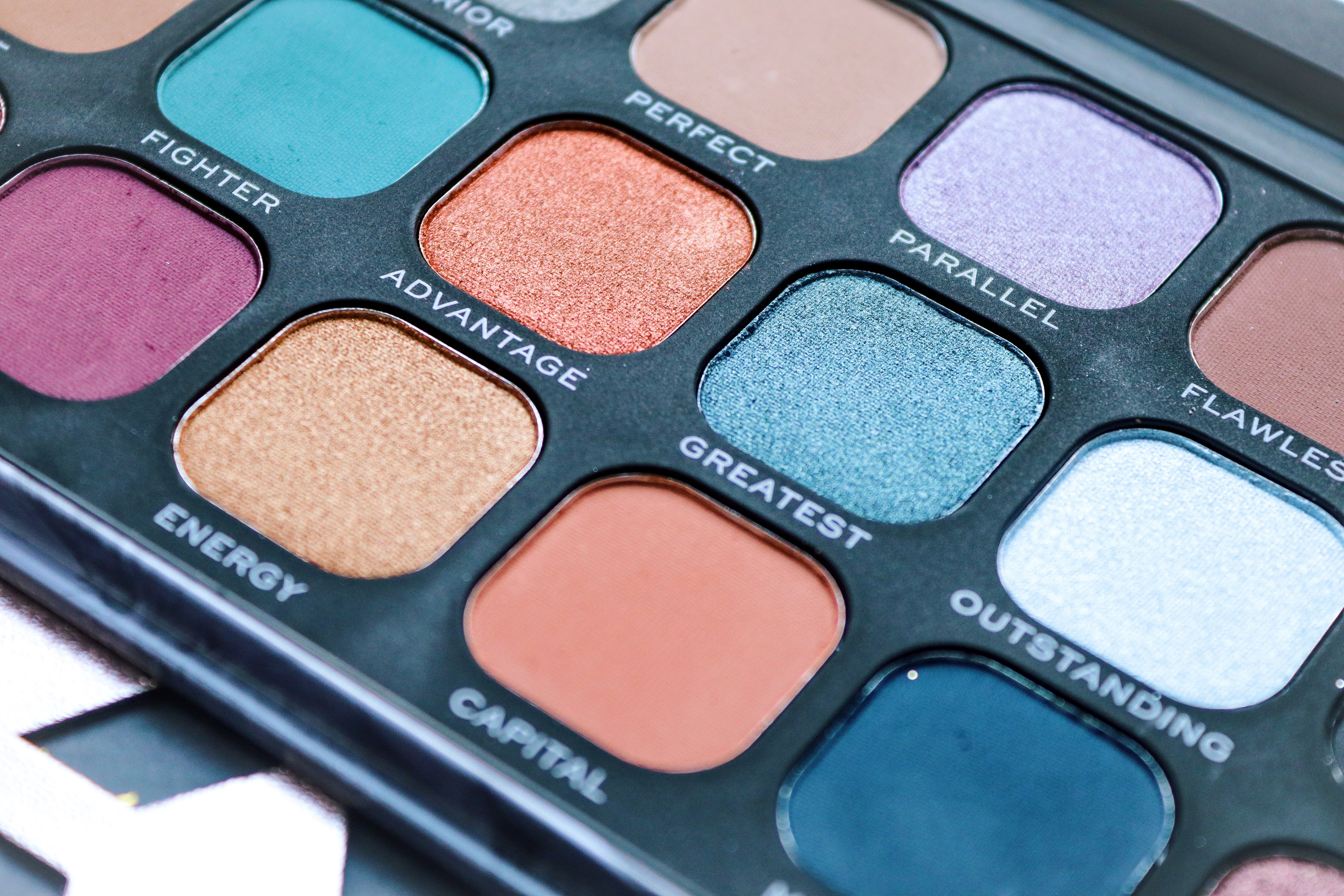
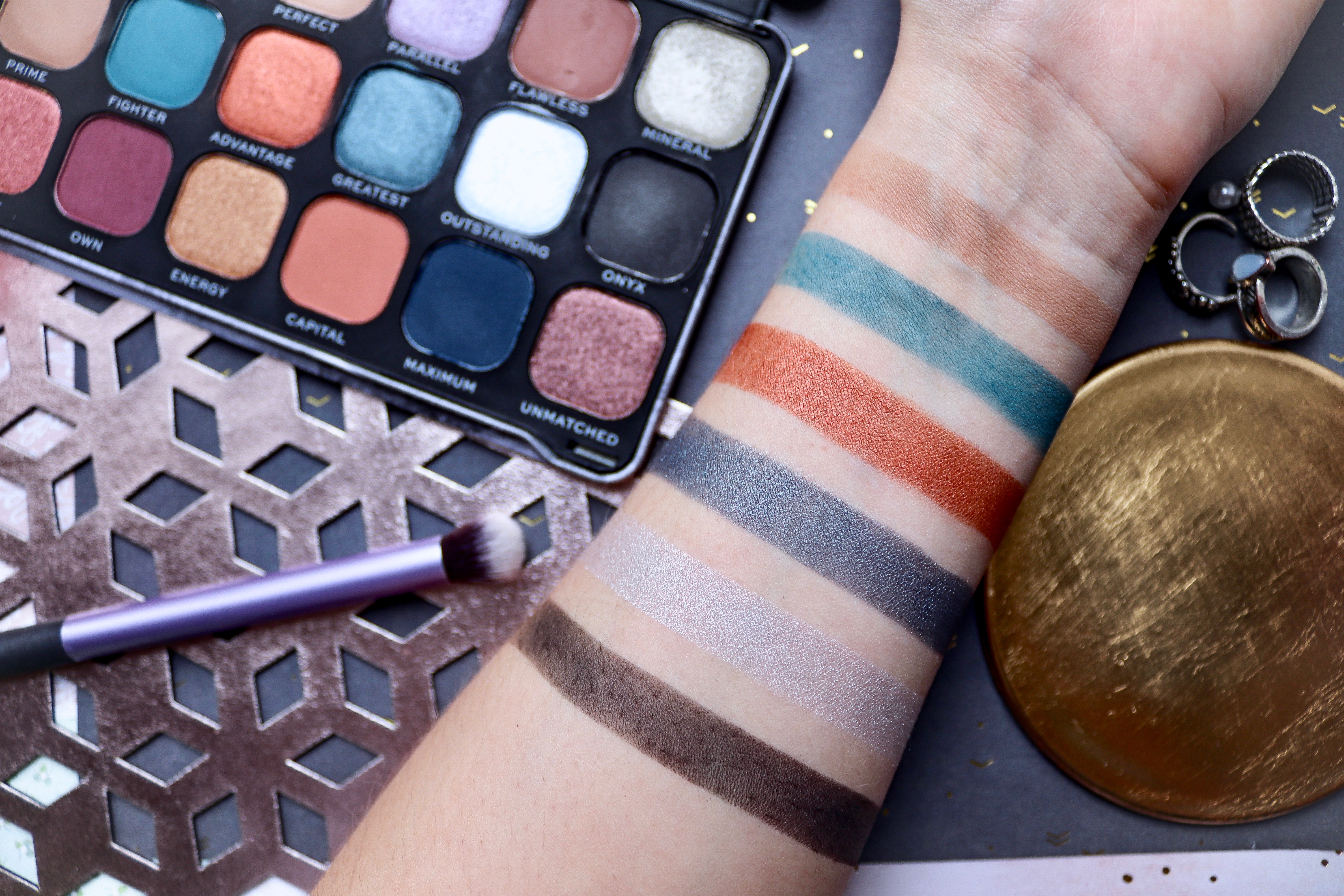
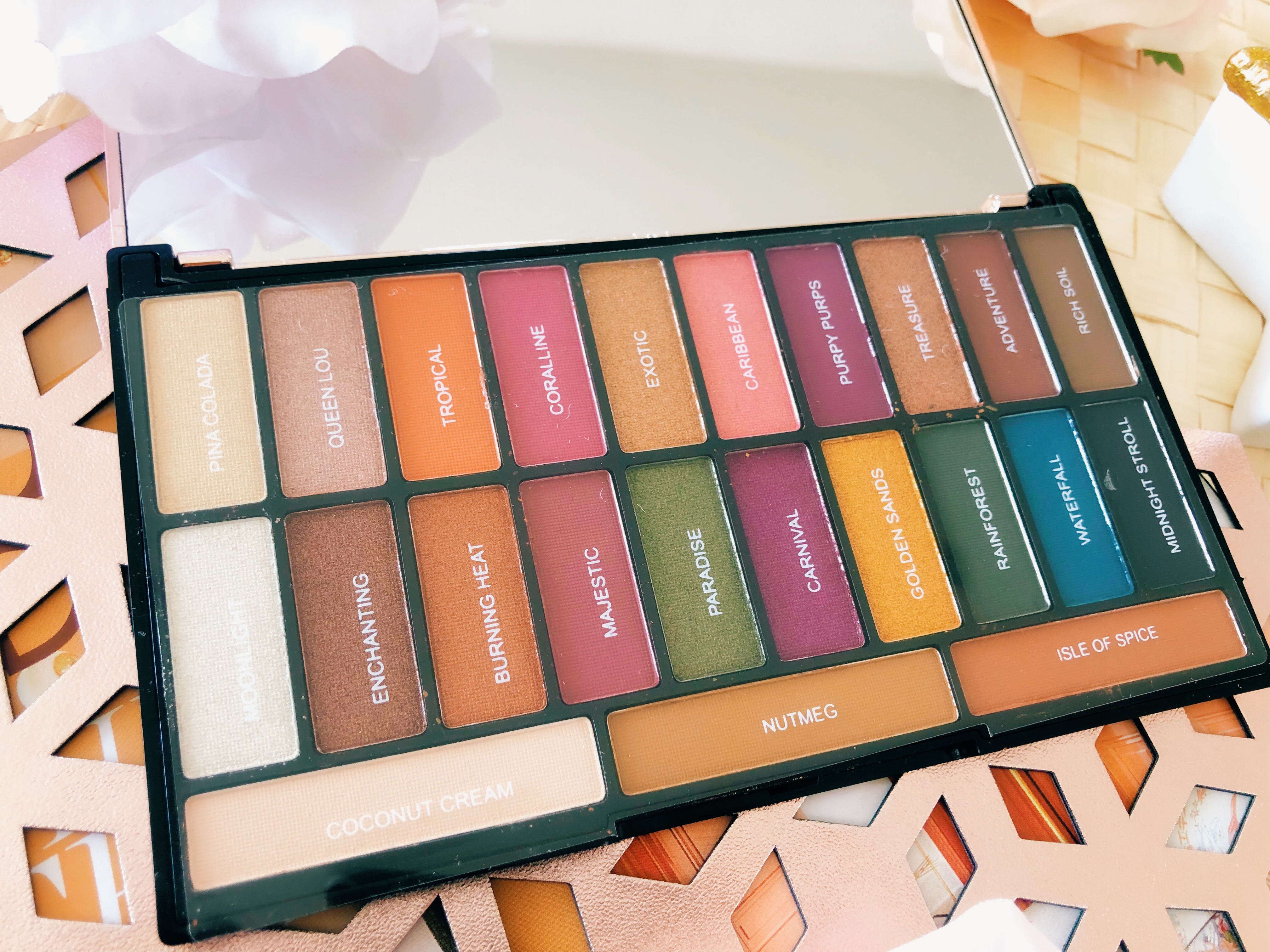
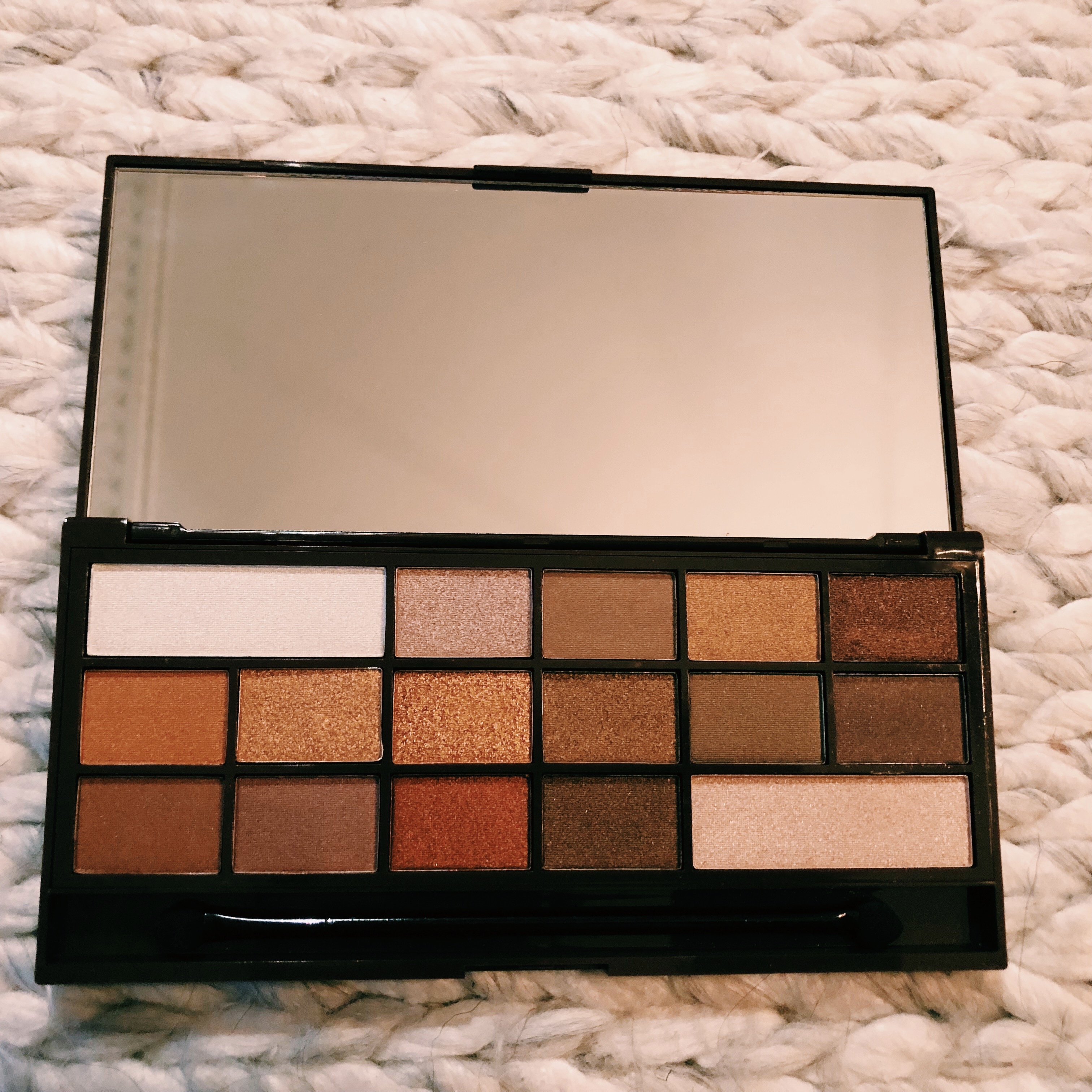
 Upon opening the palette you are greeted by 24 pans, 14 of which are matte shadows and 10 are shimmers. As you can see the palette includes a fantastic mix of shades giving you so many options when it comes to creating looks for every day or even looks for all out glam. There’s rich shimmers, bright pops of colour and even a matte black! What more could you need?! The shadows are all pigmented and buildable so you can be more subtle or go full on. I use a primer to ensure they wear all day long so I would recommend doing the same as you really get the most out of the shades. I would also recommend that you do your eyes before doing the rest of your face as I never learn and get a heavy dusting of shimmer all over my foundation covered cheeks – No thanks.
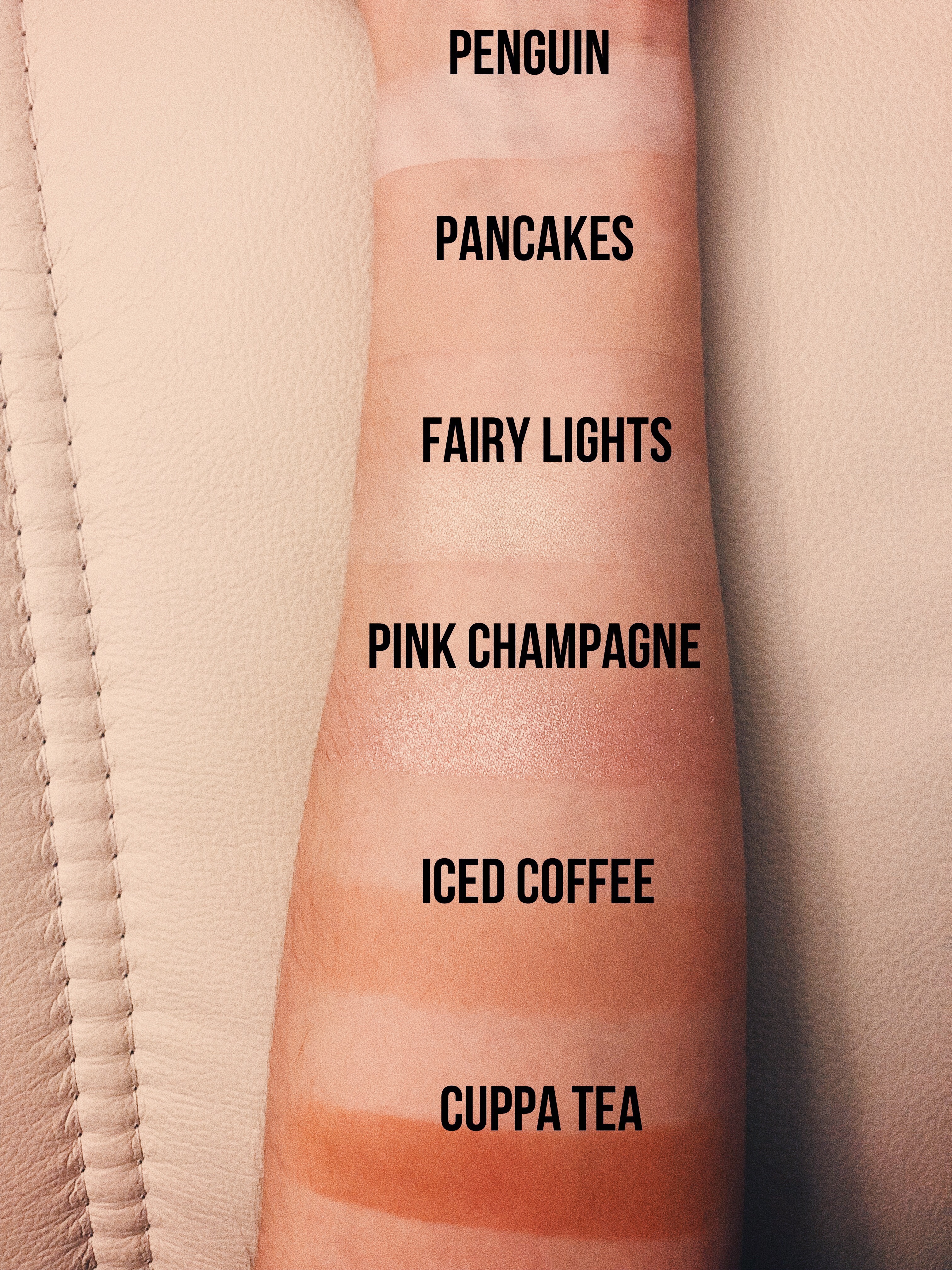
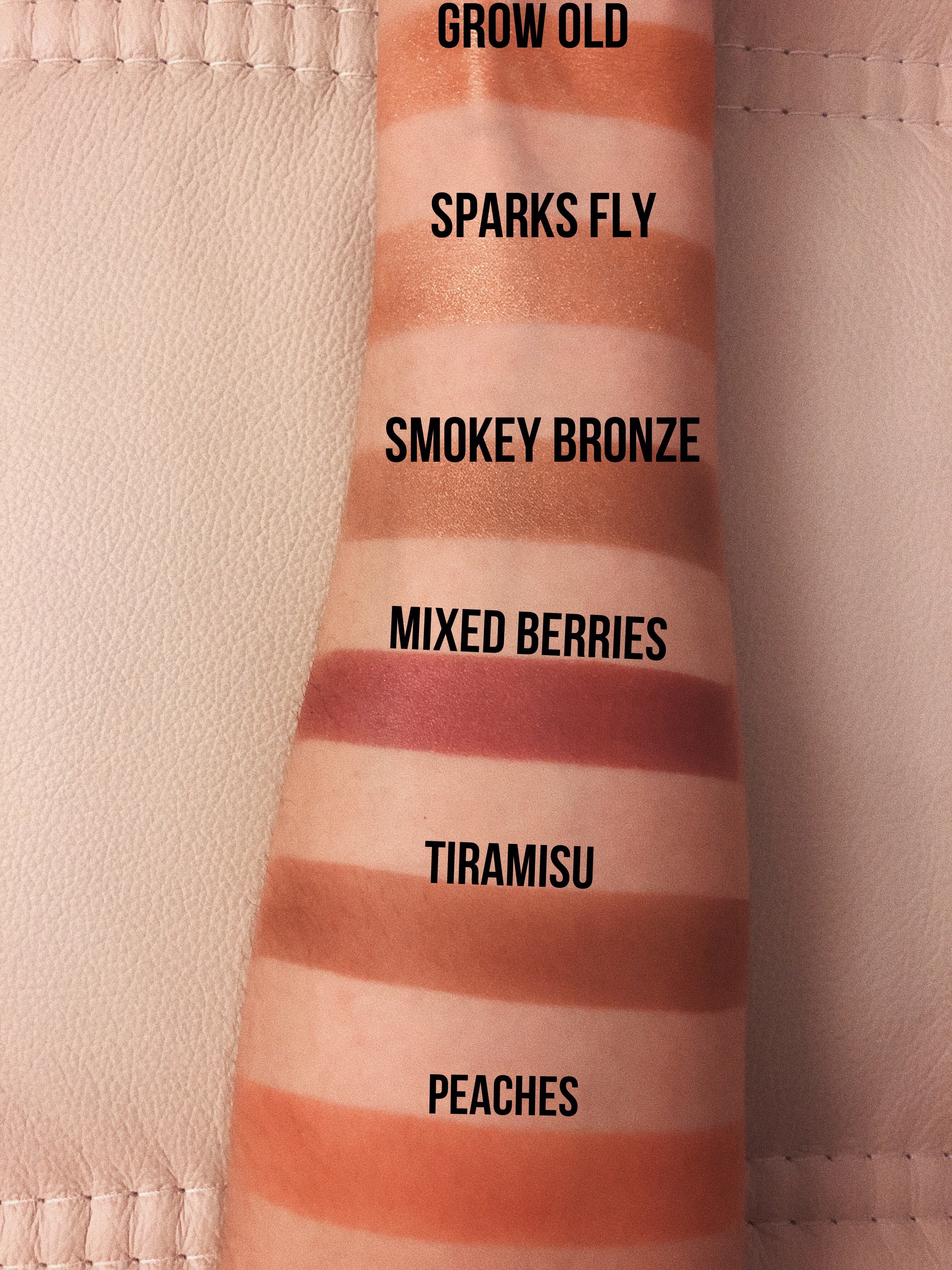


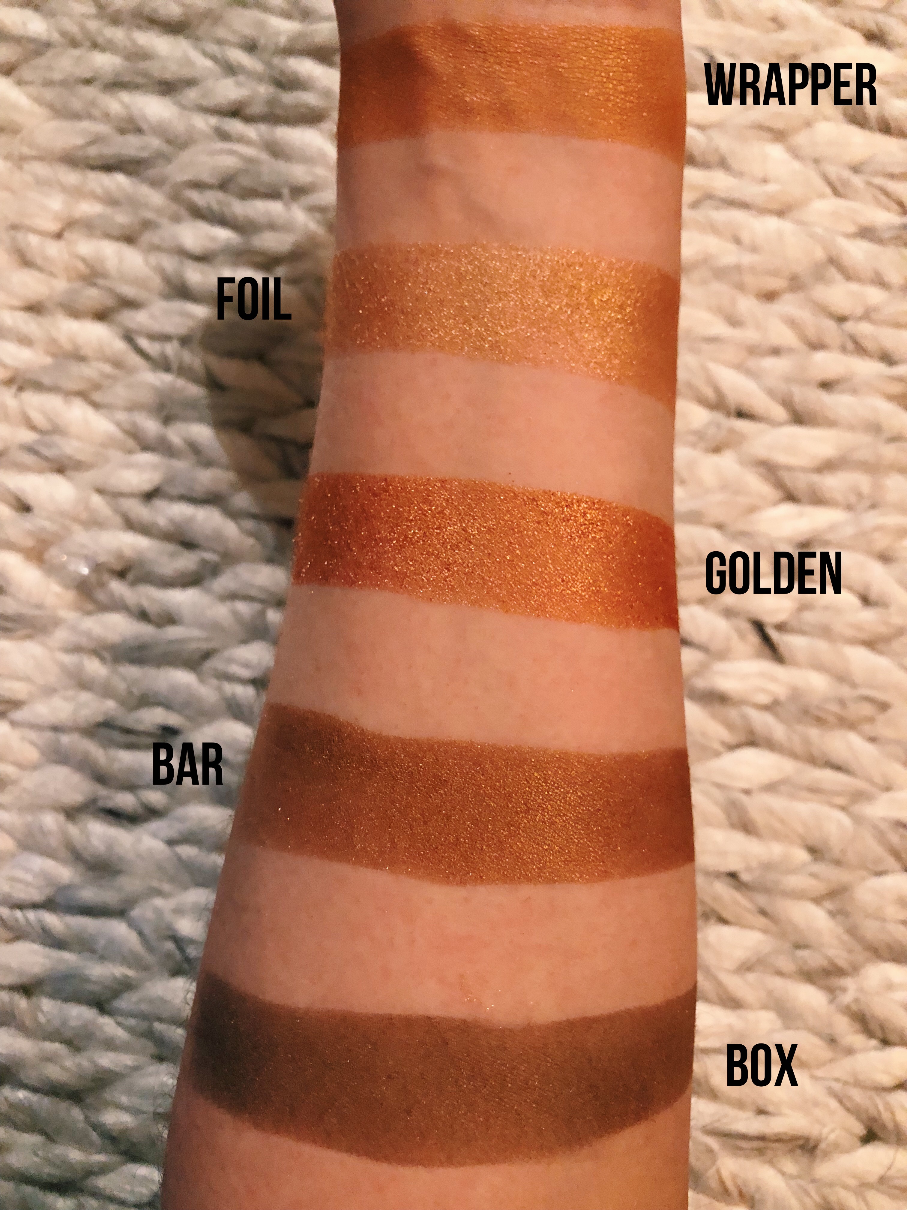
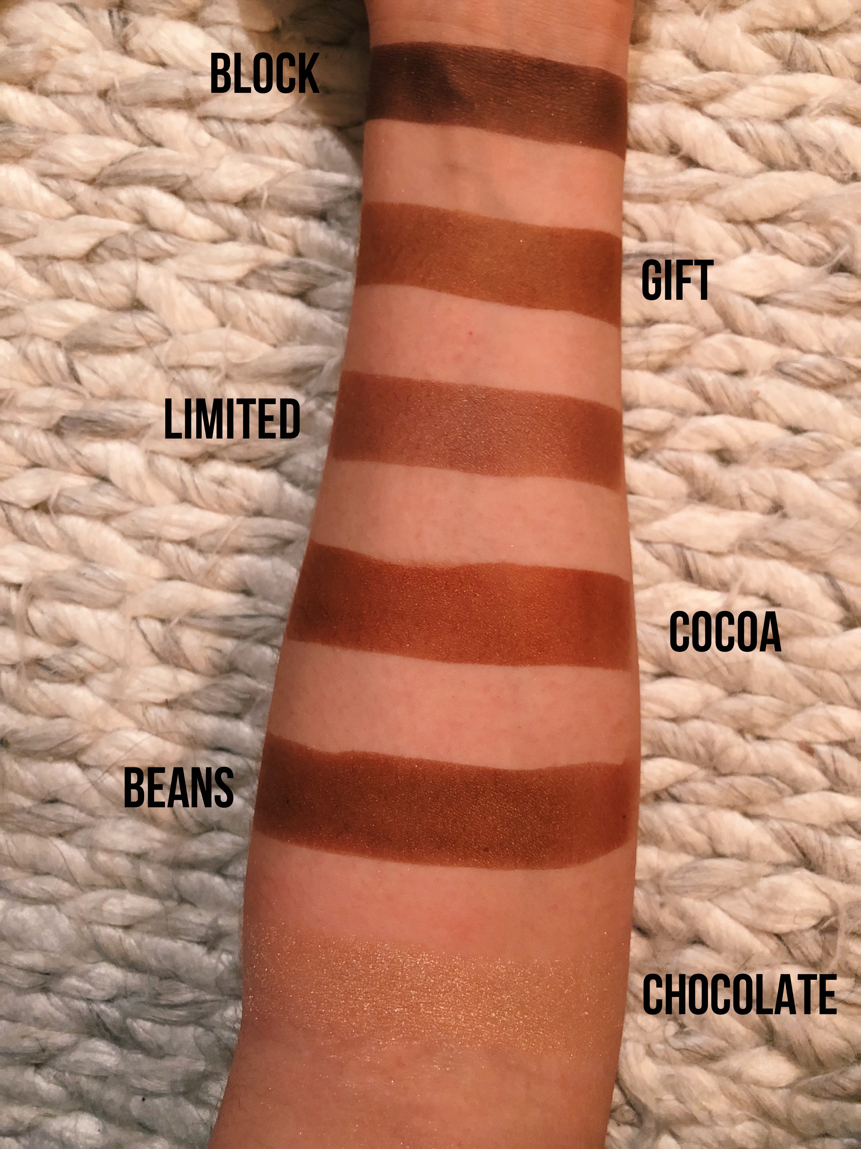


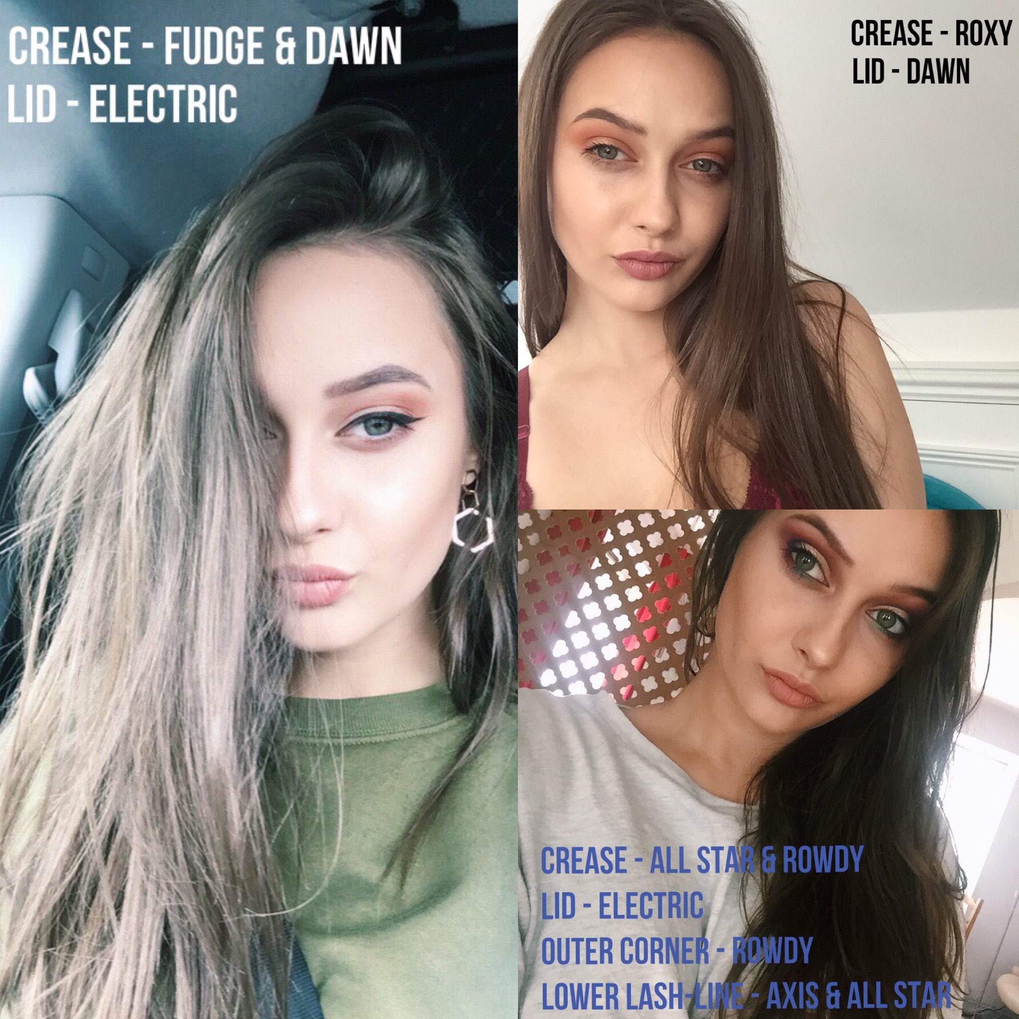
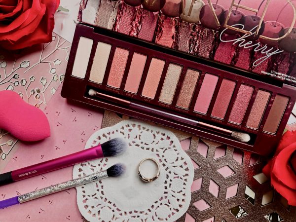
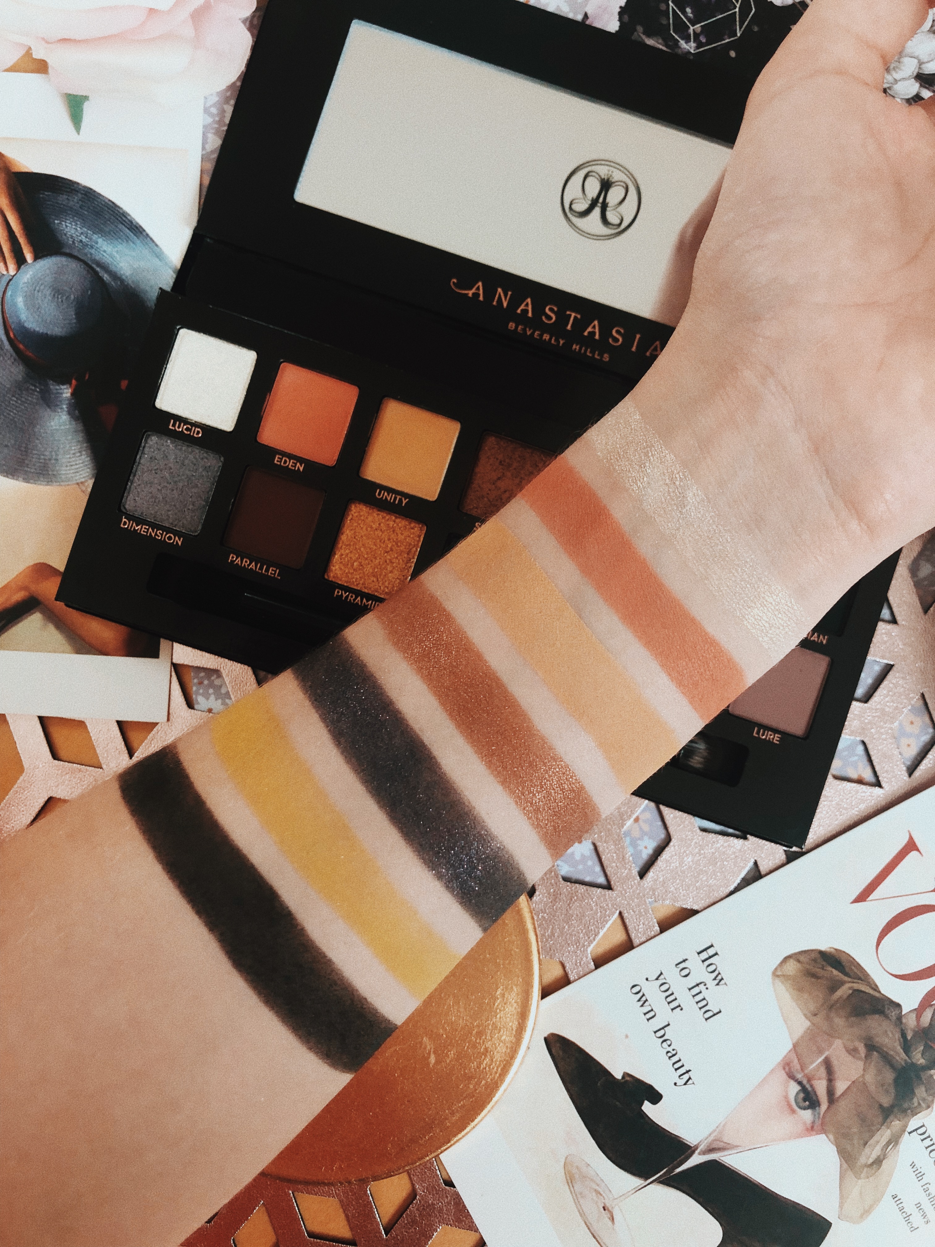
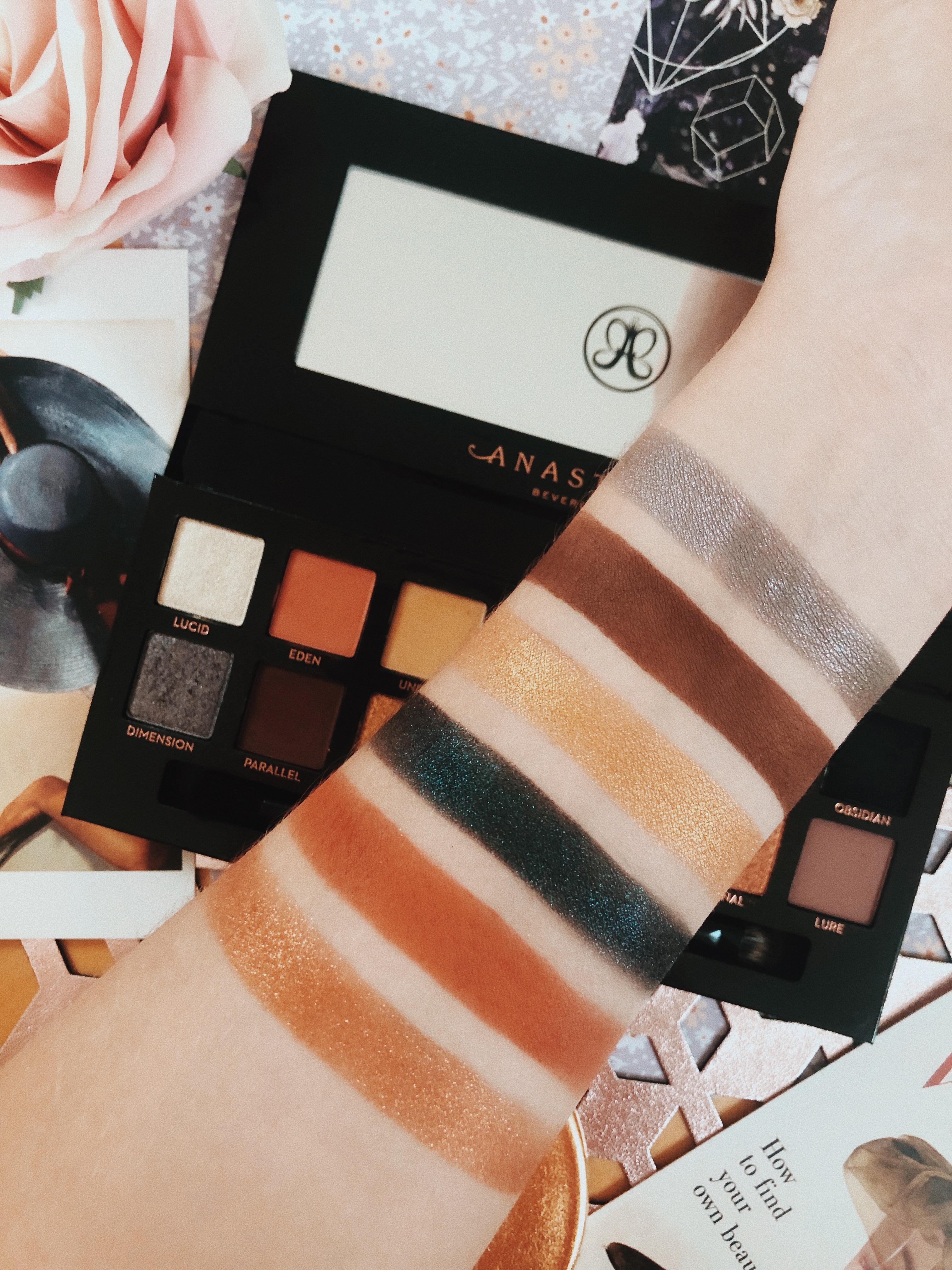
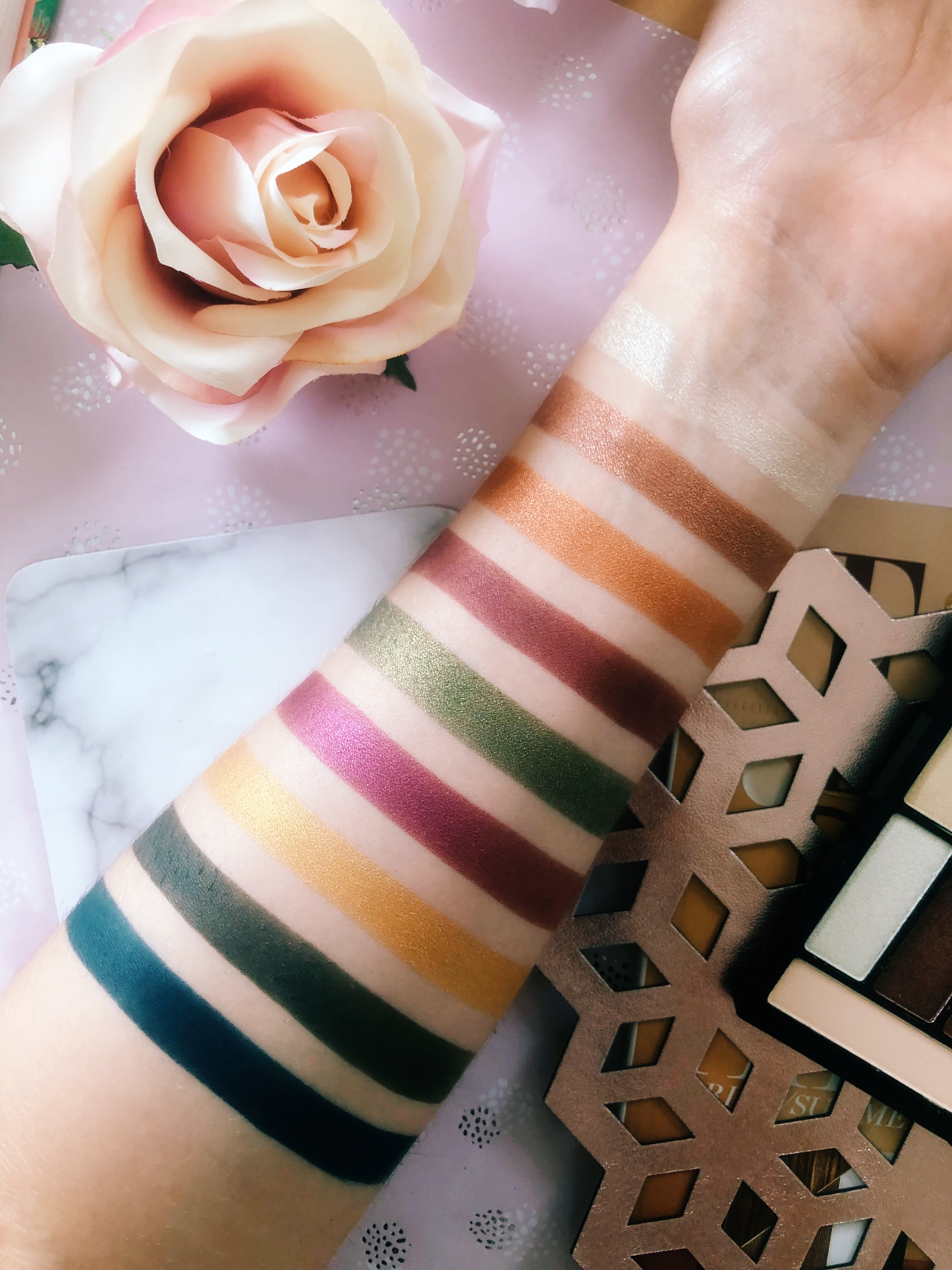
 From top to bottom,
 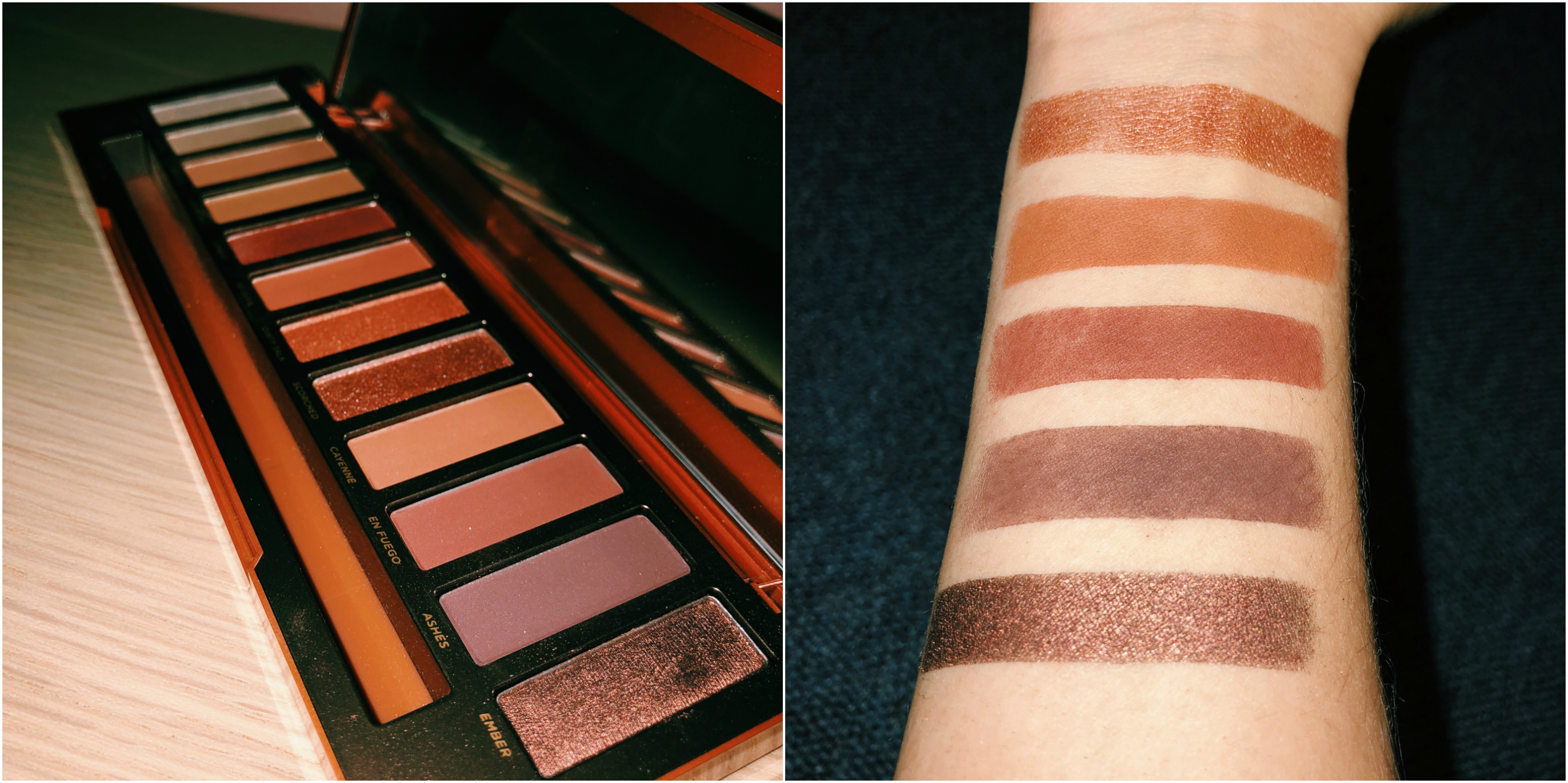 From top to bottom,