Categories
2019 BEAUTY BLOGMAS MAKEUP

TOO FACED GINGERBREAD EXTRA SPICY PALETTE – REVIEW & SWATCHES

Hey Everyone,

I hope you’re all doing well! Welcome to Blogmas Day 4! Today, I have another palette review for you and this one is particularly festive. I was lucky enough to receive the Too Faced Gingerbread Extra Spicy Palette for my birthday (thanks dad), so I’ve been putting it to the test over the last few weeks. I’m so excited to finally share my thoughts with you!

*This post contains affiliate links


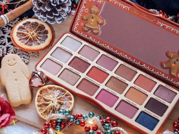
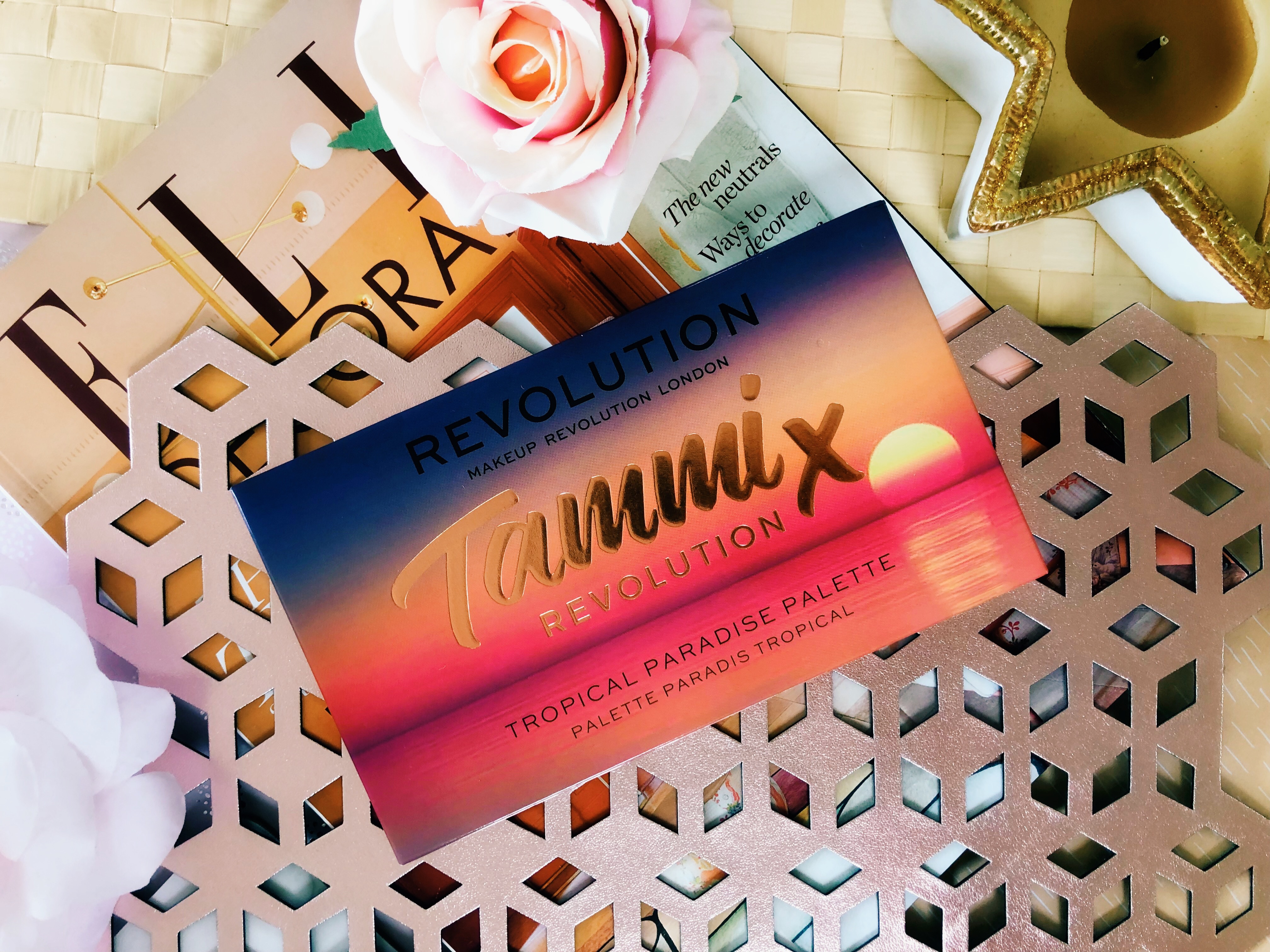
The Too Faced Gingerbread Extra Spicy Palette launched earlier this year as part of their 2019 holiday collection. If you didn’t already know, it’s actually a follow up to their incredibly popular Gingerbread Spice Eyeshadow palette, that was released last year. They had a lot to live up to!


PACKAGING & PRICE

There’s no doubt that this palette is a stunner. Too Faced are known for their cute and themed packaging, it’s something they always do well! The palette is housed inside a tin, which features the cutest little gingerbread couple on the lid. Inside, the palette has a generously sized mirror which has a decorative border featuring the same little characters. If this packaging doesn’t make you feel all festive inside, I don’t know what will. How much is it? The Too Faced Gingerbread Extra Spicy Palette retails at ยฃ39, which is the standard price for most of their eyeshadow palettes. Where can you buy it? You can get hold of the palette from Too Faced’s website itself, or through other retailers such as Look Fantastic, Selfridges, ASOS, Debenhams and John Lewis.


WHAT’S INSIDE?

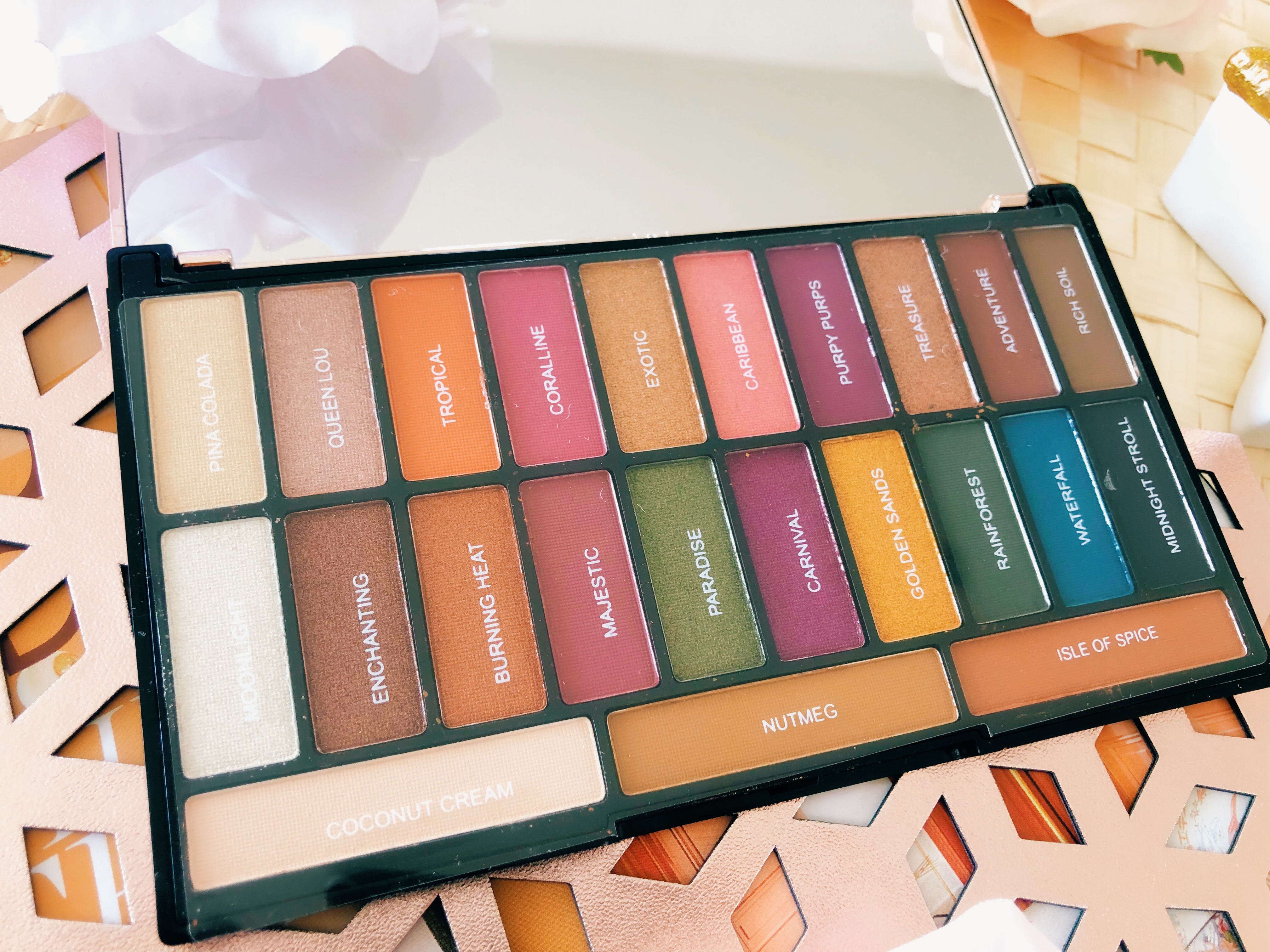
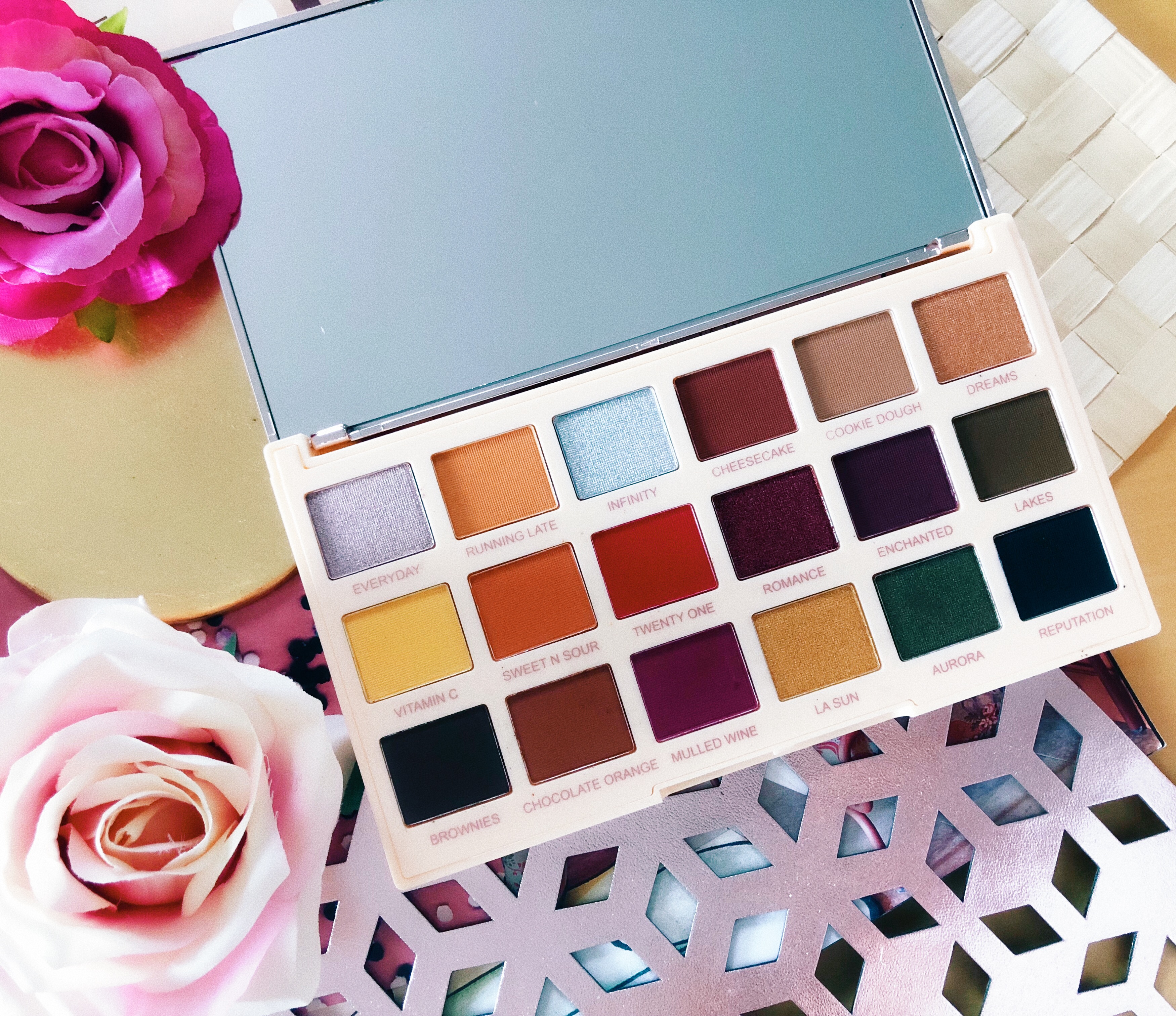
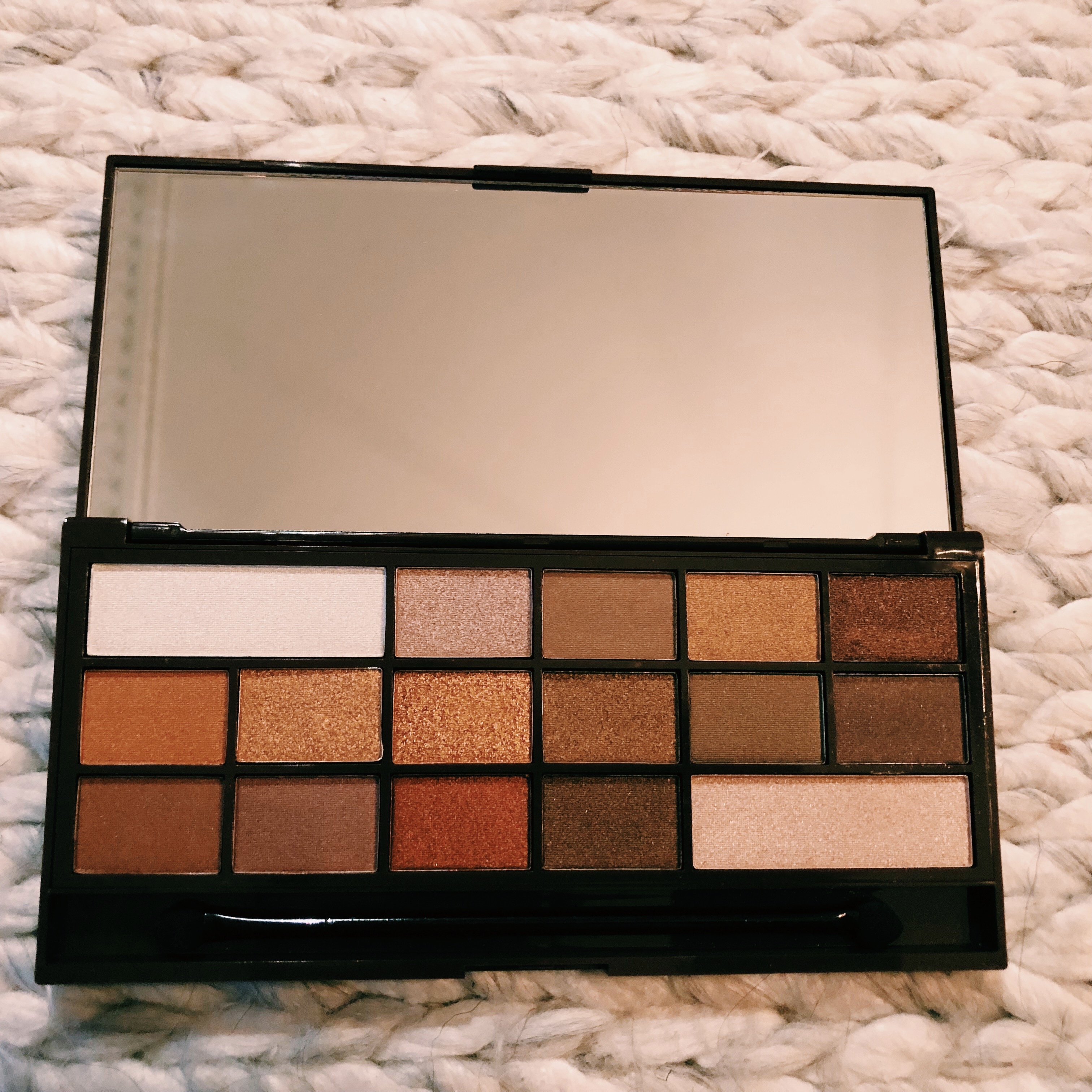
Inside, there are 18 eyeshadows, including a variety of mattes and shimmers. Sticking with the holiday theme, each shade has it’s own festive name inspired by Christmas sweets and treats. Not to mention, the palette has a sweet, lightly spiced scent, which is dreamy. It features a great selection of rich and warm-toned shades that can create looks for every occasion. It’s the perfect palette to create some spicy daytime looks as well as some smouldering smokey eyes.


Swatches of the first row: Vanilla Waffles – Drizzle it

1ST ROW SWATCHES

Vanilla WafflesCream/light beige with a matte finish – This shade is buttery soft to the touch and it blends like a dream. It’s pretty much the perfect base for me! It’s also great to use if you go slightly overboard with a darker shade, as it lightens and brightens in seconds.

Cookie CutterLight-medium peach with flecks of pink/gold glitter and a frosted finish – This shade is so gorgeous. It reminds me of the shade “Bang Bang” in Urban Decay’s Naked Cherry palette, which is one of my favourites! Its the tiniest bit chunky so I tend to apply it wet and in small amounts so that I can get it to look smooth on my lids.

Soft and SweetMedium pink/coral with a matte finish – In terms of texture, this shade is slightly powdery. Once blended, it can sheer out a little so I’d recommend building it up over a primer.

For The GrahamLight brown with warm undertones and a matte finish – This is an every day shade for me, I love using it as a transition into something darker for Autumn and Winter looks. It’s a basic shade but it’s a staple. Like Soft and Sweet, it’s slightly powdery but it’s easy to work with over a primer.

In a Pinch Bright orange with warm undertones and a matte finish – I love this shade. It’s pigmented and easy to apply and blend with or without the use of a primer. It a perfect matte shade for those that love creating simple warm-toned looks.

Drizzle It Reddish rose gold/copper with warm undertones and a metallic finish – The pigmentation of this shade is so intense! It’s definitely one of my favourite shades in the palette. I love how festive it looks on my eyes, it works beautifully alongside Vanilla Waffles and Soft and Sweet.


Swatches of the second row: Lick the Spoon – Cookie Call

2ND ROW SWATCHES

Lick the SpoonMedium peach with silver reflects and a frosted finish – The pigmentation of this shade is gorgeous! It’s not as buttery as I’d hoped it would be so it does feel slightly dry. However, if you use a wet brush and a patting motion, the pigment should pack onto the lid nicely.

Spicy Mami – Deep copper with orange and gold flecks and a satin finish – This shade confuses me a little bit. It looks as if it’s going to be a one-swipe metallic wonder however it actually takes a little bit of work. I always apply it on top of a primer using a wet brush to get the most out of it. It’s not as glittery as it looks, it actually has more of a satin finish to it.

Extra Spicy – Deep orange with warm red undertones and a matte finish – I was actually really impressed with the pigmentation of this shade. It was a tiny bit powdery in the pan but it still applies and blends really easily.

Half BakedDark copper with warm undertones and a metallic finish – I find myself reaching for this shade all the time. It’s just so pigmented and pretty! It works beautifully with Soft and Sweet or Butterscotch. It’s also really smooth and easy to work with – I love it!

Butterscotch -Bright, light orange with yellow undertones and a matte finish – This is my favourite matte in the whole palette. I love using this on its own to give a more subtle hint of warmth to my makeup looks. It’s nicely pigmented and easy to blend out too.

Cookie Call Deep reddish brown with purple undertones – This shade didn’t swatch particularly well and I think that’s because it requires some building. Once I’ve got it to a level of intensity that I’m happy with, it looks fine! I have to admit, it’s not the most festive of colours but it does work well with a few of the other shades in the palette.


3RD ROW SWATCHES

Plenty of DoughMedium peach with warm undertones and a matte finish – Another slightly drier matte, but when used wet or over a primer it’s good to go.

Candy QueenLight copper/gold with a metallic finish – This shade is so pretty! It’s probably the shade that I reach for the most actually, even on the days where I’m aiming for a more “natural” look, I can’t resist! Also, just skip straight to using this with a damp brush – thank me later.

Gingerbread GlamReddish-brown with warm undertones and a matte finish – This honestly blends like a dream, it’s another go-to matte shade for me.

Hot TamaleBerry red with warm undertones and a matte finish – Such a pretty shade! I can’t create a pink makeup look without it. It’s very pigmented so be patient with it when it comes to blending.

Cinna-moanDark copper with warm/red undertones and a matte finish – Once blended, this shade has a habit of sheering out a little too much. However, it’s easy to build up with a couple of layers of application.

Midnight Snackย – Dark black base with flecks of blue/turquoise glitter and a sparkly finish – I wasn’t too keen on this shade at first as it just didn’t seem particularly festive or cheery. That being said, it’s actually a great shade to create some smoky looks – perfect for a Christmas party! It works really well with Hot Tamale.


WHAT DO I THINK?

Overall, I really love this palette. The colour scheme is gorgeous and it compliments the original palette beautifully. It’s definitely going to be a popular palette for the holiday season, I reckon it will sell out pretty fast. If you’re into creating warm-toned looks, using pinks, oranges and coppers. For those that want something more icy and cool-toned, this probably won’t be the one for you. In terms of formula, some of the mattes and a couple of the metallics needed some building but there was nothing that a wet brush and a primer couldn’t fix. I also noticed that a few shades were drier in texture so, again, using a wet brush can help with this! The packaging is absolutely gorgeous. It’s so festive and colourful!

*Get the Too Faced Gingerbread Extra Spicy Palette here


Let me know what you think of this palette in the comments! Donโ€™t forget to follow my socials โ€“ come and say hey!

N xxxx

TWITTER | FACEBOOK | INSTAGRAM | PINTEREST  

Categories
BEAUTY MAKEUP

MAKEUP REVOLUTION: WILD ANIMAL COURAGE PALETTE REVIEW, SWATCHES & PHOTOS

Hey Everyone,

I hope you’re all doing well! I’ve been doing a lot of volunteering over the last couple of weeks so I’ve been a busy bee but nothing can stop me throwing myself at a new Makeup Revolution launch! Today, I’m reviewing the Courage palette from the Wild Animal range. These really caught my eye because the packaging looks amazing but also the variety of shades included is amazing! I just knew I would get a lot out of these palettes so I may have purchased them all… at least that means you guys have three new reviews to read! I’ve included lots of photos and swatches to help you make your mind cup – be sure to let me know what you think in the comments!

*Some links in this post are affiliate links


PACKAGING & PRICE

This packaging for this palette is just gorgeous. It’s similar to their usual plastic style casing however it does feel very weighty and luxurious which I love. It just feels like a good quality palette and that’s before I’ve even opened it and seen the shades! Given that leopard print has made a comeback this year, it feels very fitting to have a whole palette kitted out in such a bold design. How much is it?ย The Courage Palette retails at ยฃ10 which such a great price for 18 eyeshadows.ย Where can you buy it?ย You can get hold of the Courage Palette fromย Makeup Revolutionโ€™s websiteย itself or throughย Superdrugย (which does student discount and has a point system too) or Beauty Bay!


WHATโ€™S INSIDE?

Makeup Revolution treated us to 13 shimmers and 5 mattes, as well as a massive mirror that takes up the other half of the palette! I’m kind of disappointed that the shades don’t have names as it makes life a whole lot easier, particularly as a blogger when it comes to reviewing and recommending shades. In terms of the colour scheme, this is the dreamiest of warm, bronze and golden palettes. I know it’s July but imagine using this in Autumn! It’s just so damn pretty. I’m a warm-toned kind of girl too so I can see myself using all of these shades – even that khaki one too!


1ST ROW SWATCHES

Given that the shades aren’t named (sigh), I can’t really talk you through them all in my usual style. However, I do have some favourites that I’ve just got to mention! In this row, the shimmer shades are so soft and smooth. The mattes are also very pigmented and easy to blend. I really like this formula. My favourites from this row are the second, third and fourth shades!


2ND ROW SWATCHES

This is definitely my favourite row in the palette, it’s like Autumn in six shades. The first four are mind-blowing, particularly that red/cherry one. It’s so pigmented it’s unbelievable. I cannot believe this is included in a ยฃ10 palette! The matte shade second from the bottom was ever so slightly patchy but I expect with a bit of bending and building it will look fine. The last gold shade is also absolutely gorgeous and it feels so buttery!


3RD ROW SWATCHES


This row is probably my least favourite. The matte shades are so pigmented, especially that first one! It’s a proper chocolatey brown and I really enjoy using shades like this to smoke out my makeup looks. It also looks makes such a difference when I apply this along the waterline too! My eyes look so much wider and greener. The third shade is gorgeous, it’s quite unique too as it’s a cool toned bronze with silver flecks in it and I don’t think I have a shade like it in my collection. I love the khaki shade here too as I really want to start using more greens in my makeup looks! I feel like khaki is a safe place to start as it’s not too in your face and I reckon I might be able to pull it off!


WHAT DO I THINK?

I think this is a great palette. It only costs ยฃ10 and you get 18 shades to play with. A majority of the shades included are shimmers but I’m glad they’ve included some mattes in there too as it means full looks can be created from just using the one palette and if you like to travel light, that makes a huge difference. If you’re into browns, coppers and burgundies, this is a palette that I’m sure you will enjoy. The formula of the shimmer shades is absolute madness – I honestly don’t know how they do it but I’m more than happy to pay this kind of price instead of the ยฃ40-ยฃ50 that some brands are asking for! The packaging hasn’t let me down either, it’s their usual style but the design and the gold exterior makes it look and feel so luxurious. There’s also a huge mirror included which always comes in handy.

In terms of what I don’t like, I have very little to say. I think one or two of the mattes could do with being a little less patchy but overall, they’re easy to build and blend so I’m not too bothered. I also would have liked the shades to have names as I find that easier as a blogger but also it’s just an extra detail that I often enjoy about palettes (maybe I’m weird).

Get the Makeup Revolution Wild Animal Courage Palette


Let me know what you think of this palette in the comments! Donโ€™t forget to follow my socials โ€“ come and say hey!

N xxxx

TWITTER | FACEBOOK | INSTAGRAM | PINTEREST  

Categories
BEAUTY MAKEUP

JUVIA’S PLACE ‘THE ZULU’ PALETTE – REVIEW, SWATCHES AND PHOTOS

Hey you,

I’m back with another review and this time I’m going to be talking about a Juvia’s Place palette. I’ve been wanting to add some colour to my makeup collection for a while, instead of playing it safe with neutrals and bronze/gold shades (very guilty). This is definitely new territory for me but when I think of colourful makeup, I think of this brand so I think it’s worth starting here! I’ve never owned or used any of their products before but I’ve only heard and seen incredible things so I thought I would share my thoughts with you! Today’s review is about the infamous Zulu palette! I noticed this palette a while ago and all I can say is that the pigmentation blew my mind and that was only through watching someone else swatch the shades, so I simply had to get it and try it for myself! 

This post contains affiliate links.

Love colourful eyeshadow palettes? Check out my review of the Tammi x Revolution Palette! 

JUVIA'S PLACE 'THE ZULU' PALETTE - REVIEW, SWATCHES AND PHOTOS

PRICE

So let’s get straight in there with the facts. How much is it? The Zulu Palette retails at ยฃ20 but sometimes it’s on sale and if you have student discount, you can get an even better deal on in some circumstances. I’ve noticed that all of their products are reasonably priced and I like that you can have access to great quality makeup, without having to spend a fortune on it. Where can you buy it? You can get hold of the Zulu palette on the Juvia’s website itself or through BeautyBay.


JUVIA'S PLACE 'THE ZULU' PALETTE - REVIEW, SWATCHES AND PHOTOS

PACKAGING

I know that in most cases, it’s what’s inside that matters, but packaging is often the first thing that we see. It makes a big difference as to whether or not I end up making the final purchase – especially if I’m buying something online. If there’s one thing that Juvia’s Place know how to do, it’s packaging. The use of bold and vibrant colours is stunning. I love the beautiful Egyptian Goddess on the front, the level of detail in the illustration is amazing. The background colour is a pretty, pastel pink shade with a holographic tint to it. It’s clear that a lot of time went into designing this packaging and I really like that. It makes them stand out from other brands. We see so much of the same thing being churned out by brands over and over again, it’s nice to mix it up!


JUVIA'S PLACE 'THE ZULU' PALETTE - REVIEW, SWATCHES AND PHOTOS

WHAT’S INSIDE?

Okay bright colour fanatics, take a deep breath and feast your eyes on these. There’s 9 eyeshadows included: 6 mattes and 3 metallic shades. I guess, some would argue that the palette is fairly small in terms of how many shades you get, right? In this case, I think less is more. First of all, let’s address the size of the pans. They are huge – I don’t think I have a palette with pans this big in my whole collection. Already, you’re getting a lot of bang for your buck.

Secondly, as you’ll see below, the quality is amazing. I’m sick of investing in expensive palettes, only to discover some of the shades are high quality. This is one of the first palettes that I’ve purchased, where every single shade is amazing. There isn’t one that’s worse than the others. They’re all on the same level in my opinion and that’s rare! I’d rather have less product at a higher quality than splash out on something where I barely get my money’s worth. That being said, I do have a tiny suggestion for improvement – I would love the shadows to be labelled! It’s difficult when writing a review and when recommending shades to people when nothing has a name.


JUVIA'S PLACE 'THE ZULU' PALETTE - REVIEW, SWATCHES AND PHOTOS

1ST ROW SWATCHES

Matte Orange – I don’t think I’ve ever used an orange eyeshadow quite like this one. It’s extremely pigmented and yet the formula is buttery and soft. The colour payoff is insane and yet there’s no kickback or fall out. How have they managed this? It’s a great shade for darkening the crease when creating a colourful warm-toned look.

Matte Yellow – The formula is soft and buttery and it’s incredibly pigmented. It can blend out to be slightly less bold as it appears in the pan but it’s buildable and you could certainly get a really intense pop of colour.

Matte Brown – I thought this shade was going to be quite dark but I think that’s just how it looks in the palette and in the pan. Perhaps it’s in contrast to all of the brighter shades adjacent to it? Either way, it’s not a disappointment, it’s still a beautiful shade. It’s like the perfect, warm-medium brown. I use this almost every day, in my outer corners to create a smokey eye look and there’s no going back now. This is my go-to brown.


JUVIA'S PLACE 'THE ZULU' PALETTE - REVIEW, SWATCHES AND PHOTOS

2ND ROW SWATCHES

Matte Turquoise – Turquoise has always been my favourite colour so of course, I was practically drooling when I swatched this shade. It felt slightly powdery to the touch but it appleid exactly like the others: pigmented and without fallout or kickback. It blends out to be slightly less intense as it would appear in the palette, but it’s easy to build. I actually prefer the opportunity to build a shade to my desired level of intensity.

Metallic Green – This is where I feel like I enter a whole new dimension. This shade is absolutely stunning. If you were to say, Nina, I know a bright green metallic eyeshadow that you’ll love, I would probably laugh in your face. I’m so surprised at how much I love this shade. It’s so buttery and creamy and it blends like a dream.

Metallic Aqua – Another incredible shade. I can see myself absolutely rinsing this in summer. It’s just so pretty! I think it’s my favourite colour in the palette.


JUVIA'S PLACE 'THE ZULU' PALETTE - REVIEW, SWATCHES AND PHOTOS

3RD ROW SWATCHES

Metallic Pink – I’m still not quite over this. I think it’s of my all time favourite eyeshadows – ever. I’m obsessed with the way that the colour shifts between a peachy pink and a rusty gold. I’m so glad that they chose to add a duo-chrome to the mix because it continues to make this palette more unique! As you can see, it’s pigmented, it looks stunning and it is pink, what’s not to love?

Matte Pink – The definition of “hot pink”. They’ve absolutely aced the formula too. It’s buttery and blends out really well, despite how pigmented it is! I can see myself using this shade a lot during Spring, as I tend to go for use lots more pinks and purples. It’s really pigmented and bold but it still blends really smoothly. Another formula I’m very impressed with.

Matte Purple – I cannot wait to be creative with this one. It’s so bold and vibrant, I was expecting it to be difficult to blend but of course, in true Juvia’s Place style, it’s perfect.


JUVIA'S PLACE 'THE ZULU' PALETTE - REVIEW, SWATCHES AND PHOTOS

WHAT DO I THINK?

I can’t believe that this palette only retails at ยฃ20. You can also get it on sale AND use a student discount to grab it at an even better price – an absolute steal if you ask me. If you’re into colour and pigmentation that is out of this world, this is a palette you absolutely cannot miss out on. There isn’t a bad shade in there, which is a rare find. I’m also extremely impressed with the formulas, there’s no fallout and they all blend like a dream. Some of the most expensive brands out there are still producing chalky, patchy and rubbish eyeshadows, but with the Zulu Palette there isn’t a bad swatch in sight. I like that the mattes aren’t as intense as they look because it gives me a chance to build them up to the intensity level that I want!

If I were to suggest any improvements, firstly, I wish the shadows were labelled. It makes reviewing so much easier but it also means I can refer to individual shades when I post pictures of looks or when I recommend them to friends. Secondly, I’d say that there could be at least one more metallic in there – I’m just being greedy but that formula is to die for and I need more. It makes reviewing so much easier but it also means I can refer to individual shades when I post pictures of looks or when I recommend them to friends. Secondly, I’d say that there could be at least one more metallic in there – I’m just being greedy but that formula is to die for and I need more.

Get the Juvia’s Place Zulu Palette


Let me know what you think of this palette in the comments! What bright coloured palettes or eyeshadows do you like? Don’t forget to follow my socials – come and say hey!

N xxxx

TWITTER | FACEBOOK | INSTAGRAM | PINTEREST  

Categories
2018 BEAUTY BLOGMAS MAKEUP

THE CHERRY ON TOP? URBAN DECAY’S NAKED CHERRY PALETTE

Hey Everyone,

This post contains affiliate links

I hope you’re all doing well! Ladies and gents, we are gathered here today, to witness the beauty that is the Naked Cherry Palette! Urban Decay’s Naked palettes have always been popular in the beauty community and every time a new one is released, we all go nuts. When we heard about the potential release of a cherry themed palette, we all nearly lost our s#!t. For a start, I love all things cherry! Whether that’s the fruit, the scent or the colour – I’m obsessed. In fact, I was so keen that I ordered the palette during the early release period!

 I wanted to review it straight away, so waiting for Blogmas wasn’t easy! I’m glad I did though, as I’m sure lots of you will be adding this to your Christmas lists or buying it for someone special! They’d definitely have to be special considering that the palette retails at a whopping ยฃ42, which is actually ยฃ3 more expensive than the other Naked palettes. Naturally, I assumed that the Naked Cherry would be as close to perfection as possible, otherwise why charge such a high price? Am I right people?


The packaging is stunning! It’s almost the same as the Naked Heat Palette; a glossy plastic exterior with “Naked” embossed on the front. The crimson compact is a beautiful addition to any makeup collection. Not to sound incredibly boring, but I actually prefer the plastic packaging compared to the velvet exterior that certain brands *cough ABH* go for, as they get dirty so quickly! It’s nice to have palettes that are easy to clean, that don’t look gross after a few uses. I love the use of the cherry images too! Inside there’s a full size-mirror, perfect for on-the-go use! The palette also comes with a double-ended brush, which isn’t my favourite, but I have others that I can use instead, so I’m not hugely bothered by this. One end is fab for precision but the other is quite rigid and isn’t great for blending. Next time, I’m hoping for something fluffier! I know this sounds fussy but it actually makes blending a heck of a lot easier, especially for those of us that haven’t got all day to sit and buff shadows into perfection. Apparently, the palette is subtly scented of cherries … all I’m getting is a hint of plastic and a clay-like smell. I’m kind of gutted that they didn’t follow in the sweetly scented footsteps of Too Faced and make this a cherry scent-sation (sorry, I had to). It would’ve been a nice touch, you know?


The Naked Cherry Palette features 12 all-new cherry-hued shades. The range of shades included are fantastic; a gradient ranging from natural neutrals through to dark, rich berry tones. There’s a brilliant balance of mattes (7) and shimmers (5) which is something I always look for when purchasing new palettes. I once (accidentally) bought a palette that only had mattes in it and I’ve never been so disappointed in my life, I could only create basic looks that had no glam (worst nightmare) and it totally limited what I could do with it. There’s so much creativity to be had with the Naked Cherry Palette and I can see lots of amazing looks being created. If you want to add a subtle shimmer you can, but if you want to create a dark and smouldering look, you can do that too, the choice is yours! Top tip: if you’re ever unsure of where to start with a new palette, look up what others are doing on Pinterest and you’ll find plenty of inspiration there!


Hot Spot Pale ivory matte – I was actually so surprised at how pigmented this one was! It swatched beautifully with only a tiny bit of fallout.

CautionMatte peachy beige – This shade literally couldn’t be a better match to my skin-tone! I’ll definitely be using this as a base before applying anything else as it’s PERFECT. It’s also surprisingly pigmented too although it does feel a tiny bit powdery.

Bang BangMetallic pink-coral with gold shift – I was so excited about this shade when I first saw it. It was quite dusty so I’d say a little bit goes a long way with this one. It’s so pigmented already but I noticed a huge difference when I applied it with a wet brush. It’s literally the perfect sparkly pink!

FeelzDusty warm rose matte – In terms of coverage, it wasn’t quite as pigmented as the first two shades in the palette, so I was a little disappointed when I swatched it. However it can be intensified with a primer! I feel like it could have been better though, which isn’t much fun to say after I’ve paid this much money…


Juicy Matte, soft & warm peach/coral – I really love using shades like this in Spring, when all of the flowers are out and everything is looking much brighter and prettier! Is it just me that tries to tie their makeup in with the seasons or…? It’s somewhat semi-opaque, and it took a bit of work to get it all the way there, however because it’s so pretty, I’m up for using it with primers to get the most out of it!

Turn OnSoft metallic rose pink– This is what I’m talking about people! I absolutely LOVE this shade. It’s pretty, it’s pigmented and it’s rose gold – what more could you want? It looks so bright and shiny on the lid and adds a touch glam to any look in seconds. However, I’m not sure what I’m going to say when someone asks what I’m wearing in public – “oh it’s just turn on on my lids, orgasm on my cheeks and a few coats of better than sex on my lashes”. If you want to get everything you can out of this shade, apply it with a wet brush or finger – trust me!

AmbitiousMetallic Rusty-copper shimmer – I was kind of disappointed with this one. It looks very pretty when applied carefully, however if you’re wanting to go all out on the lid, it seems to lose it’s shine and becomes quite dull after a while. I’m not sure whether or not that’s intentional but I’m not the biggest fan. I tend to use a very thin layer of it to try and keep it subtle and sparkly.

BingMatte muted pink-mauve – I really like this shade! The coverage is amazing and what I’d hoped all of the mattes in the palette would be like. It feels very smooth and buttery and is incredibly easy to blend. More like this please Urban Decay!


Devilish Pink-plum matte with warm undertones – I found this one a bit patchy and I’m not sure why, given how nice the formula of Bing was. I’m usually able to increase it’s opacity by using a primer and layering it slightly, so I still enjoy using it.

Young Love Metallic magenta/cranberry pink – Isn’t it beautiful? Another formula that I absolutely love! I like that it’s cool toned too, as it means I can combine it with purples and blues for an icier look this Winter. When applied dry, the sparkle seems to fade much faster but if I apply it wet, it looks amazing for hours!

Drunk DialMetallic Burgundy Plum – I love using this shade in the outer corners of my lids, especially when I want to darken a look and add some drama. It’s pigmented and the colour payoff is amazing. It’s also so creamy and buttery to blend out – another formula I am a huge fan of! Again, it loses it’s sheen after a while so I always apply it wet.

PrivacyMatte Deep reddish-brown – I always hope for a dark brown shade in every palette because let’s be honest, we’d be lost without them. They’re key for making smokey eyes in seconds and they’re perfect for defining any look. I’d describe it as semi-opaque, you can see in the swatches it was slightly patchy, but all it takes is a little more work than usual and it looks gorgeous as a result. Sometimes it can sheer out slightly after a few hours so I’d recommend applying it with a tiny bit of a pigmented black shade in order to keep it looking dark and dramatic for as long as possible!


So, what do I think?

In terms of what I didn’t like, my main concerns are around the formulas and the price tag. A few of the matte shades required a fair bit of building and I noticed a few of the shimmers tended to sheer out after application. This isn’t the end of the world, it’s just a tiny bit annoying. I think the price tag is excessive. I’m all for brands trying new things and learning from their mistakes, but if a price tag as hefty as ยฃ42 is going to be justified, I’d expect everything to be near enough perfect. Maybe it’s just me, but if I’m paying this much, I don’t really want to have anything bad to say about it. It makes me wince a little when I think of what else I could spend my money on *bank account cries in the distance*.

That being said, I think Urban Decay are onto something special! I like that they’re beginning to create palettes based on a particular themes – we got the beautiful oranges and browns in the Naked Heat and now we have the pinks and plums in the Naked Cherry! It makes me excited for what they will release next. I actually like this palette a lot, despite the fact that I think there’s a few improvements to be made. I love the shades, the colours, the packaging and the theme – it has a lot going for it! I love the balance between mattes and shimmer and I think that the palette is going to be loved by those that are just starting out as well as the experienced MUAs out there. It oozes creativity and I can’t wait to see what people are doing with it! Would I recommend this palette? Yes definitely! But only if you’re happy to use lots of wet brushes and primers! If you love cherries, all things pink and purple – go for it!

Buy the palette here!

What do you think of the Naked Cherry Palette? Be sure to let me know in the comments and don’t forget to follow me on my socials!

N xxxx

TWITTER | FACEBOOK | INSTAGRAM | PINTERESTT


Categories
BEAUTY MAKEUP

ANASTASIA BEVERLY HILLS – SOFT GLAM PALETTE {REVIEW & SWATCHES}

Hey Everyone,

I hope you’re all doing well! Today’s post is all about the latest addition to the Anastasia Beverly Hills family of eyeshadow palettes, Soft Glam. Since their cult favourite, Modern Renaissance, the ABH palettes have been somewhat of a collectors item within the beauty community. I have to say, they are some of the best palettes that I’ve ever used so I’m sure you can guess which direction that this review is going to go in…

This palette contains affiliate links


Anastasia Beverly Hills Soft Glam Palette Review & Swatches

As soon as I saw a picture of the palette online, I knew it would be full of neutrals and warm-toned shades. The name “soft glam” sounds loike a combination of subtlty and sophistication, which is right up my street! As much as I love embracing my crazy inner MUA, sometimes I love to keep it simple! I’m drawn to nudes and neutrals just as much as I am to vibrant and dramatic colours, so I know that I will still really enjoy using this palette. It seems to me that this is the kind of palette you can take anywhere and you’re good to go – which is ideal for people that travel a lot! The packaging, as expected, has the same gorgeous velvety exterior as the other ABH paletes, which I absolutely love! It looks and feels so luxurious and it’s so much nicer than the usual plastic and cardboard most other brands use. The only slightly “hmmm” part about this palette, is the price tag. At ยฃ43, it’s a rather expensive addition to any makeup collection. The question being, is it worth it?


Anastasia Beverly Hills Soft Glam Palette Review & Swatches

The palette contains 14 beautiful shades, including essential mattes to stunning shimmers. Just like I thought, the shades are warm-toned and neutral, perfect for both day-time looks as well as night-time glam. They’re also the kind of shades that can work all year round, meaning you can easily get your money’s worth when it comes to usage! So many looks can be created with this palette, from elegant and understated to bold and glamorous. There is a slight overlap with some of the shade from the Modern Renaissance palette (Tempera, Burnt Orange and Cyprus Umber), which is kind of frustrating as I paid a lot of money in the hope that this palette would be a totally new addition to my collection, however, I do love all three of those shades and I’m quite glad to have some replacements. I’ve been wearing the shadows for a couple of weeks now and I have reviewed every single one below!


Anastasia Beverly Hills Soft Glam Palette Review & Swatches

Tempera – Ultra-matte beige with warm undertones – One of my favourite base shades ever. I always use this before I apply anything else to my lids. It always makes my eyes look bigger and brighter, and it compliments any shadow that I wear it with. It’s velvety soft and yet it’s so richly pigmented, I don’t know how they do it. It blends like a dream without losing any coverage either, 10/10! 

Glistening – Iridescent gold with orange undertones – This shade doesn’t have the same “wow” factor that the other shimmers do as it’s not as pigmented. It blends out to be quite sheer on me, however when applied with a wet brush, I can build it up a fair bit. However it’s a shame it isn’t more intense. I guess the palette is called “soft” for a reason though, right? It’s probably the ideal shimmer for someone that prefers a subtle look. 

Orange Soda – Ultra-matte pastel peach – How gorgeous is this shade? I can see myself wearing this all year round as I love warm toned shadows! It’s pigmented and blends really well too. It tends to fade after a while so I like to combine it with other shades or just use it as a subtle transition into something darker. 

Rose Pink – Rose gold/copper with warm undertones – Now we’re talking, this shade is right up my street! I love anything rose gold – especially when it comes to makeup! It’s pigmented but can sometimes be difficult to apply so I like to use a good base as well as setting spray to help it along a bit.

Sultry – A medium-dark coppery chocolate brown – YES – I love this shade! The colour payoff is amazing and it adds a touch of drama to any look. I love using this on the outer part of my lid to create some depth. I nearly always use it with a damp brush to make it more intense. 

Bronze – Metallic bright bronze-gold – The sparkle that this shade gives off is amazing, I feel so glam when I’m wearing it and I always get compliments whenever I have it on. It’s so bright that it makes me look ten times more awake! Again, I tend to apply it with a wet brush, which always intensifies the payoff.

Mulberry – Ultra-matte deep mulberry/plum – The formula is velvety soft and it blends beautifully. I was worried it would be patchy but it was totally fine and applied evenly.


Anastasia Beverly Hills Soft Glam Palette Review & Swatches

Dusty Rose – Ultra-matte dusty mauve – I love this shade. It’s so elegant and even on it’s own looks lovely. It’s super pigmented and it applies evenly too. I reckon it’s the perfect springtime shade and would also look gorgeous in summer. I don’t actually own any shades quite like this either, so I’ve really enjoyed experimenting with it over the last couple of weeks.

Fairy – Multi-dimensional bright yellow-gold – Isn’t that the perfect name for this shade? It’s so soft and gentle and yet so pigmented and bright! I’ve been wearing this almost every day and I blooming love it. I always apply it on top of a concealer instead of a primer to intensify the brightness and it works a treat!

Burnt Orange – An ultra-matte deep orange – This shade is so pigmented! I didn’t even have to try to get it to swatch well either! It blends really well so I love using this in the crease as a transition shade and also on it’s own for a more subtle look. 

Sienna – Ultra-matte earthy brown with red undertones – I love this shade! I’m getting some strong autumnal vibes, so as soon as September rolls around, I can see myself wearing this a lot! 

Rustic – Ultra-matte cinnamon brown – I think browns are the shades that I reach for the most! Rustic blends out for a subtle look but can also be built ip up to be quite bold too. I love wearing this on it’s own with a tiny bit of shimmer on the lid. However, as lovely as it is, you may be able to see in the photo above, that it darkened in random places, which made it look a little bit patchy. 

Cyprus Umber – Ultra-matte dark coffee brown – I feel like I’m repeating myself here but it’s another brown shade that I reach for all the time! This shade comes in so handy for adding a bit of depth to a look or for creating a smokey eye. Also, I have to say that the pigmentation is insane too, I’m very impressed. 

Noir – Ultra-matte carbon black – I love it when palettes include black shades! There was a time where I used to wonder how they could ever be used, whereas now I’m using them all the time. Just like Rustic, it can turn a day-time look into night-time glam in seconds. I often blend this along my lower lashline to make my eyes look bigger and brighter. It’s not as creamy as the other mattes in the palette, so it takes a bit more work to blend out. 


I actually really like this palette. I was a bit worried that it would be a tad too subtle for me as I tend to go for shades that I can go all out with. However although the shades are mainly neutral, are all rich in pigmented and with that comes the option to go all out if I wanted to, or I can keep it simple. That’s why I like this palette, it gives you the freedom to create what you want and even just looking at it, I can see so many different combinations! Some of the shades needed a bit of help from primers and wet brushes but I didn’t expect them to be as intense as some of the shades in their other palettes, as after all, it’s been named “soft” for a reason. I’m experimenting with the whole “less is more” idea, so I reckon this palette will come in handy when trying to create some more natural looks. I also think that ABH have been working on their matte formulas as they all felt velvety to the touch (more so than usual) and blended out beautifully. However, a couple of the mattes seemed to darken slightly in random places which isn’t ideal for a high-end palette. My main issue with this, is that I paid a lot of money for this palette, so in all honesty, any flaws aren’t going to go down well. If you’re going to charge a lot, the quality needs to be as close to flawless as possible.

So in conclusion, I like it! It’s a fantastic palette and I’m glad that I added it to my collection. It’s not perfect but it’s pretty close! The weird dark patches with some of the matte shades are a bit annoying but I can get over that as I’m able to use the shades and still get my money’s worth. I can see myself taking this on holiday with me as well as using it in winter so in my opinion it’s a palette that can be used all year round. Not only does it come with 14 gorgeous shades that can create so many different looks, but it also comes with a generously sized mirror, making it ideal to travel with for on-the-go use. Not everyone wants to go for the perky pinks or the vibrant violets, so I would recommend this palette to anyone that’s looking for something more delicate with a hint of glamour too.

Check out the Soft Glam palette here!

Want to know what the other Anastasia Beverly Hills palettes are like? Check out my reviews of Modern Renaissance, Subculture and Prism palettes to find out!

TWITTER | FACEBOOK | INSTAGRAMPINTEREST 

N xxxx

Categories
BEAUTY MAKEUP

I HEART REVOLUTION: COTTON CANDY CHOCOLATE PALETTE – REVIEW, SWATCHES & PHOTOS

Hey Everyone,

I hope you’re all doing well! I’m currently writing this in Majorca! I’ve spent the last few days soaking up the sun and floating in a ring in the sea (it’s a hard life but someone has to do it). I’m flying home in two days, so I’m sure the holiday blues will kick in when I have to go back to university for my third year! That’s going to be the worst wake up call EVER. One thing that I’m sure will get me through, is the Makeup Revolution Cotton Candy Chocolate Palette, which I’m going to be reviewing today!

This post contains affiliate links*


The Cotton Candy Palette is part of the I Heart Makeup chocolate bar series, Read my reviews of the Mint Chocolate Bar Palette & Golden Bar Palette if you want to know more about the range. This palette retails at ยฃ8.99 and you can grab it on the Makeup Revolution website or from Superdrug.


PACKAGING

Just like the other palettes in the range, it’s designed to look like a chocolate bar. It’s clear to see that it was influenced by candy-floss with that pretty baby pink and cream colour scheme. The one thing I’m not a huge fan of, is how chunky the palette actually is. I appreciate the creativity but I find it difficult to store. I use a filing system and these palettes take up a lot of room.


WHAT’S INSIDE?

The Cotton Candy Palette contains 18 shades; 14 shimmers and metallics and 4 mattes. I wish there had been a bit more variety. The best thing about having a palette that contains a bit of everything is you can rely on it to create lots of looks on its own. I will definitely need to reach for other palettes to create more looks. It’s a shame as there’s so much space inside the palette. I think it could have been split more evenly. Most of the shades are neutrals and pinks which is ideal if you like playing around with those colours. There’s also a good variety of warm and cool toned shades. Also, it’s scented people! We’re not talking Willy Wonka’s factory, it’s kind of a fake chocolate smell, but it’s nice! I hate when eyeshadows smell of chemicals so this makes for a nice change.


FIRST ROW

Topped A champagne gold metallic – Quite powdery but when applied carefully it looks great! 

CarnivalA light rose gold metallic – Not that pigmented but it is buildable and it looks gorgeous on! It’s such a pretty shade for Autumn. I love using bronze shades, particularly pinky ones! 

EnjoyA taupe matte – My least favourite shade in the palette! As you might be able to see from the swatches, it’s patchy and it took a lot of effort to get any pay off. Ironically I didn’t exactly enjoy it! 

Fancy – A light copper satin – Similar soft feel to Carnival however this one has more pink in it. It’s quite subtle at first but it’s also buildable and it’s a lovely shade for the inner part of the lid.

FairgroundA matte taupe with a gold shimmer – I’m slightly disappointed with this matte shade too! It’s not very pigmented and it takes a while to build it up

SweetheartA burgundy red satin – I love this shade! It’s so pretty and it will look so stunning during Autumn and Winter along with some other warm toned shadows. It also feels silky soft and applies beautifully.


SECOND ROW

Made To ShareA warm light brown matte – This matte is much more pigmented than the others and I actually quite like it! I can use it as a transition shade but other than that I probably won’t use it all that much.

Fairy FlossA pastel pink shimmer – It’s quite similar to the shade Topped in that it’s powdery and glittery at first but when applied bit by bit and with a wet brush, it looks gorgeous! I love wearing pinks so I know I’ll get a lot of wear out of this one!

StrawberryA pink metallic – My favourite shade in the palette! It’s nicely pigmented and it’s just as good as some of my more expensive metallics! 

CloudsA silver-grey metallic – I don’t actually own a good silver metallic shade and I’ve been looking for one for ages so I was happy to find this one inside the palette! It’s slightly chalky but it still looks lovely on! 

Spun SugarWarm rose metallic – I love this shade! It’s pigmented and easy to apply (especially with a wet brush) and I can see myself using this one a lot! I love that it has a pink shift to it, it looks so elegant and pretty! It’s a more subtle pink than the shade “strawberry”. 

Sweet Tooth Cream metallic shimmer – Annoyingly, this is also quite powdery and glittery so the fallout is a bit annoying but I still use it to glam up my makeup looks! I think they just need to work on their shimer formula a little bit more. 


THIRD ROW

Pretty In PastelMetallic pastel purple – My second favourite shade in the palette! Look how pigmented it is, it’s ridiculous. I know I’ll get a lot of wear out of this shade in particular, especially when the weather starts compliment these colours a bit more in Spring!

ConfectionLight metallic bronze with a white Shift – This is such a stunning shade! I love anything champagne coloured as I find these shades are the most flattering on me. I tend to wear metallic shades like this every day paired with a neutral matte.

So SweetA light pink metallic with a white shift – I would have liked this to be slightly more pigmented, it’s just not quite bold enough for me.

Treat For YouDeep cinnamon matte – This is the kind of shade that I wear every day. It’s perfect for depending the crease. It was slightly patchy when swatched but on the eyes, it looks flawless.

Puff Deep muted purple with pale pink shift – Although I’m a fan of warm toned makeup looks, every now and again I like to experiment with pinks and purples. I can see myself using this to create some berry toned smokey eye looks all year round. Imagine this with the shade Strawberry and Fairy Floss.

DreamsDeep copper metallic with a slight shimmer – I bloody love this shade. It’s the perfect copper and you know me and my bronze eyeshadows – I can’t get enough of them. It’s pigmented, buttery and it can work with so many different looks.


WHAT DO I THINK?

In terms of things that I don’t like, I think there could have been more matte shades. There needs to be more of a variety, perhaps some darker and lighter. When it comes to creating makeup looks, I tend to use the palettes that have the most in them, that way I don’t have to reach for anything else. If I’m travelling, I can pack lightly. It’s just so much easier to be creative! We definitely could have had some fun, bright colours in there. Perhaps some pinks and purplest to fit with the theme? I might sound picky but it would have made such a difference!

That being said, this palette only costs ยฃ8.99. Given that it contains a whopping 18 shades and I like nearly all of them, it’s really great value. Even though I think it could be improved, I really like the design, the colour theme and the formula of most of the shades. I love the packaging but it I think it would be slightly better if it was bit less bulky and chunky. That won’t stop me from buying more of these palettes though!


What do you think of this palette? Have you tried it? Let me know in the comments! Donโ€™t forget to follow my socials โ€“ come and say hey!

N xxxx

TWITTER | FACEBOOK | INSTAGRAM | PINTEREST  

Categories
BEAUTY

ANASTASIA BEVERLY HILLS PRISM PALETTE {REVIEW & SWATCHES}

Hey Everyone,

I hope you’re all doing well! I’m trying to get organised before I go on holiday to Mallorca in a week. I have a list of things to do that just keeps growing every day, no matter how much I seem to get done! I have lots of exciting content scheduled to go up for you guys whilst I’m on holiday so if you aren’t subscribed, make sure that you are so that you get notified with every new post!ย At the end of every post, I link all of my social media so that you can see what I’m up to in-between posts, I’d love it if you gave me a follow – come and say hey!

Today I’m going to be reviewing the Anastasia Beverly Hills Prism palette! I know some of you will be thinking “didn’t this come out last year?” and you’d be right in thinking that! It did come out ages ago, however, I only just caved and bought it so I thought I would post a review! There’s just something so collectable about the ABH palettes, I feel like I need them all.ย I know lots of you are makeup lovers too, so if any of you are considering purchasing the palette, keep reading!

This post contains affiliate links

0CF815FF-71D4-42A3-AA3A-D44C7F9AEB54.JPG

I already own two ABH palettes (Modern Renaissance & Subculture) so I reckon I have some knowledge about the quality of their eyeshadows and what to expect.ย You may be familiar with the high price tags, however for those that aren’t, they usually retail at ยฃ43. Just like the others, the Prism palette is covered in a beautiful crushed velvet material featuring a gold geometric design. There’s something so luxurious about this packaging, it partially justifies that price tag.


Processed with VSCO with c8 preset

Processed with VSCO with c8 preset

Processed with VSCO with c8 preset

The Prism palette contains 14 shades including some ultra-matte, duo chrome and metallic pigments. It’s definitely a palette for those that enjoy experimenting with bold and bright colours! I bought it purely because of the variety that it offers – think of how many unique looks that can be created from these 14 shades! The paletteย comes with a dual-ended soft blending brush which actually does a fab job. There’s a generously sized mirror for on-the-go use which makes it perfect for travelling with. ย It’s also the kind of palette that can work all year round for lots of different occasions. For example, we’ve got bright pops of colour for Spring and Summer and the darker neutrals and shimmers for Autumn and Winter. Just looking at it makes me want to be creative! I love that the shades are all labelled too as I always lose this flimsy sheets that some palettes come with. Want to see some swatches? Keep reading…


60B0498E-16AE-4F12-A893-BE5DBE55E038.JPG

LucidAย duo chrome with warm gold undertones and flecks of pink-ย I love using this as a brow highlight or for my inner corners. It can sheer out on the lid so I’d recommend applying and building it with setting spray on your brush.

EdenA pink/coral matte with warm orange undertones – Very pigmented. It’s almost fluffy to touch! So smooth and easy to apply.

UnityA light beige/nude matte – Slightly too dark to use as a base shade for me but I use this if I want to add a really natural bit of depth added to my eye makeup.ย I’m usually not that fussed about these kind of shades, they’re not the most interesting but handy to have in a palette. It’s also pretty pigmented and it swatched beautifully.

SphinxA metallic bronze with warm orange undertonesย – This is a pigmented shadow however I’ve used better. I like my bronze and golds to be blinding and this takes a few applications to achieve that. It’s not sheer but it’s also not full coverage.

OsirisA midnight blue/purple shimmer with flecks of silver – It’s nice to have a cool shimmer shadow within the palette, which is what I meant when I talked about the variety that this palette has to offer. This shade was very easy to swatch and blend out as it’s very buttery and soft.

SphereA bright yellow matteย with green undertones– I was really excited about this shade when I first saw it. I love using bright colours in my inner corners to add some drama so this seemed like the perfect shade (I know it looks like a mustard yellow but it’s much brighter than that). It’s not the most pigmented and it can sort of blend into a sheer base on the lid which isn’t what I was hoping for. It’s buildable but I was hoping for a more pigmented matte. I’ve been using it to blend warm shades together and I reckon I’ll get some more use out of it during the Autumn months.

ObsidianA deep black matte – I’m just not a fan of this shade, it’s my least favourite in the palette. It was difficult to move around when swatching and on the lid, plus it was semi-sheer and patchy in some places. For the price of the palette, this should’ve been much better than it was.

D16073D9-2BDF-484E-8452-816CD3C41795.JPG

DimensionDuo chromeย grey/silver shimmer withย pink flecksย – I love this shade. It’s so pigmented! It blends like a dream and it barely takes any effort to achieve full coverage. I like how unique this shade is too, it’s unlike any other shadow that I’ve come across, so I’m happy to pay a little extra for something new in my collection. It was quite dry which made fallout a slight issue when applying. I tend to use setting spray when applying shimmer shadows as not only do they apply better but they last longer too!

Parallel – A warm and dark chocolateย brown matte –ย Everyone needs a shade like this in their life. They’re so handy for making any look smokey and dramatic. I use this shade all the time to darken any look for some nighttime glam! It’s pigmented and blends out pretty well for such a dark shade.ย 

PyramidA metallic yellow gold – Now we’re talking. This shade is fab! I love using this all over my lid – it’s too pretty to only use a tiny bit of it so I go all out! It’s also the kind of gold that works all year round for any occasion so you definitely get your money’s worth.

ThroneMetallic dark blue with flecks of green – I’m unsure about this shade. It’s pigmented and it looks pretty but I think it’s a bit too dark and it just doesn’t look very flattering on me. If it was a little bit lighter I reckon I’d use it all the time.

SaturnTerracotta Matte – I’m a big fan of warm shades pretty much all year round. I use them almost every day as I find they’re the most flattering for my skin tone. This shade is exactly what I look for in every palette I buy – I get so much use out of it!

EternalMetallic Copperย – My favourite shimmer shadow in this palette! I just love a copper shade and although I have a stupid amount of them, it’s always nice to get a new one every once in a while. It’s so creamy and buttery that it blends beautifully across the lid.

LureAshy lilac matte – ย I’ve somehow managed to forget to swatch this shade – I’m so sorry! However, I have been wearing it so I can still review it for you, there just isn’t a swatch photo! I wear lots of pinks and purples so I’m always looking for new shades to create these looks. This lilac is so beautiful! I was worried it would be powdery after feeling the texture of it in the pan however it’s nicely pigmented and it looks beautiful on the lid or in the crease.


There we have it ladies and gents – the Anastasia Beverly Hills Prism palette! The packaging is gorgeous, I love the dramatic combo of black and gold as well as how the box itself is more matte than the others in the series. It feels so luxurious and I guess that’s one reason why I’m happy paying more than usual. The range of colours included is amazing! I like paying for palettes that are different from the rest and the Prism palette really stands out in that sense. So many different looks can be created from these fourteen shades. The shadows themselves are very nice quality. There are one or two that I would tweak and I think that the price should be lower if there are going to be shades lacking in pigment. However a majority of the shades are extremely pigmented and apply beautifully. I would really recommend this palette to anyone that is looking to be creative with their eye makeup. It’s definitely a palette for those that aren’t afraid to experiment with colour however if you’re looking for something more subtle, this probably isn’t the one for you! What do you think of this palette? Let me know in the comments below! Want to see what I’m up to in-between posts? Check out my social media below! I’ve also put links below to my reviews of the other palettes in this series!

READ MY REVIEW OF THE MODERN RENAISSANCE PALETTE

READ MY REVIEW OF THE SUBCULTURE PALETTE


TWITTER | FACEBOOKย |ย INSTAGRAM |ย PINTEREST ย 

N xxxx


Categories
BEAUTY

TAMMI X REVOLUTION PALETTE – REVIEW, SWATCHES AND PHOTOS

Hey Everyone,

I hope you’re all doing well! I’ve been doing a ridiculous amount of summer sales shopping this week and I’m feeling no regrets about it! Where have you been doing your summer shopping? This post is looking at the Tammi x Revolution collaboration palette, called Tropical Paradise and as usual, there’s going to be a full review including photos and swatches!

Revolution have been bringing us some amazing collaborations recently and this has to be one of my favourites! Tammi Clarke (makeupbytammi) is a youtuber who creates some of the most gorgeous makeup looks. She experiments a lot with colour and it always turns out beautifully! I knew her palette would be bright and vibrant and it’s exactly that and more…

This post contains affiliate links

F86D74E0-943F-4261-9247-4F4F257B5E4D.JPG

79E592FD-A735-434E-BD17-A2AC6548F938.JPG

The packagaing is beautiful, apparently inspired by the carribean where Tammi’s hometown is! I just love the mixture of reds and oranges – it makes me feel warm to look at! I love that the font is a beautiful rose gold shade (you know how much I love that colour). The palette itself, is rose gold and reflective, much like Soph’s Extra Spice palette. It looks pretty and all but it just seems a tad plain to me. It would be nice if each of the collaborations had a really different look to them when it came to the palettes themselves.


Processed with VSCO with c3 presetProcessed with VSCO with c3 preset

Tammi, as a woman of colour, designed a palette to suit women of a similar skin tone to her – hence the amazing colourful and pigmented shades, however, I think there’s something for everyone included! Here it is in all of it’s glory, just look at those shades (dribbling emoji) Does anything scream “summer” more to you than this? I think not! The Tropical Paradise palette retails at ยฃ10 and it include includes 23 beautiful shadows, 11 shimmers and 12 mattes. We have a mixture of the bold and bright as well as some neutral shades, so there is plenty to play around with! I was expecting a layout similar to Soph’s and many other palettes, however, I was happy to discover that more has been packed into this one! It separates the more vibrant shades from the basic neutrals which makes the palette nice and simply to use. I always find that when shades are separated into categories, I can plan my look much quicker!


Processed with VSCO with c3 preset

  • Pina Colada – A white/yellow shimmer –ย I love using this in the corner of my eye! I look so much more awake afterwards.
  • Queen Lou – A pink prosecco Shimmer – Pinky/prosecco shade and it’s just so pretty! I like using this to create a pink/purple smokey eye! It’s a great shade to put on the inner part of the lid.
  • Tropical – A warm orange Matte –ย I love using this to create warm makeup looks so it’s been an amazing shade for summer!ย 
  • Coraline ย A pinky purple MatteSuch a beautiful colour, I can’t wait to use this during autumn, it makes me think of the colour of the leaves!
  • Exotic – A cool gold (if that makes sense) –ย I love shades like this, they’re my go to for an everyday bit of glam!
  • Caribbean –ย A flirty pink shimmer –ย This shade is just so pretty! I love it – it’s the perfect pink. It’s so pigmented and easy to apply.
  • Purpy Purps ย A rich purple matteThis is pretty much Vimto in the form of a shadow, plus I am obsessed with the name! It applied slightly patchy whilst I was swatching however I reckon it’s buildable.
  • Treasure – A copper shimmer –ย Again, shades like this are a must for me. Anything remotely gold or copper is right up my street! Look at that pigment too!ย 
  • Adventure – A warm chocolatey brown matte –ย Everyone needs a shade like this for basic smokey eye looks!
  • Rich Soil – A grey/brown matte – Another great shade for adding some drama to a natural look.ย 

Processed with VSCO with c3 preset

  • Moonlight – A bright white shimmer –ย The perfect white to illuminate any look! It’s so pigmented too!
  • Enchanting – A chocolate brown shimmer – This shadow is so rich and pigmented, a little bit goes a long way!ย 
  • Burning Heat – A pumpkin spice shimmer –ย This reminds me of everything Halloween – I’m excited to see what I can do with this during Autumn. It’s super pigmented!
  • Majestic – A grape purple matte –ย I’m slightly disappointed with this shade. Don’t get me wrong, it’s pigmented and beautiful however it’s very similar to Coraline and Purpy Purps. I just wish we’d been given another colour! Maybe a shimmery blue instead?
  • Paradise – An emerald green shimmer –ย This is BEAUTIFUL! It’s like a christmas green shimmer and it’s so pigmented that it blew my mind. I only needed to touch it once and that was my swatch complete! Really stunning shade.ย 
  • Carnival – A Purple shimmer – I really love how rich in pigment this shade is. My eyes are green, so shades like this make the colour really pop! Imagine a look with Carnival and Caribbean
  • Golden Sands – A true gold shimmer – This reminds me of a brick of gold! It’s literally the perfect gold shimmer shadow – I use this pretty much every day. It just adds so much glam to my look, I can’t resist.
  • Rainforest – Deep green matte –ย It’s pigmented and smooth to apply however I probably won’t get much use out of it unless I’m being super creative!ย 
  • Waterfall – A Yale blue matte – I don’t own a shade like this so I was happy to see it!ย It’s EXTREMELY pigmented and it practically glides onto the skin.
  • Midnight Stroll – A black matte – Everyone needs one of these in their life! When Halloween comes around you’ll be rinsing these shades! I always find a use for them, even if it’s just running it along my lower lashline as it adds some definition and makes me look so much more awake! (I somehow forgot to swatch this, but it looks as you would expect)

Processed with VSCO with c3 preset

  • Coconut Cream – A pale cream matte – The perfect base shade! I use this every day. It’s also super creamy and easy to apply.
  • Nutmeg – A caramel matte brown –ย I love using this as a transition shade, it’s a must in my routine!ย 
  • Isle of Spice – A cinnamon brown matte – I love using this to warm up my makeup looks, it’s another great transition shade but also works for a simple and natural look too.ย 

WHAT DO I THINK OF IT?

Okay, so I absolutely love this palette! I think it’s a real reflection ot Tammi’s style and if you like her makeup looks, you’re going to love this! She often posts little tutorials on her instagram that demonstrate how to use the palette, so if you’re unsure of where to start, check it out. The shimmer shades are absolutely BOMB and there are none that I think need improving. The quality is amazing, considering they easily beat some of my higher end palettes! Most of the matte shades are highly pigmented but they may need a tiny bit of work to build them up! I like that this palette is different from the basic ones that come out all the time, it’s clear that thought and creativity went into it!

IS IT WORTH THE MONEY?

You’re paying ยฃ10 for a palette that is pigmented, well designed and great quality! I think that’s a fantastic deal if you ask me. Some high end palettes cost ยฃ40 and for a fraction of the price, you’re getting the same high quality – yes please? If you like being creative and colourful with your makeup, this is definitely the palette for you, however if you prefer a more natural look, I’d say put your ยฃ10 towards a different palette with some nmore natural shades in it.


I hope you enjoyed this review! I always enjoy writing about Makeup Revolution as I think they’re such a fantastic brand! It’s nice that they’ve been able to combine affordable prices with great quality makeup so that more people can afford it! People of all age groups are buying from them and I think that’s such a positive thing. I used to think that I had to spend a huge amount to have really good makeup but that isn’t the case anymore! Go ahead and check out my socials below, I’d love to hear from you!

READ MY SOPH X REVOLUTION REVIEW

TWITTER | FACEBOOKย |ย INSTAGRAM |ย PINTERESTย 

N xxxx


Categories
BEAUTY MAKEUP

SOPH X REVOLUTION: EXTRA SPICE PALETTE & LIPSTICKS – REVIEW, SWATCHES & PHOTOS

Hey Everyone,

I’m super excited for this post as I’m reviewing the new Soph X Revolution palette and her new lipsticks! I ordered them as soon as they were released as I just knew they would all be amazing. I’m also a huge fan of Sophie and her channel so I was more than happy to support her with this! Some of you may have read my review of her first palette but if you haven’t you can read that here. Either way, I’m too excited to keep talking any longer so bring on the review!

*This post contains affiliate links


Soph x Revolution Extra Spice Palette Review, Swatches and Photos

The packaging is pretty much a the opposite version of her first palete, this time with the case being rose gold and the palette itself being a matte nude/pink shade. It retails at ยฃ10 (wow)  The lipsticks are also a new addition to this collaboration – I totally wasn’t expecting these! There are three in total, all creamy satin nudes and they retail at ยฃ4 each.


Soph x Revolution Extra Spice Palette Review, Swatches and Photos

This packaging, as you probably know is just SO ME! I absolutely love anything rose gold, so I’m considering framing it to be honest. It’s so pretty and sleek looking that I can’t wait to put it on my dressing table so I can see it every day! I love that she’s been able to create a second palette and I would honestly keep buying them if she brought out another ten. Soph said she wanted to create something that could be the “extra spice” in someone’s makeup collection and I reckon she’s done just that. I can see myself using this palette every day and it just stands out from everything else I own.


Soph x Revolution Extra Spice Palette Review, Swatches and Photos

So this palette features 18 shades and JUST LOOK AT THEM – I cannot get over how stunning these colours are and there’s such a great variety! Soph picked every shade and named them herself! I love that each shade means something different to her and that the whole palette is a reflection of her personality. There’s a mixture of 6 shimmers and 12 mattes in this palette so there’s plenty to choose from! Compared to her previous palette, it’s definitely a bit more bold and vibrant however it still has a very generously sized mirror! Can we also talk about that fact that she definitely took on board our feedback and added labels to each shade within the palette! I love that, as I’m forever losing those plastic sheets that come with the names on.


Soph x Revolution Extra Spice Palette Review, Swatches and Photos
  • Every Day – A duo-chrome pale purple with a white/iridescent shift – Super pigmented and creamy
  • Running Late – A matte orange with a light brown undertone – My kind of transition shade
  • Infinity – A silver/metallic shimmer – WOW, this is so pigmented and buttery 
  • Cheesecake – A matte chesnut brown with red undertones – A great shade for a smokey eye
  • Cookie Dough – A matte soft/light brown – Another good one for transitioning 
  • Dreams – A warm copper shimmer – So creamy and smooth, extremely pigmented

Soph x Revolution Extra Spice Palette Review, Swatches and Photos
  • Vitamin C – A bright matte yellow – The only shade I’m disappointed with, I just found this was too patchy and the colour pay off wasn’t great
  • Sweet n Sour – A warm matte orange  – I can’t wait to use this for summery makeup looks
  • Twenty One – A cherry pink with red undertones – I’ve never used a more pigmented pink/red, this is incredible
  • Romance – A rich burgundy shimmer with a pink shift – I think I’m in love, this might well be my favourite shade in the palette
  • Enchanted – A matte purple with red wine-type undertones – This is such an interesting shade, it kind of reminds me of “Rowdy” in the Subculture palette!
  • Lakes – A matte olive/khaki green – Given that 90% of my wardrobe is khaki this is bound to come in handy

Soph x Revolution Extra Spice Palette Review, Swatches and Photos
  • Brownies – A very deep brown with purple undertones – Again, this was a tad patchy but with a few layers it builds up
  • Chocolate Orange  A warm brown with red undertones – I love shades like this for every day simple looks
  • Mulled Wine – A matte Ribena Purple – This shade is so vibrant and bright, it’s such a great shade for anyone into bold looks (aka me most of the time) 
  • LA Sun – A bright gold shimmer – Bloomin’ heck these shimmers are all just incredible, this one in particular is something else!
  • Aurora – An olive/khaki shimmer – It’s like shrek met a disco ball, I am loving this shade however it wasn’t as creamy as the other shimmers in the palette, it took a few swatches
  • Reputation – A matte charcoal black – I’m so glad she included a matte black shade again as I don’t own one and I always seem to end up needing it! It’s also great for really dramatic looks too!

Soph x Revolution Lipstick Review, Swatches & Photos

So, there’s three gorgeous nude shades in this collection. From top to bottom we have, Syrup, Fudge and Cake.ย Below, I’ve reviewed them all separately so keep scrolling!


B2FDC13E-9C80-4054-A835-10B775DA9F86.JPG
BE3A4608-07DC-425C-B051-B9DB5DED3E3B.JPG

SyrupThisย is the kind of nude that most people could pull off. It’s a very simple brown nude, which typically I would run away from but I because of the creamy satin texture and finish, I’m absolutely loving it! I love that it’s so soft and silky on the lips too, as I hate anything drying and sometimes pale nudes can have “foundation lip” look to them which is a no from me but this bad boy is a 10/10 on that front.

Check out the shade Syrup here


Soph x Revolution Fudge Lipstick Review, Swatches & Photos

Fudge – This is a darker nude to Syrupย and I was originally kind of terrified of this shade as it looked so so dark. However, upon trying it on it didn’t swatch that way whatsoever! It actually came up on me as a kind of dark orange nude which I really like! I’d suggest swatching it before buying it just to double check it’s what you think it is as it will probably look very different on different skintones! Either way I love it and I reckon I will be wearing this shade A LOT during Autumn.

Check out the shade Fudge here


Soph x Revolution Fudge Lipstick Review, Swatches & Photos
Soph x Revolution Cake Lipstick Review, Swatches & Photos

Cakeย – This is by FAR my absolute favourite lipstick in the collection. It’s pretty much ย your basic pink nude. I can tell this will be an everyday product for me and I actually prefer it to a majority of my high-end lipsticks which is crazy considering I only paid ยฃ4 for it?! It’s kind of giving me Velvet Teddy vibes, anyone else?

Check out the shade Cake here


Overall, I am EXTREMELY impressed with this collection. Soph has given us another fantastic palette along with three beautiful nude lippies. Firstly, the palette is an absolute dream. There are some things that I would change however, like the pigmentation of Vitamin Cย and Auroraย as I think they could both be even better. That being said, the other 16 shades are honestly very very good. The quality of the packaging is also amazing. The shimmers are so buttery and creamy and the mattes are super easy to blend out. I would easily pay ยฃ20 for this palette let alone the ยฃ10 that it actually retails at (wowza). The lipsticks are equally as fabulous too. I don’t know what they used to make them but I’ve never used anything that buttery or creamy before and there’s just no going back now! It’s safe to say that I am now a brown lippie convert. I would really recommend trying these out!


I really hope you enjoyed this review and found it helpful as I know lots of people are deciding what they want to order from this collection!

N xxxx

Categories
BEAUTY

PRIMARK ‘NUDES’ MAKEUP RANGE – REVIEW, SWATCHES & PHOTOS

Hey you,

I’m back with another review of course but first can we just talk about this bloody weather? Why has it decided to snow all of a sudden? I was so excited about the sun coming out and now the Beast from the East has well and truly arrived. Nottingham has seen pretty much non-stop snow over the past few days and I think we’re all over it. Especially when I live at the top of a hill and need to get to uni most days. Anyway, with that rant over let’s get on with the review.ย Today, I’m going to be talking about one of Primark’s (many) new makeup ranges. I’ve always been a fan of their low priced clothing and great value for money homeware but they have only just started paying close attention to the trends within the beauty community. They’re just so on the ball with keeping up with the latest thing, I honestly don’t know how they do it and how they churn out so many products so fast! I popped into my local store last week and I was so impressed with how much their makeup ranges have improved.


PRIMARK MAKEUP NUDE RANGE REVIEW PHOTOS SWATCHES

I spotted their “Nudes” range straight away. Does it remind you of anything? Yep, there are some serious KKW/Yeezy S6 vibes up in here. If Primark are trying to dupe those ridiculously pricey products, I think it’s definitely worth taking a closer look as these could save us a lot of money! Who doesn’t want to save money when it comes to makeup? In terms of the packaging, they’ve ticked every box in my opinion. These nude and pinky tones are everywhere at the moment too so they did a pretty good job picking up on that.ย My bedroom at home is a mixture of pink and grey so anything nude fits right in – I’m super excited to add these bits to my collection.


2 x BLENDER SPONGES – ยฃ2

PRIMARK NUDES BLENDER SPONGES

PRIMARK NUDES BLENDER SPONGES

I have tried Primark’s beauty blenders/sponges before and I was so disappointed. It was kind of like smacking small rocks against your face which wasn’t exactly what I was hoping for.ย I noticed that there were some included within the “Nudes” range and I thought I would give them another shot. I was pleasantly surprised, I absolutely love these! They feel expensive – I know this sounds strange but they feel firm and well made (pretty much exactly like my actual Beauty Blender). I think these are such great value too at ยฃ2. I would happily pay ยฃ1 for a beauty blender every time I needed one as my usual sponges cost a fair bit to replace. I simply hold these under the tap and squeeze out any excess water before applying my foundation with them – they work just fine! I will definitely be buying more of these.


EYELASH CURLER ยฃ1.50

PRIMARK NUDES EYELASH CURLER

PRIMARK NUDES EYELASH CURLER

PRIMARK NUDES EYELASH CURLER RESULTS

I’ve always kind of thought these things are a myth or a gimmick. Growing up, my best friend always used one every single day and swore by it but I just never really thought it would make a difference. You’ll have to excuse the state of my eyebrow but I just thought it was worth showing you the results. I’ve always had long eyelashes but they literally do NOTHING and it makes me want to cry, they just stay straight no matter what product I’m using. So somehow, my brain started working properly and I realised that eyelash curlers were the solution. These worked wonders on my lashes and actually made them do something for once. I’ve been using these every day since I bought them! Also, my lashes are still curled when I wake up so these must be doing a good job!


2 x TWEEZERS – ยฃ1.50

PRIMARK NUDES TWEEZERS

PRIMARK NUDES TWEEZERS

PRIMARK NUDES TWEEZERS

I know this is pretty boring but I was in dire need of some new tweezers. Last year I started using false eyelashes and I would use my regular tweezers to apply them and after a while they just got a bit sticky and clumpy and so they couldn’t be very accurate when I needed to sort my brows out (as you can see from above photo of my face hahah) I like that this pack includes average sized tweezers but also some more narrow-headed ones for more precision. Plus they’re pink and my old ones were boring and grey so yay!


MATTE LIQUID LIPSTICK & LIP LINER – THRILL SEEKER ยฃ3

PRIMARK NUDES LIQUID LIPSTICK & LINER IN THRILL SEEKER

PRIMARK NUDES LIQUID LIPSTICK & LINER IN THRILL SEEKER

PRIMARK NUDES LIQUID LIPSTICK & LIP LINER IN THRILL SEEKER

 PRIMARK NUDES LIQUID LIPSTICK & LIP LINER IN THRILL SEEKER

PRIMARK NUDES LIQUID LIPSTICK & LIP LINER IN THRILL SEEKER

NOPE. Straight up this disappointed me SO much. First of all, it’s super drying and it literally made my lips look and feel like shrivelled up prunes. Secondly, the lip liner broke off as soon as I got it out to swatch it, so I had to hold the tiny nib in my hand to try and get anything from it. Thirdly, I do not rate lip liners that aren’t pencils as you basically get zero product and if it breaks like mine did, there’s literally nothing you can do about it. Finally, the liquid lipstick dried a kind of brown/coral nude and not the pinky toned nude that it looked like it would be. It made me look so washed out. Also, it smelt of chemicals and didn’t have that typical toffee smell that most liquid lipsticks have. Overall, I’m very disappointed and Primark definitely need to work on the formulas of their lip kits.


MATTE EYE SHADOW PALETTE – ยฃ4

PRIMARK NUDES MATTE EYESHADOW PALETTE

539E7A8E-1304-4895-94B0-DE0F6182635F.JPG

75CE0616-E9F8-4CE9-9DEA-DF62B3625A2B.JPG

I was so impressed with this palette given it only retails at ยฃ4. It’s so beautifully packaged – very similar style to the Kylie Cosmetics 9 pan palettes. The colours are really pretty and elegant and they work well together, especially for Spring. I think the pigmentation of these shadows is so good, I didn’t have a single problem with blending them out and none of them were patchy. The only thing I will mention, is that the final shade I swatched (bottom right of palette) is supposed to be a purple, but no matter how many photos I took, the brown undertones took the limelight. I would really recommend trying this palette out as it’s not that different to those that I’ve spent more money on from higher-end brands. Well done Primark!


METALLIC EYE CREAM – ENCHANTEDย – ยฃ2

PRIMARK NUDES METALLIC EYE CREAM

PRIMARK NUDES METALLIC EYE CREAM

I love a good cream eyeshadow and I rarely find ones that I love, I tend to use Kiko’s cream shadows. However, I was really pleased with how this turned out. It’s pigmented, it’s creamy and easy to blend and it’s available in a few gorgeous shades. I love using this as a base for when I do halos or cut creases. I can’t wait to use this on holiday – it will look so pretty ย when it catches the light.ย I really recommend trying these out as they’re fab quality but also great size for your makeup bag.


BODY SHIMMER DUST – ยฃ4

PRIMARK NUDES BODY SHIMMER DUST

PRIMARK NUDES BODY SHIMMER DUST

PRIMARK NUDES BODY SHIMMER DUST

PRIMARK NUDES BODY SHIMMER DUST

YES. I am loving this product. It’s pretty much a luminous powder that blends out to add a gorgeous glow to your skin. It makes me look so much healthier and polished and I am obsessed with it. The packaging is so sleek and luxe too, it looks so much more expensive than it actually is. I also really love the little sponge/pad that it comes with as it’s so soft and works so well with the powder. You also get a huge amount (11g to be precise) of powder which will go A LONG way.ย I can’t wait for summer when I want to add a natural glow/shimmer. I absolutely recommend this product, it’s so gorgeous and it blends out so easily to add a stunning natural glow. 10/10.


Overall, I think this range is brilliant. Although the liquid lipstick was an absolute no from me, the rest of the products were all great and barely cost anything. I think they’re onto something here and they’re certainly giving Kim K something to panic about when it comes to price tags. Let me know if you want me to review any of the other Primark make up ranges as there are a few that have caught my eye.ย I hope you enjoyed this review even though it’s quite lengthy. I wanted to go all out with this as I tried reading some reviews myself and they didn’t include that many of the products. Let me know what you guys think of this range and whether or not you’ve tried or want to try any of the products included.

N xxxx

TWITTER | FACEBOOKย |ย INSTAGRAM |ย PINTEREST

Categories
2017 BEAUTY BLOGMAS

I HEART REVOLUTION: MINT CHOCOLATE PALETTE – REVIEW SWATCHES & PHOTOS

BLOGMAS DAY 23:

You guys seemed to enjoy reading my review of Tam Beauty’sย I Heart Revolution Golden Bar palette so I thought I would take a look at another in the collection.ย If you don’t already know about Tam Beauty, I’ve written about them before in some other reviews that I will link below!ย Long story short they’reย  cruelty free and based in the UK. They’re kind of an umbrella brand for Makeup Revolution, I Heart Makeup, Freedom and some others too. Today I’m testing out the Mint Chocolate palette, also from Tam Beauty’s I Heart Makeup brand. Enjoy!

READ MY SOPH X PALETTE REVIEW

READ MY GOLDEN BAR PALETTE REVIEW


Processed with VSCO with c2 preset

Processed with VSCO with c2 presetThe Mint Chocolate palette, like the others in the collection, features the amazing chocolate bar packaging, this time with a fluorescent light green and a dark brown base. Immediately this was a throwback for me! As a little girl I always used to get mint choc chip ice cream, it was my absolute favourite – the colours are spot on. It will cost you ยฃ8.99 – or in other words, a bargain.


Processed with VSCO with c2 preset

Processed with VSCO with c2 preset
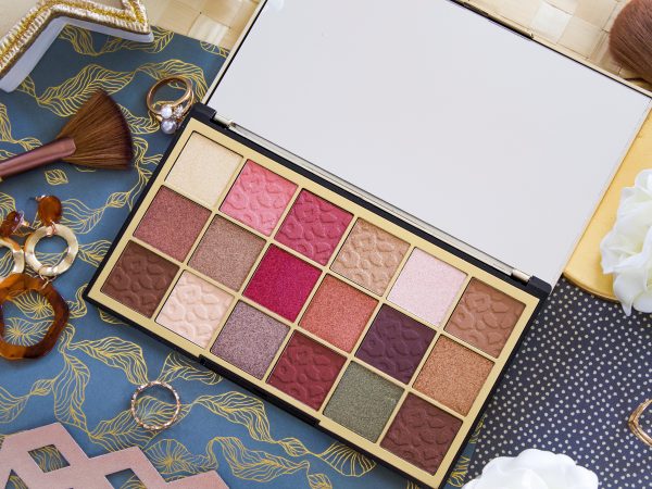
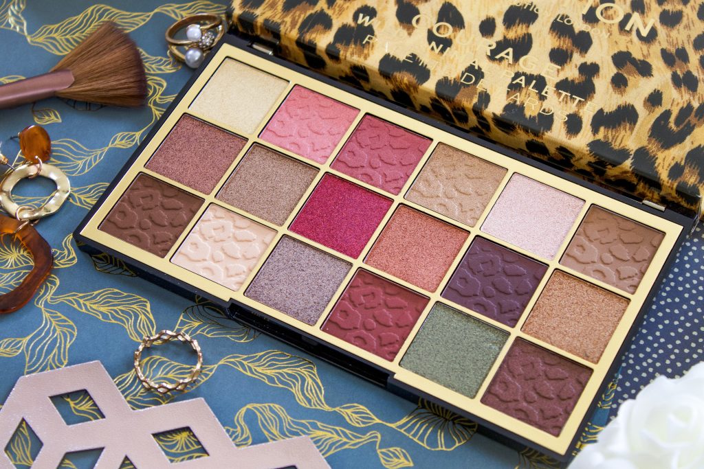
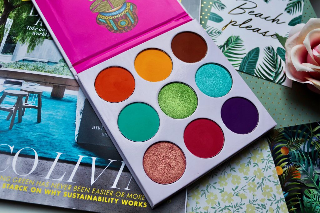
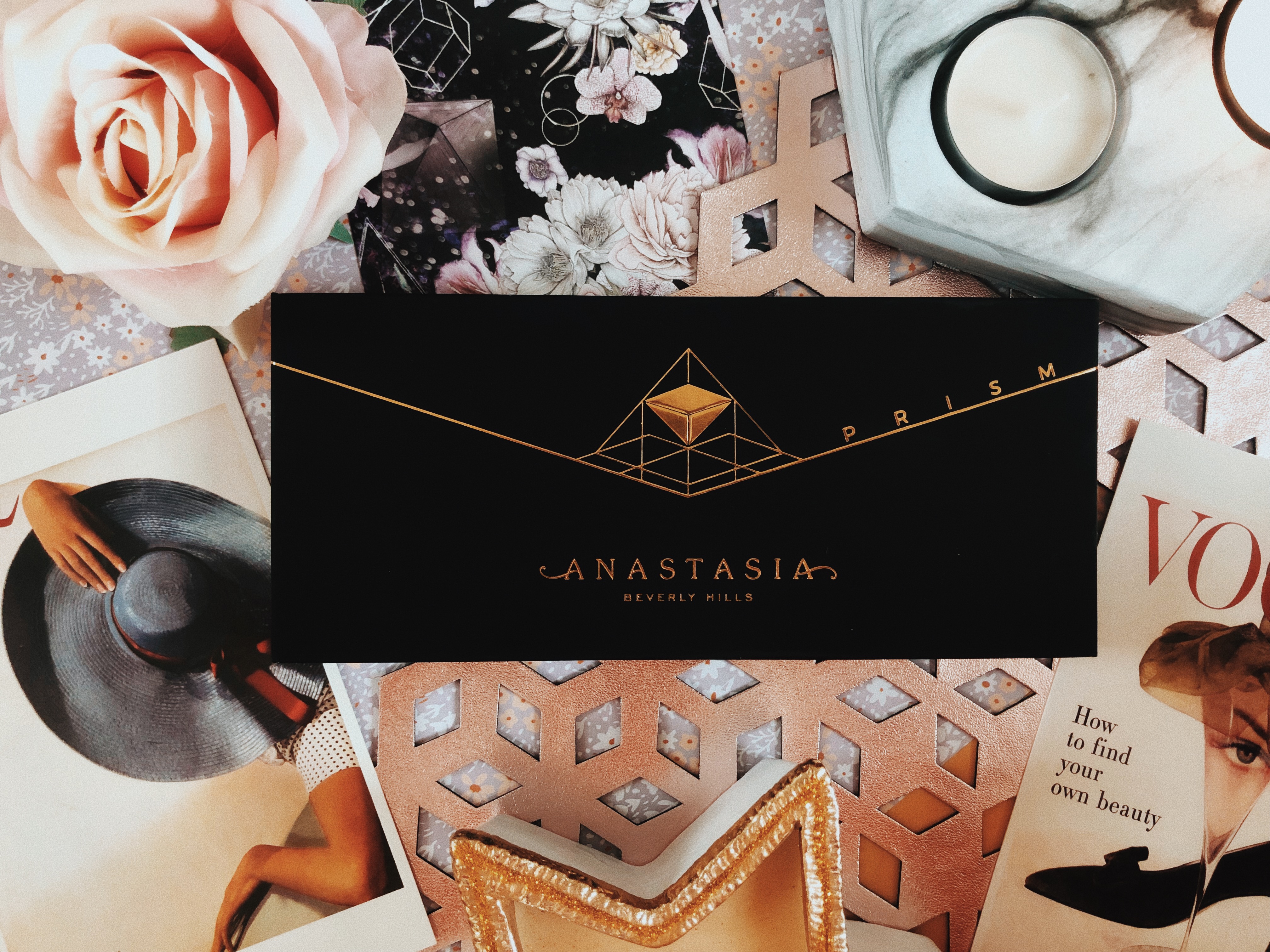
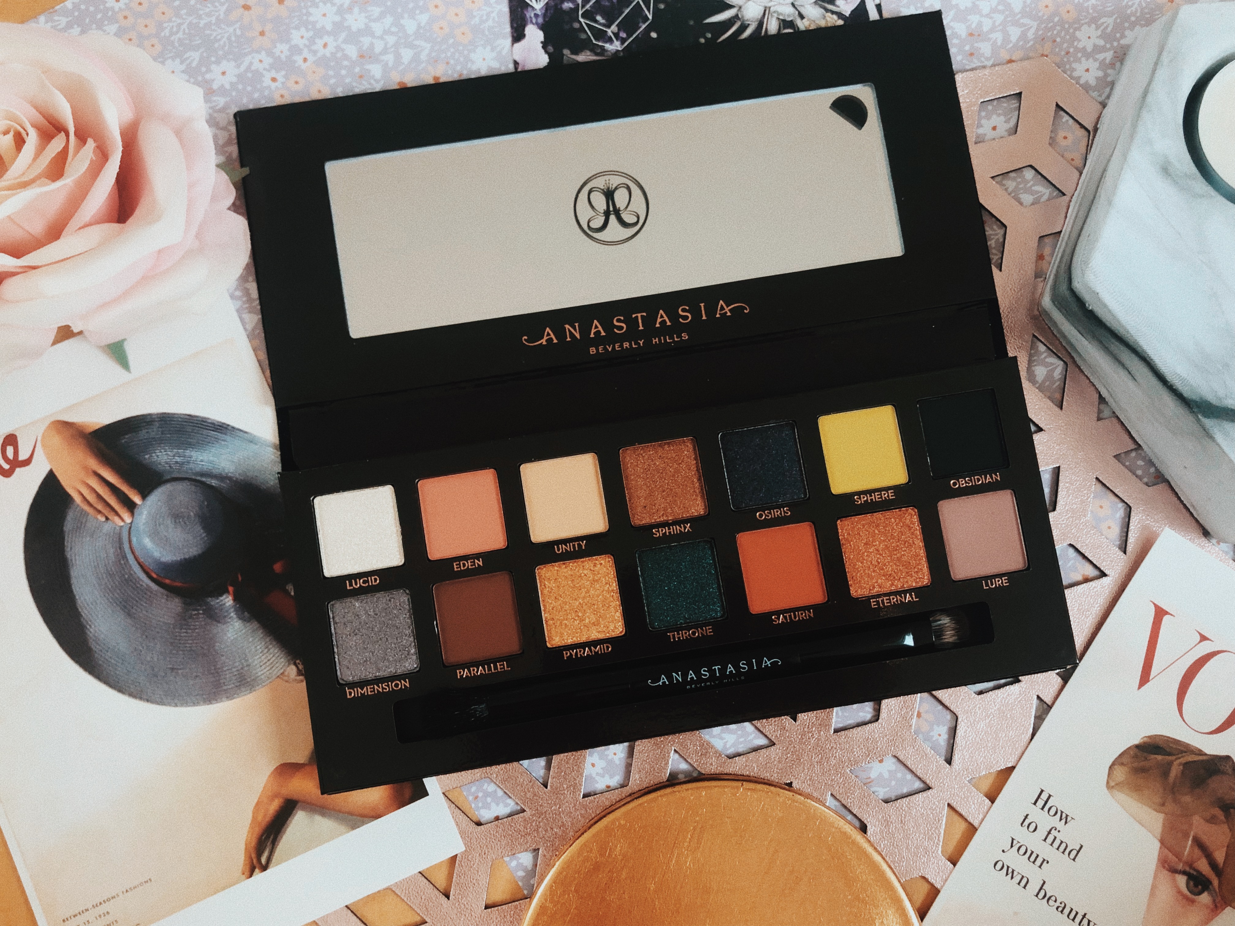
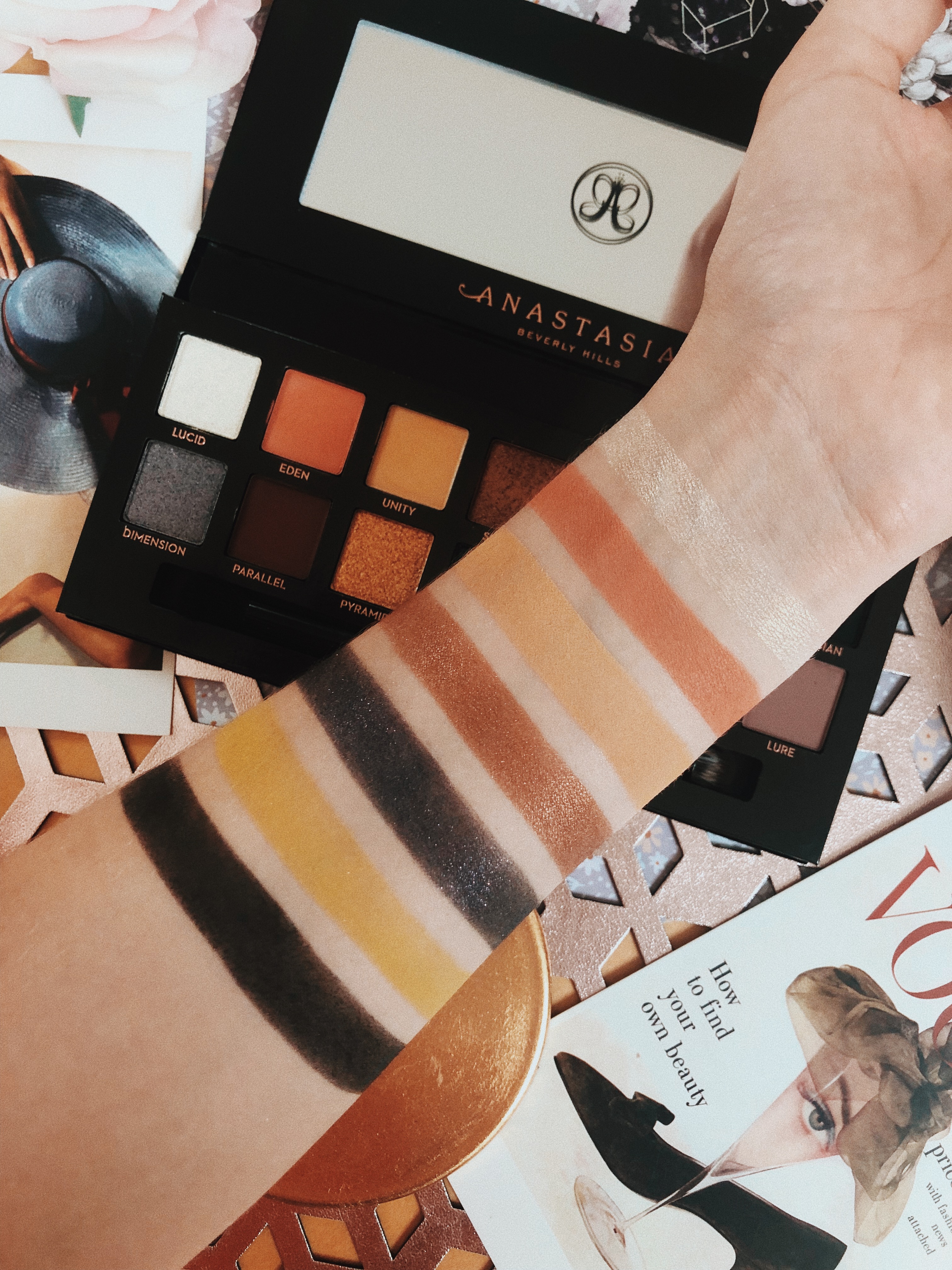
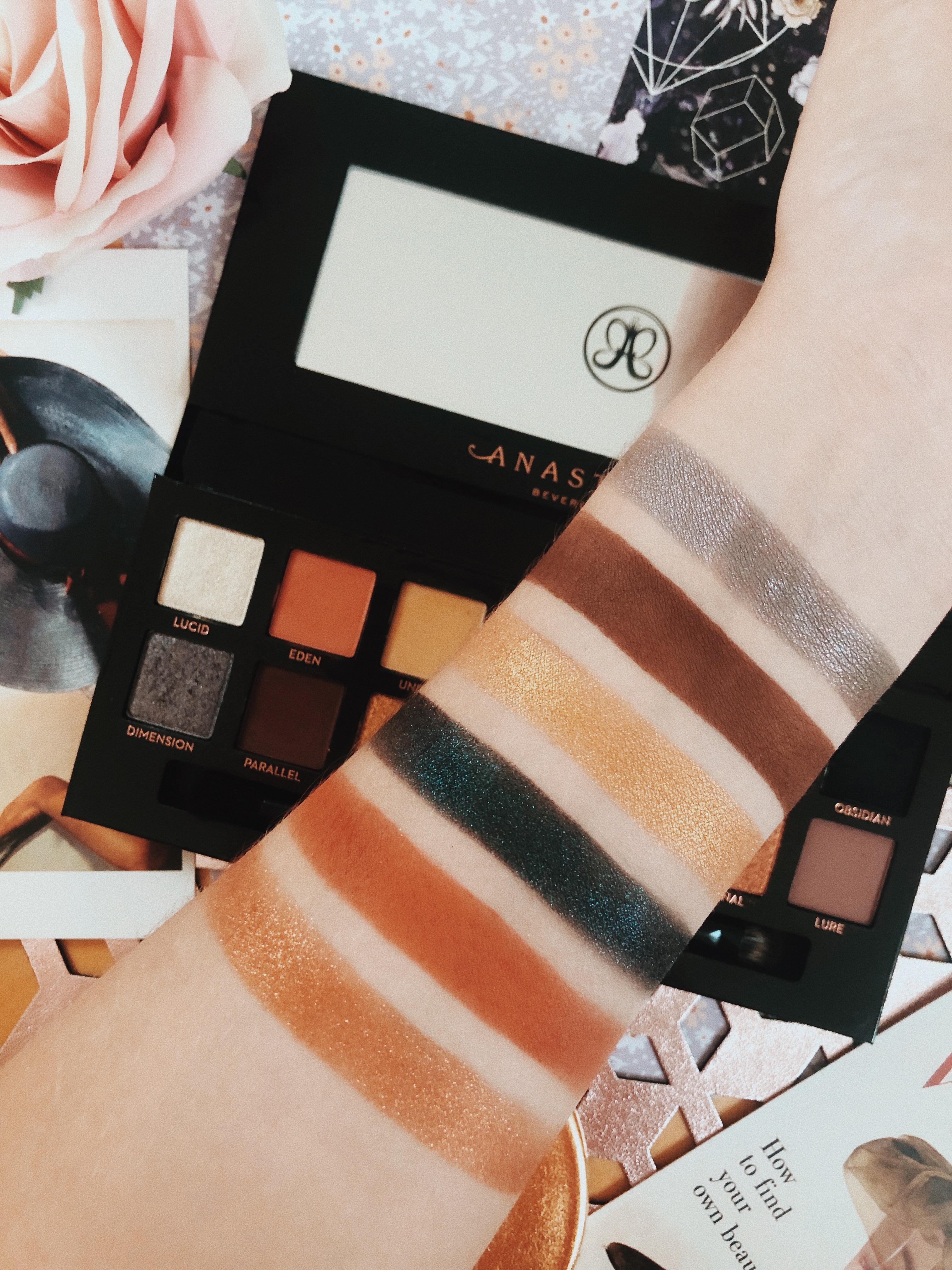
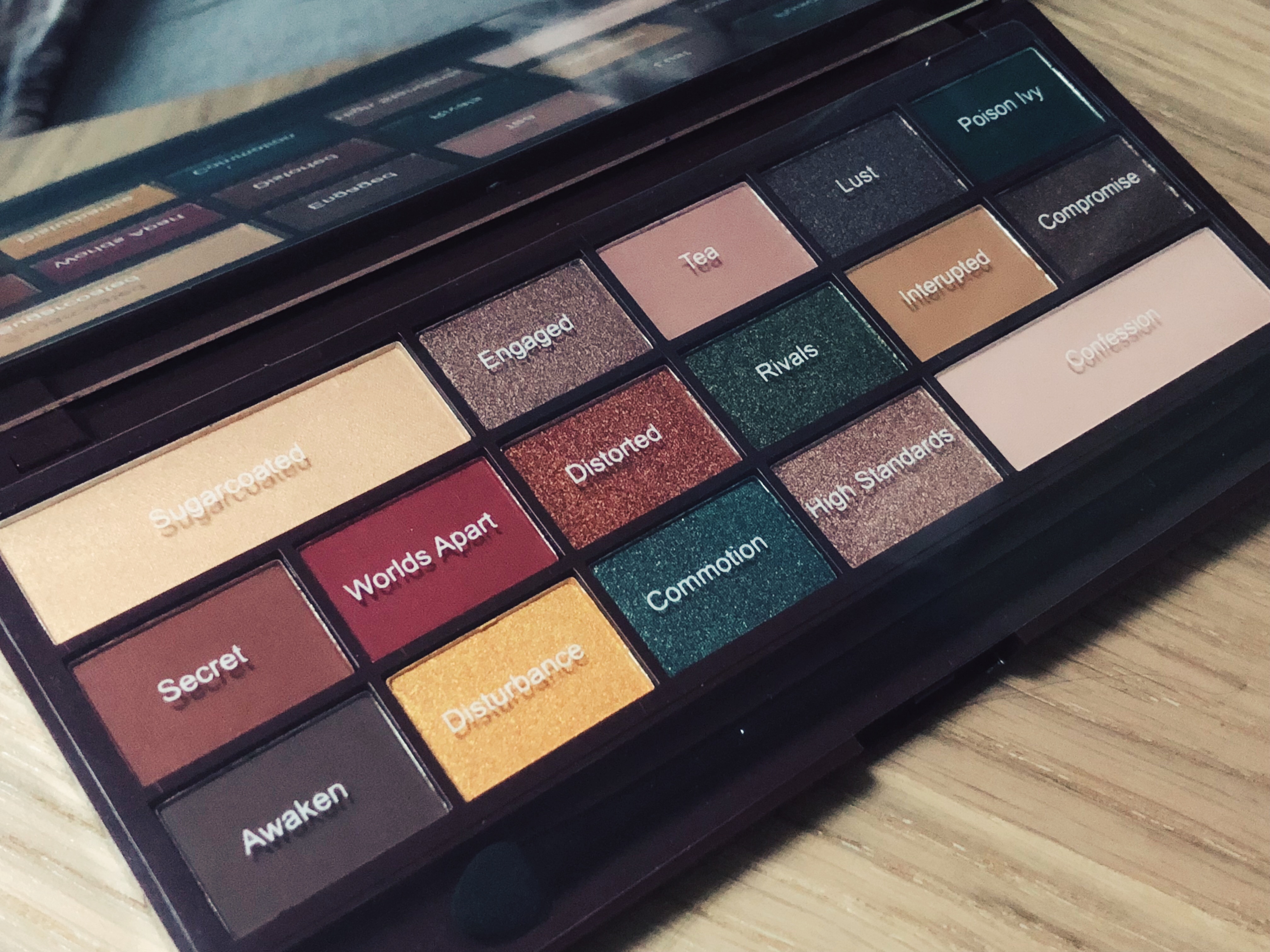
A lot of people have said this palette is very similar to the Anastasia Beverly Hills Subculture palette (I’ve also
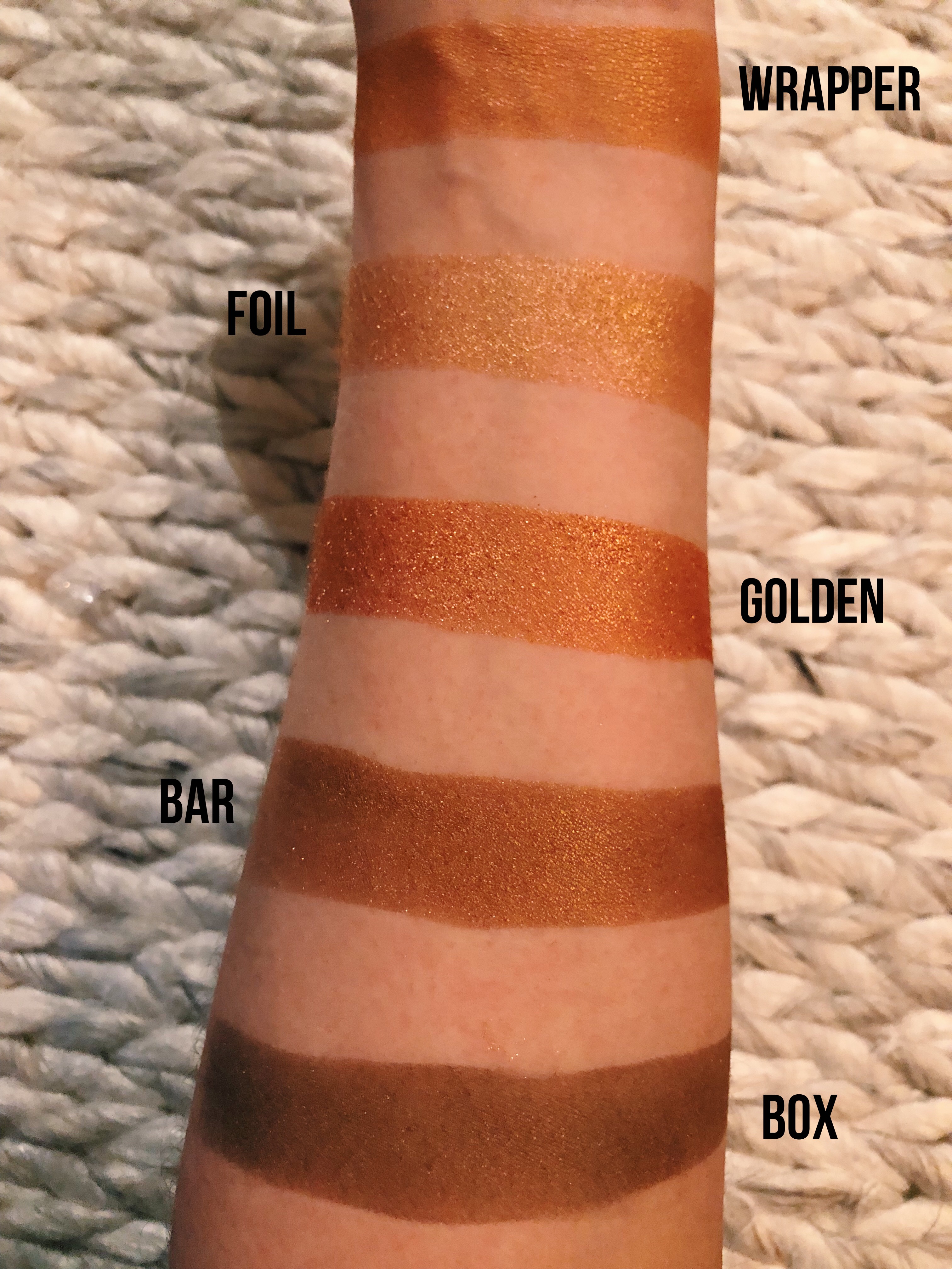
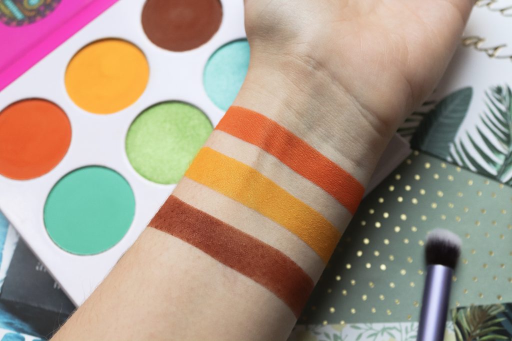
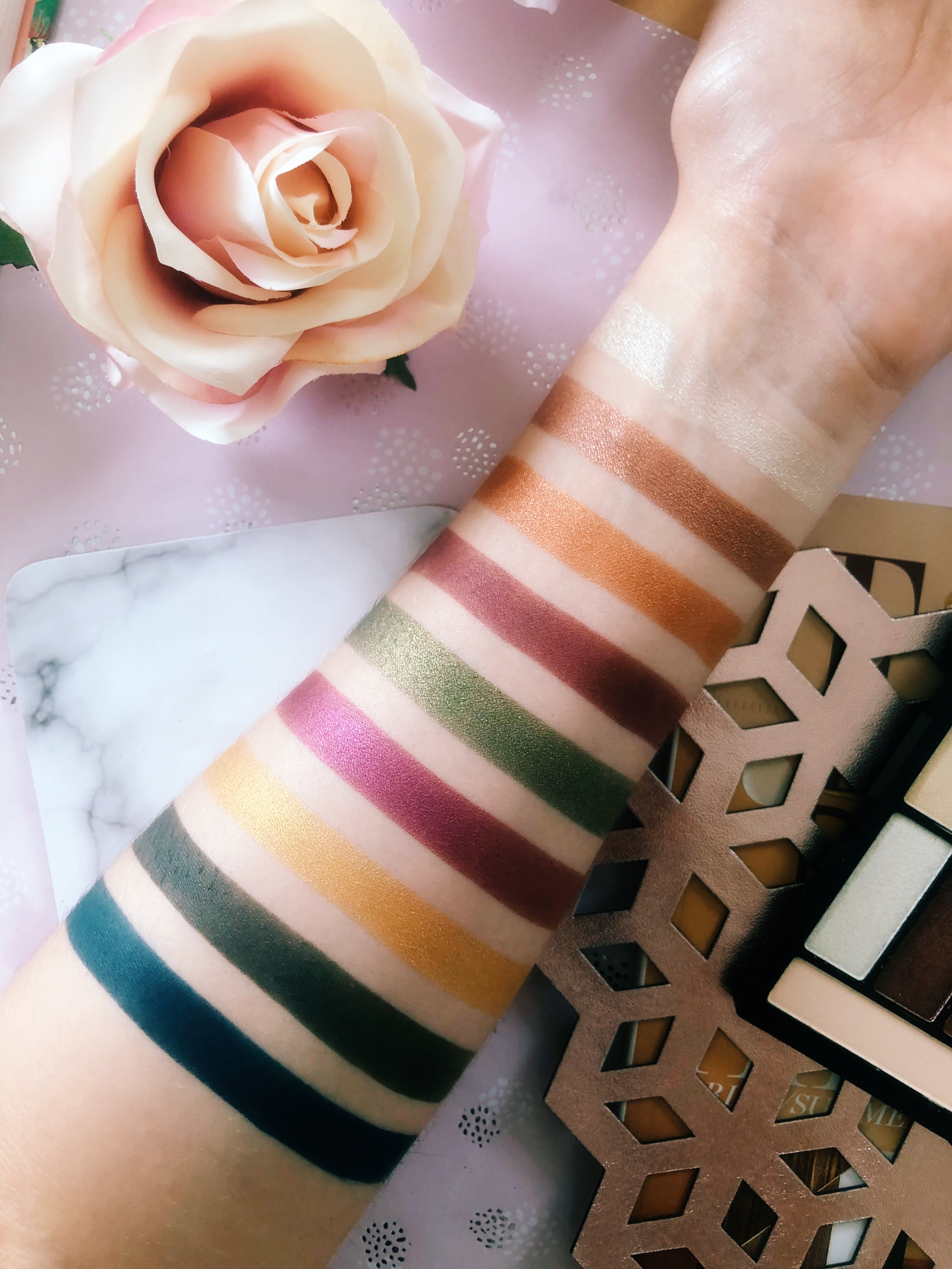
 reviewed this) with it’s autumnal selection of shades, oranges, coppers and reds galore! I wish I had been using this through October/November as the colours are perfect for that time of year. The palette is mainly muted and warm however, there’s also some pops of colour, a bright yellow and a shimmery green. The palette includes 9 foils/shimmers and 7 mattes. I think it’s such a unique combination of colours which makes me even more excited to mess around with it. It seems there was an attempt to make it smell of peppermint but it actually kind of smells medicinal. Don’t worry though, it’s not really strong it’s just when you stick your nose in up close.


IMG_1403

So here’s the first row…

  • Sugarcoated: A light champagne-gold foil/shimmer –ย Perfect for halo looks or inner corners. It’s super creamy but it takes a couple of goes to pick up a lot of pigment.
  • Engaged: A prosecco meets brown foil/shimmer –ย Super pretty and pigmented. It was easy to pick this one up and swatch it. I reckon this would look lovely all over the lid.
  • Tea: A pink-brown matte – I use this as a transition shade as it’s so simple and blends beautifully. It’s creamy and although subtle, it’s buildable.
  • Lust: A blue to brown foil/shimmer –ย This might be my favourite shade in the palette, it’s so unique and I’ve never owned a shadow like this (it really reminds me of the shade ‘Petrol‘ in the Soph x Palette which I reviewed a couple of days agoย if you fancy having a peek)
  • Poison Ivy: A dark forest green matte –ย This is the shade I’m most disappointed with. It’s very patchy (you can see if you look closely in the photo) and I struggled to swatch it let alone blend it on my lids. It’s definitely buildable you just have to put some more work into this one.

    IMG_1413

The second row…

  • Secret: A rich warm brown matte – I love this shade, it’s really creamy feeling and it is great for warm smokey eye looks which I do all the time.
    Worlds Apart: A red matte with pink and purple undertones –ย This one felt slightly more chalky but it still swatched well after I applied a couple of layers. I would most likely use this for autumnal looks but probably for festive ones too as it’s so rich and warm.
  • Distorted: A copper foil/shimmer with orange undertones –ย I am a sucker for anything gold or copper and this immediately lured me in.ย  The quality of this shade, keeping in mind it’s in a palette sold in drugstores, is INSANE. It’s so pigmented and gorgeously creamy.
  • Rivals: An emerald green foil/shimmer –ย This shadow isn’t as creamy as Distortedย and it’s slightly chalky/powdery feeling but it’s so pigmented and it still applies and blends really well. It’s the perfect shimmery green for festive makeup looks as there’s definitely some flecks of gold in it too!
  • Interupted: A cup of tea brown/nude matte –ย (Yes it’s spelt without a double ‘r’ so I’m not sure if this is a typo on the palette or intentional) So far I’ve used this as a transition shade in the crease or as a base for other shadows. It’s very soft and creamy feeling and it’s buildable too if you want it to stand out a little bit more. It’s just a bit too similar to my skin tone so it doesn’t show up that much on me.

Compromise: A brown foil/shimmer – At first I didn’t find this to be that pigmented but after another layer it was gorgeous. The texture was creamy as well which I love as it just makes applying and blending so much easier. I like that this is a warm toned shimmer too – right up my street!


IMG_1414
The third and final row…

  • Awaken: A dark chocolate brown matte –ย Just like Poison Ivyย I found this to be quite patchy but after a little bit more work it was okay. It’s warm toned too which I’m all about.
  • Disturbance: A bright yellow-gold foil/shimmer – Super pigmented and such a cool unique shade, I’ve never owned a bright yellow before either so I’m going to enjoy experimenting with this.
  • Commotion: A turquoise blue foil/shimmer – Turquoise is my favourite colour anyway so I immediately fell in love with this shade when I saw it.
  • High Standards: A champagne-pink nude foil/shimmer – Another pigmented shadow, perfect for halo looks and inner corner highlights. It’s so delicate and pretty looking.

Confession: A pinky-white matte – I’ve been using this as a base after I apply primer/concealer to my lid as it just doesn’t show up that well on me. However, it definitely brightens up my eyes no matter what I’m using it for.


In conclusion, it’s a great palette for the amount that you pay. No, not all of the shades are perfect in one swatch but it is after all, ยฃ8.99 so I can understand why this isn’t the case. However, every shade is buildable and can be as intense as you want it to be which makes up for any initial patchiness or lack of immediate pigment. I love the mix of shimmers and mattes which means I can take this palette anywhere and use it for a whole look on it’s own and the inclusion of a massive mirror helps with making it really travel-friendly too. I would recommend this palette to anyone looking to experiment with some coloured eyeshadows or if you would use this kind of palette every day. It’s only ยฃ8.99 so if you reckon it’s your kind of thing it’s not a terrifyingly priced product. If you already have this or are planning on buying it, let me know where you stand as I would love to know.

READ MY SOPH X PALETTE REVIEW

READ MY GOLDEN BAR PALETTE REVIEW

N xxxx

Categories
2017 BEAUTY BLOGMAS

I HEART REVOLUTION: GOLDEN BAR PALETTE – REVIEW, SWATCHES & PHOTOS

BLOGMAS DAY 19

Superdrug is my favourite place to go when hunting for new (affordable) makeup. They nearly always have at least one display of theย TAM Beauty make up brands, Makeup Revolution, Freedom Makeup and I Heart Makeup. I am such a huge fan of these products as they’re always of such high quality and yet they’re priced affordably – what more could you want?

The beauty community has definitely been talking about theย I Heart Revolutionย palettes and rightly so! They’re becoming more and more popular after they launched a collection of dupes for theย Too Faced Chocolate Bar palettes. They even duped the Sweet Peach palette (I will be comparing the two in a review soon!). The latest palette from this fabulous brand is the Golden Bar Palette. You can most likely buy this from your local Superdrug store or order it from their site online. TAM Beauty ship internationally so you can also order it on their website.


Processed with VSCO with c3 preset

I fell in love with this palette as soon as I saw it, the packaging certainly sucked me in – TAM Beauty knew exactly what they were doing! All of the palettes in this collection are designed to look like chocolate bars however this one caught my eye when I noticed the metallic gold packaging.ย It’s a fricking gold chocolate bar! I also loved the melting chocolate on the front of the palette, it reminded me slightly of theย Kylie Cosmeticsย packaging.


Processed with VSCO with c1 preset

Not a bad view huh? Featuring 16 shades, this palette was a steal at only ยฃ9, especially if you consider the ridiculously expensive Too Faced palettes (ยฃ40). The Golden Bar palette may not be exactly the same, however, it’s extremely similar and it’s certainly giving them a run for their money. In my opinion, if you can purchase a highly pigmented palette for even the price of a more expensive one, you’re onto a winner. There’s also a very generously sized mirror covering the entire lid, making this a great palette to travel with. The one thing that I didn’t enjoy about the packaging, was the plastic overlay that had the shade names on it. I would much rather have a palette with the names printed below each shade, making life that little bit easier, especially for tutorials or reviews like this one. Another thing to keep in mind that also let me down slightly is that there are no matte shades. This means a full look can’t really be completed as there is nothing to use as a transition shade so you’d need to use another palette.


IMG_0986

Collection:ย A cool icy white shimmer –ย  I love using this for inner corner highlights and under my brows! I sometimes even dot above my lips for a more defined cupid’s bow.

Ribbon:ย A light pink champagne-shimmer – I would say this is one of the more subtle shades but it’s certainly buildable. I sometimes use a setting spray to intensify it which works perfectly!

Edible:ย A muted taupe-brown shimmer – In my opinion, this is the least pigmented shadow in the palette. I like the colour for a more subtle hint of brown in my crease but it’s no way near as pigmented as some of the other shades. Again, if you use a setting spray it can intensify it.

Tablet:ย A dark bronze/gold shimmerย – I love using this shadow as it’s darker than the other gold shimmers in the palette so it’s perfect for a less blinding look (I’m all down for full-on lightbulbs on the lid though)

Wrapped:ย A red/purple toned brown shimmer –ย I love using this to slightly smoke out my outer lid, however, it’s a shimmer shade of course so it’s not as intense as a matte shadow would be.


IMG_0989

Wrapper:ย A warm orange/yellow gold with brown undertones –ย I often use this shade with warm toned shadows to create a red toned look. The orange undertones also meant I could use it for Autumnal looks as well!

Foil:ย A golden shimmerย – I often use this in the centre of the lid as it’s just such a gorgeous shimmer. I used this for a halo smokey eye look the other day and it did a fab job!

Golden:ย A rich golden shimmer –ย This is my favourite shadow in the palette. It’s just so insanely pigmented, it’s INCREDIBLE. I can’t believe this came in a palette that costs ยฃ9…? It really does show that you don’t need to break the bank to own some crazily pigmented shadows.

Bar:ย A bronze shimmer with olive-green undertones – I tend to use this shade less as it’s not as blinding or rich as the other gold shades however it’s still a unique colour to have in a palette.

Box:ย A khaki shimmer – I love this shade, it always looks nice on the lid with a smokey outer corner. I’m a fan of any coloured shadows, especially khaki as I already wear so much of this colour (90% of my wardrobe).


IMG_0995Block:ย Taupe/dark brown shadow with purple undertones –ย I use this all the time to add some drama to my eye makeup looks, it’s another great shadow for intensifying the outer lid and creating a smokey eye.

Gift:ย A milk-chocolate brown shimmer –ย This is what I would call the perfect chocolate shimmery brown shadow. It’s quite a warm shade too so I like using it for red/orange toned looks but it looks good as part of an everyday look as well.

Limited: A musky pink/purple shimmer with light brown undertones –ย I absolutely adore this shade, it’s such a gorgeous mixture of pink and purple and of course, it’s shimmery! It looks even better when applied with a setting spray.

Cocoa: A rich red/burgundy shimmer –ย I am loving using this shade for red smoky eyes which is fab for festive makeup looks!

Beans:ย A medium-brown shimmer –ย This is a pretty similar shade to Block, however, I prefer it. It’s lighter and easier to blend into a more everyday look. It’s slightly darker than Limitedย which makes it better for a smokey eye.

Chocolatier:ย A light nude/prosecco shimmer with cool undertones – I was pretty disappointed with this shade. Yes, it’s pigmented however it’s so chalky and powdery so getting your brush to pick up the right amount is difficult. It still looks great on the lid, especially for a halo look or inner corner highlights.


Overall, I think this palette is SUCH good value, given how pigmented each individual shadow is. I also have to mention how well the shadows last, they don’t crease and I don’t even use a primer which speaks volumes. The packaging is also amazing and of high quality, unlike some of my cardboard based palettes. I love the variety of colours that this palette offers for such a low price. The negatives of this palette, for me, was the fact that the shade names weren’t printed inside and that there were no matte shades so I can’t use it on its own. However, I would recommend this to anyone looking to build their collection of shimmer shadows as they’re all great quality and very pigmented.

Let me know if you would like reviews of any of the other bits in this collection as I own most of it!

N xxxx


Categories
2017 BEAUTY BLOGMAS MAKEUP

ANASTASIA BEVERLY HILLS SUBCULTUREโ€‹ PALETTE {REVIEW & SWATCHES}

BLOGMAS DAY 8

After the huge success of the Anastasia Beverly Hills Modern Renaissance Palette, (take a look at my review) everyone was expecting great things when it’s “sister” the Subculture palette was released. The palette sparked lots of debate within the beauty community. There was lots of discussion surrounding the choice of colours, as they are pretty bold. I managed to convince myself that I can rock shades like this but I can understand why some people were terrified when they saw a mustard yellow.

I decided that I had to try this controversial product for myself and I bought myself the Subculture palette during summer, as I was wearing lots of bold eye looks during these months and thought this palette would be perfect for just that! It retails at ยฃ43 on their website *distant screams from my bank account* The packaging is made from a beautifully soft and a flocked teal coloured, crushed velvet material which definitely makes it feel more expensive, almost identical to the MR palette. There are 14 shades (11 mattes and 2 metallics and 2 duo chromes) A majority of the shades are warm and muted with some retro 70s vibes (YES PLEASE). When looking at the shadows all together, it reminds me of mid-century modern interiors, I LOVE IT. The shades are also quite grungy and autumnal in that there are some mustard yellows and khaki greens with some coppers and golds too.


Processed with VSCO with c3 preset

  • Axis – “Ultra matte sage green” Teal/Turquoise has always been my favourite colour so I was delighted to see this shade in the palette. I love it, it’s an unusual colour and it’s just SO pigmented. I wouldn’t recommend going in too hard with your brush as you might look like you have a black eye (been there, done that unfortunately) If you do anything but tap it lightly, you could probably paint a picture with the amount of shadow you will pick up so be careful!
  • Mercury – “Ultra Matte Slate Grey” I was a bit disappointed when I saw this shade as it just looked so dull compared to the others. However when I swatched it I was pleasantly surprised. It’s a cool toned grey with what I reckon to be lilac undertones (see picture with flash) and it looks super pretty in the crease when blended out.
  • All Star – “Ultra Matte Vintage Wine” I love a good plum coloured eyeshadow. I have green eyes so pinks and purples really make them pop. I love using this in the crease as it’s so pigmented yet blends out so beautifully.
  • Adorn – “Metallic Bronze” This could be my favourite shade. It’s SO pretty and when it catches the light it’s absolutely stunning. It’s so rich in pigment and looks even better when a setting spray is used.
  • Destiny – “Ultra Matte Sage Green” I LOVE this shade, it’s a dark khaki green which is one of my favourite colours. Surprisingly it applies with very little fall out if you’re gentle when you apply it. I love using this in my outer corner for added intensity. I do find if you pack too much on however, it can become quite patchy when blending it out so apply sparingly. I would say that is the case with most dark matte shadows though, it’s all in the blending!
  • Dawn – “Ultra Matte Sand” I actually really like this shade even though it’s pretty simple. It has subtle muted peach undertones which make it a nice shadow to use for a more natural look. I use this as a transition shade most of the time as it blends like a dream.
  • Cube – “Duo Chrome Pink Pearl” My least favourite shade. It’s just not pigmented enough for me. At first I thought it looked gorgeous but upon using it I just got a sort of weak pink sheen. It seems to have a sort of skin on it that means it’s quite chalky too. I would’ve preferred just a plain pearly white shade so I could at least use it for inner corner highlight or on my brown bone.

Processed with VSCO with c3 preset

  • Rowdy“Ultra Matte Blackened Purple” I love using this shade to smoke out different looks, it can change up your makeup 0-100 real quick, from a study session in the library to GET ME TO DA CLUB.
  • EdgeUltra Matte Gold Mustard” I was originally terrified to touch this, I mean, it’s a YELLOW. However, I really enjoy using it now. I love the colour anyway so I just braved it and it’s not too bad! It’s nice to put in the inner part of the lid and it’s easy to blend into a darker shade (I’ve used New Wave to warm it up in the outer corner of the lid)
  • Untamed“Ultra Matte Tarnished Green” This is a smokey green with undertones of turquoise/teal and is lighter than axis but still just as pigmented. SO pretty.
  • New Wave – “Ultra-matte citron orange” I was also kind of scared to use this shadow but it’s truly gorgeous. At first, I thought it was another yellow but it’s actually a warm matte orange shade. I used this lots during summer to create warm toned looks which it was PERFECT for!
  • Fudge“Ultra Matte Warm Bronze” I love using this for smokey eye looks. It adds that extra bit of drama to your lid. It’s a warm brown with red undertones.
  • Electric“Duo Chrome Lime-Gold” This is such a unique shadow. It’s so quirky and looks great on a night out but I actually wear it during the day too. It’s mainly gold however it has gorgeous flecks of green that jump out at you when it catches the light.
  • Roxy“Ultra Matte Muted Coral” I love this shade, it’s such a pretty colour to use as a transition shade in the crease or as a base on your lid. It’s actually a great shade for summer as it’s got some flirty pink/ apricot undertones that really compliment green/blue eyes.

    Here are some looks that I’ve managed to create with this palette (apologies in advance, I’m no expert)

Image-1-3


I don’t think there’s a problem with fallout or kick back if you’re gentle with the shadows. I would say all but one of the shades (cube) are nicely pigmented. I would strongly suggest just lightly tapping the shadows as opposed to swirling your brush around the pans as this picks up a small amount of colour that you can blend easily and build up if you want more of a bold look. I would also suggest using a setting spray with the metallic shades in the palette, to make them hella sparkly – the difference is amazing! I wouldn’t recommend this palette to those that enjoy the safety of neutral toned shadows. I would say it’s a palette for the more experimental individuals out there however some shades, for example Electric, Fudge and Adorn could be used to make a really pretty more “natural” look but if there’s only a few shades in here that take your fancy, it’s probably not worth paying the hefty price.

BUY IT HERE

I hope you enjoyed this review and let me know in the comments what you think about this palette or if you’ve found any great dupes!

N xxxx

TWITTER | FACEBOOK | INSTAGRAMPINTEREST  


Categories
2017 BEAUTY BLOGMAS

URBAN DECAY: NAKED HEAT PALETTE – REVIEW

BLOGMAS DAY 3

So although I reckon I’m pretty late to the party with this, I thought a review was still owed to the undecided out there. Cutting to the chase, this palette is truly AMAZING. I have green eyes so I have always been drawn towards warm-toned shadows as they make my eye colour pop more than any other shades. Although the palette was dropped in the UK on the 27th July, I only just managed to get my hands on it, but I am so glad that it’s now safely tucked away in my makeup bag.

This post contains affiliate links

There have been a variety of Naked palettes released by Urban Decayย over the years with some gorgeous gold-hued, cool toned and smokey shades, however, this palette is very different. It contains 12 amber-hued neutral shades (seven mattes and five shimmers) and its sold at a rather terrifying (but absolutely worth it) ยฃ39.50. It also comes with an amazing duo-ended brush but it’s in the process of being cleaned after thorough use (so, unfortunately, it won’t have its moment in the photos.)

BeFunky Collage-20.jpgFrom top to bottom,ย 

  • Ounceย “Ivory shimmer”, it’s creamy & pearly – I use it most days for a brow bone highlight or for my inner corners, haven’t found much use for it on my lids.
  • Chaser“Matte light nude”, with a tiny hint of coral, it doesn’t have a huge impact but I’ve been using it as a transition shade and to define my crease more.
  • Sauced – “Soft terra-cotta matte”,ย a red-toned matte fudge shade, I love buffing this into my crease to warm up my look.
  • Low Blowย “Brown matte” (A yellow-y baby poop matte as described over on Theannaedit) although it’s quite a natural shade,ย I love using this to slightly buff out my look – it blends like a dream.
  • Lumbreย “Copper shimmer w/gold pearl shift”, this rose gold shadow is great for a natural shimmer on the lid especially if you’re into more subtle looks. I’ve worn this mostly during the day as I prefer more intense and pigmented shadowsย for nights out.
  • Heย Devil“Burnt red matte”,ย I like this shade a lot, it’s perfect for creating a simple warm look as its so easy to blend out into something more subtle. It’s a buildableย shade so it can be used for an intense look too.
  • Dirty Talk“Metallic burnt red”,ย This. Shade. Is. Amazing.ย ย I do love a good copper shadow and this is a massive 10/10 from me. It’s such a stunning shimmer shade, with a bronze base.ย I use it for going to uni, clubbing, a quick trip to town (the lot – I can’t get enough) it can work with a more subtle sultry-daytime look as well as a full beat looks for a night out. It’s definitely a buildableย shade with incredible pigmentation if you want to go all out.

BeFunky Collage-22From top to bottom,

  • Scorchedย – “metallic deep red w/gold micro-shimmer”, there are hints of rose gold and copper, I’d say it was just slightly rosier and more coral toned than Dirty Talk so I still love it, how, ver it works more with pink or orange based eyeshadow looks.
  • Cayenneย – “deep terra-cotta matte”, such a gorgeous chocolatey brown shade, it’s really pigmented and looks so nice in the outer crease when buffed out. It works so well with He Devil when creating a simple warm-toned look.
  • En Fuegoย – “burgundy matte”,ย burgundy is one of my favourite colours to wear as an eyeshadow as in terms of my wardrobe, it really compliments the green in my eyes so I’m always on the lookout for shadows like this. It’s been great when creating more dramatic and intense looks.
  • Ashesย – “deep reddish-brown matte”, the colour of this shadow is so beautiful, it’s perfect for autumn with hints of warm purple and burgundy. However, the shade is difficult to blend as it’s quite powdery in consistency.
  • Emberย – “deep metallic copper-burgundy”,ย a stunning shimmer shade with undertones of purple, copper and brown, with even some tiny flecks of pink here and there. I have used this with every smoky eye makeup look that I’ve done since this palette entered my life. I haven’t found anything like this before, it’s so unique.

In conclusion, if you’re into warm-toned eyes looks, this palette is definitely for you. The matte shades blend so easily and the shimmers add a beautiful dramatic yet elegant hint to any look. It can be used for so many different eye looks, which means I get the most out of my money, as I can use it more than just every once in a while.ย Overall, I would recommend this palette – it’s definitely my favourite Naked Palette by Urban Decay as of yet!

BUY THE PALETTE HERE*


If ยฃ39.50 screams HELL NO to you, here are two dupes to help you achieve similar looks without breaking the bank…

NYX –ย Ultimate Shadow Palette Warm Neutrals – ยฃ16 – full of warm neutrals

Morphe – 25B Bronzed Mocha Eyeshadow Paletteยฃ19ย – 25 shadows, including deep browns, burgundies, coppers and golds as well as some more subtle shades too.


N xxxx

TWITTERย |ย FACEBOOKย |ย INSTAGRAMย |ย PINTEREST