Categories
BEAUTY

KIKO ARCTIC HOLIDAY BAKED BLUSH {REVIEW, PHOTO & SWATCHES}

I only started using KIKO products in the last couple of years. I was drawn in by a sale (surprise surprise) during summer a couple of years ago and I haven’t looked back since! I have purchased so many things, from eyeshadow palettes to cream shadows, from foundations to metallic lipsticks and I am yet to have a negative experience with any of their products. I have to say, I think KIKO is very underrated, I don’t hear that much about them in terms of reviews etc and I’m not sure why that is as they are a great company! KIKO have been around for 20 years, with over 1,000 stores in 20 countries. It’s influenced by modern Italy,  focusing on art, fashion and design. KIKO offer over 1,400 products ranging from makeup, skincare, brushes and beauty sponges. I really recommend checking them out.


Processed with VSCO with c1 preset

Whilst I was in Bath (read about my trip here), I was delighted to find a nice and spacious KIKO store. I had to restrain myself as there was so many things that caught my eye! One thing that I did pick up was their Arctic Holiday Baked Blush in 01 Marmoreal Biscuit. This product particularly caught my eye because of it’s stunning golden chrome/holographic packaging, perfect for the frozen theme of the collection. I think it looks pretty high end actually. It is priced at £16.90 but it is currently on sale at £11.80


42DCE400-BCC4-4207-91A7-C11E82C3C1CD.JPG

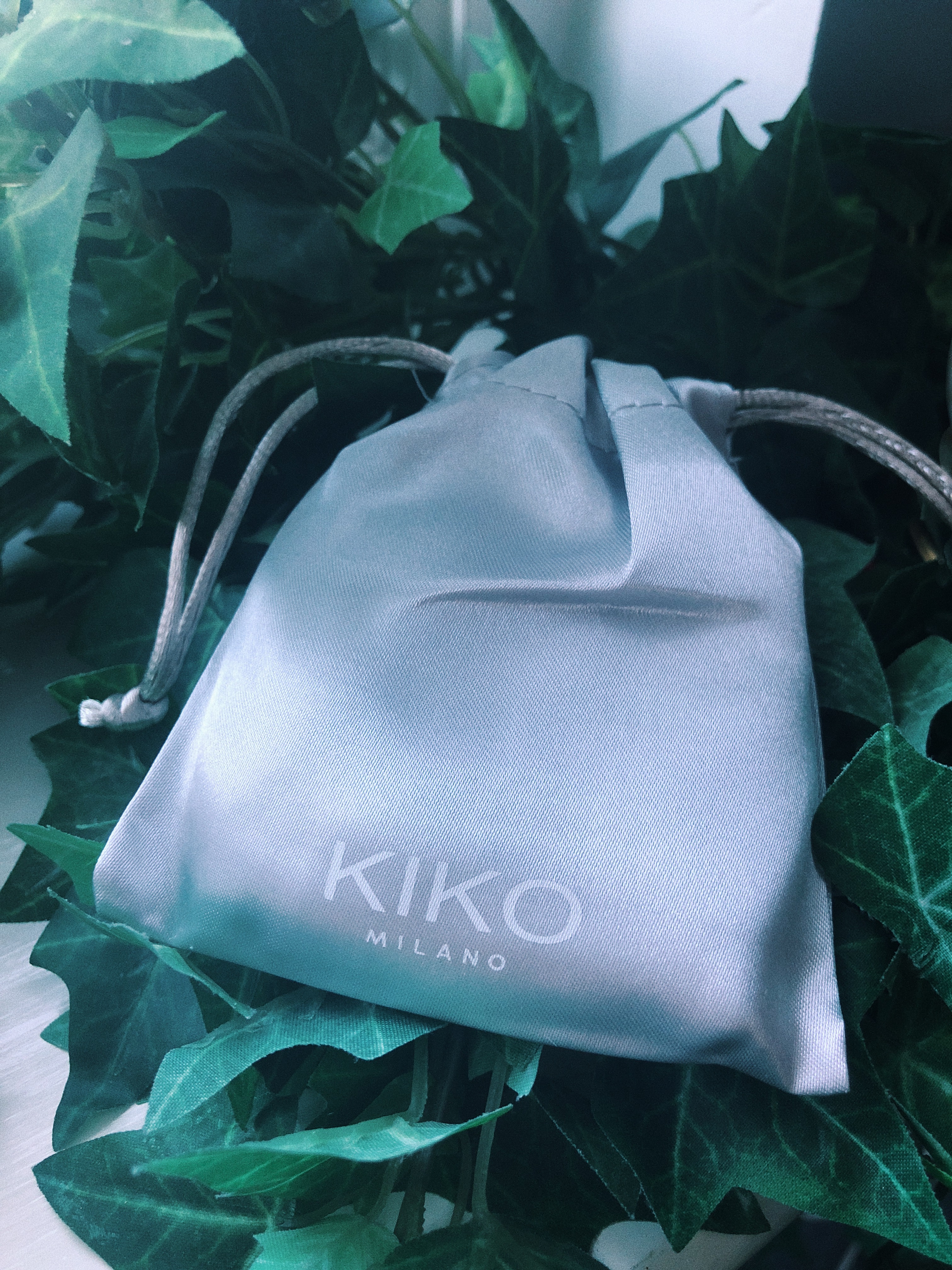
I was surprised when I found that the blush came in a little silver bag. It made the product seem so luxury and fancy, again, reminding me of high end brands. Also it’s perfect for travelling with as I recently went away and I opened my makeup bag to find that my blush had smashed and in the process had covered all my other things, so this little bag will come in very handy!


Processed with VSCO with c1 preset

So the blush comes in a silver, mirror-style plastic packaging which I think looks very sleek and elegant and it was designed by Ross Lovegrove. I also think it matches pretty well with the icy/glacial vibes that seems to be going on.


Processed with VSCO with c1 preset

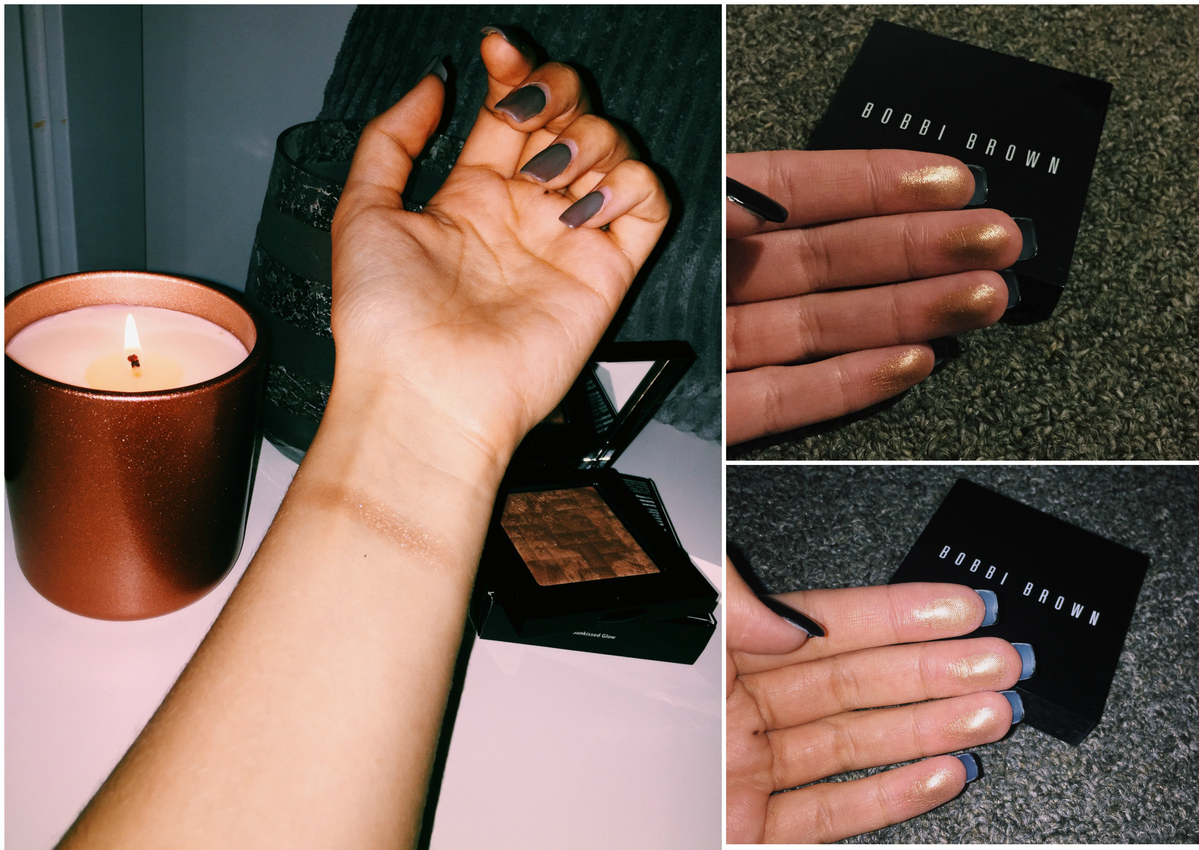
I love the fact that there is a mirror included, again, making it brilliant to travel with. I am usually super fussy with blushes. I tend to run away from anything bright or baby pink and I typically go for more muted and musky. I really liked the shade as soon as I saw it, as it’s what I would usually go for. I also liked that it’s a baked blush with a metallic finish. I’m so used to seeing plain old matte ones and I feel like they can be quite harsh on my face (I might just be crap at blending) so I was keen to try out a different type. The blush is described to have a fragrance of “ginger and spices” which I’m not so sure about. It definitely has a subtle but pleasant scent, however ginger and spices didn’t come to mind when I first sniffed it. The smell disappears when applied to the face as well so I’m not fussed.


05720492-4DFD-4DC8-917C-CD3B27F4563D.JPG

As you can see, this is super pigmented (this was one swatch). It has the most gorgeous creamy texture to it, which makes it so easy to blend out for a more natural look. It gives the cheeks the perfect glow and brightens up my whole complexion. I wear a dewy foundation so this blush enhances that by adding a healthy dash of colour to my face. It wears for hours and I have received so many compliments so I will definitely be keeping this in my makeup bag!


I absolutely love this baked blush. It’s basically everything I want in one – a dash of pink, a healthy sheen and a creamy texture! It’s also priced very reasonably given the immediate colour payoff and also the quality of the product in how it applies and also how it’s presented in it’s gorgeous holographic packaging. I feel like KIKO doesn’t fit into the drugstore category nor does it fit into the high end category either so it’s sort of in the middle, so I kind of expect to pay a tad more than I would from a drugstore brand. The quality of their products is always high and their packaging is always very nice too. If you like the look of this blush it’s also available in two other shades! There’s also loads more in this collection so click here if you fancy taking a look at what else is available. Everything in the Arctic Holiday collection seems to be on sale to so go go go!

I would love to know if any of you have tried this blush out or anything else in their Christmas collection. Also, let me know what you think of KIKO in general as I don’t hear that much about them and would love to know if you guys enjoy their products too.

N xxxx


Categories
2017 BEAUTY BLOGMAS

I HEART REVOLUTION: MINT CHOCOLATE PALETTE – REVIEW SWATCHES & PHOTOS

BLOGMAS DAY 23:

You guys seemed to enjoy reading my review of Tam Beauty’s I Heart Revolution Golden Bar palette so I thought I would take a look at another in the collection. If you don’t already know about Tam Beauty, I’ve written about them before in some other reviews that I will link below! Long story short they’re  cruelty free and based in the UK. They’re kind of an umbrella brand for Makeup Revolution, I Heart Makeup, Freedom and some others too. Today I’m testing out the Mint Chocolate palette, also from Tam Beauty’s I Heart Makeup brand. Enjoy!

READ MY SOPH X PALETTE REVIEW

READ MY GOLDEN BAR PALETTE REVIEW


Processed with VSCO with c2 preset

Processed with VSCO with c2 presetThe Mint Chocolate palette, like the others in the collection, features the amazing chocolate bar packaging, this time with a fluorescent light green and a dark brown base. Immediately this was a throwback for me! As a little girl I always used to get mint choc chip ice cream, it was my absolute favourite – the colours are spot on. It will cost you £8.99 – or in other words, a bargain.


Processed with VSCO with c2 preset

Processed with VSCO with c2 preset
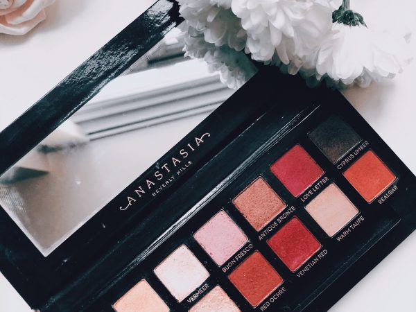
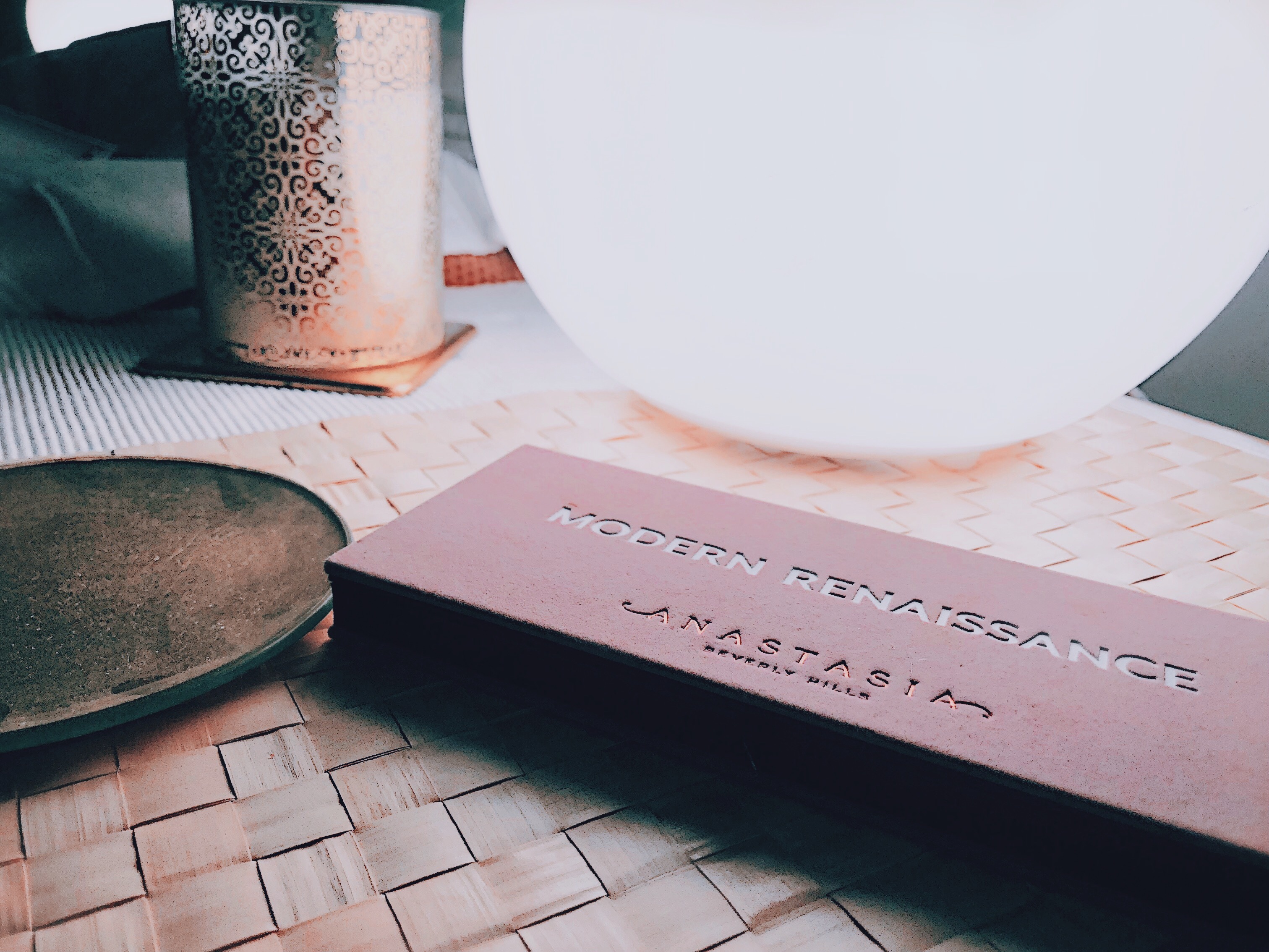
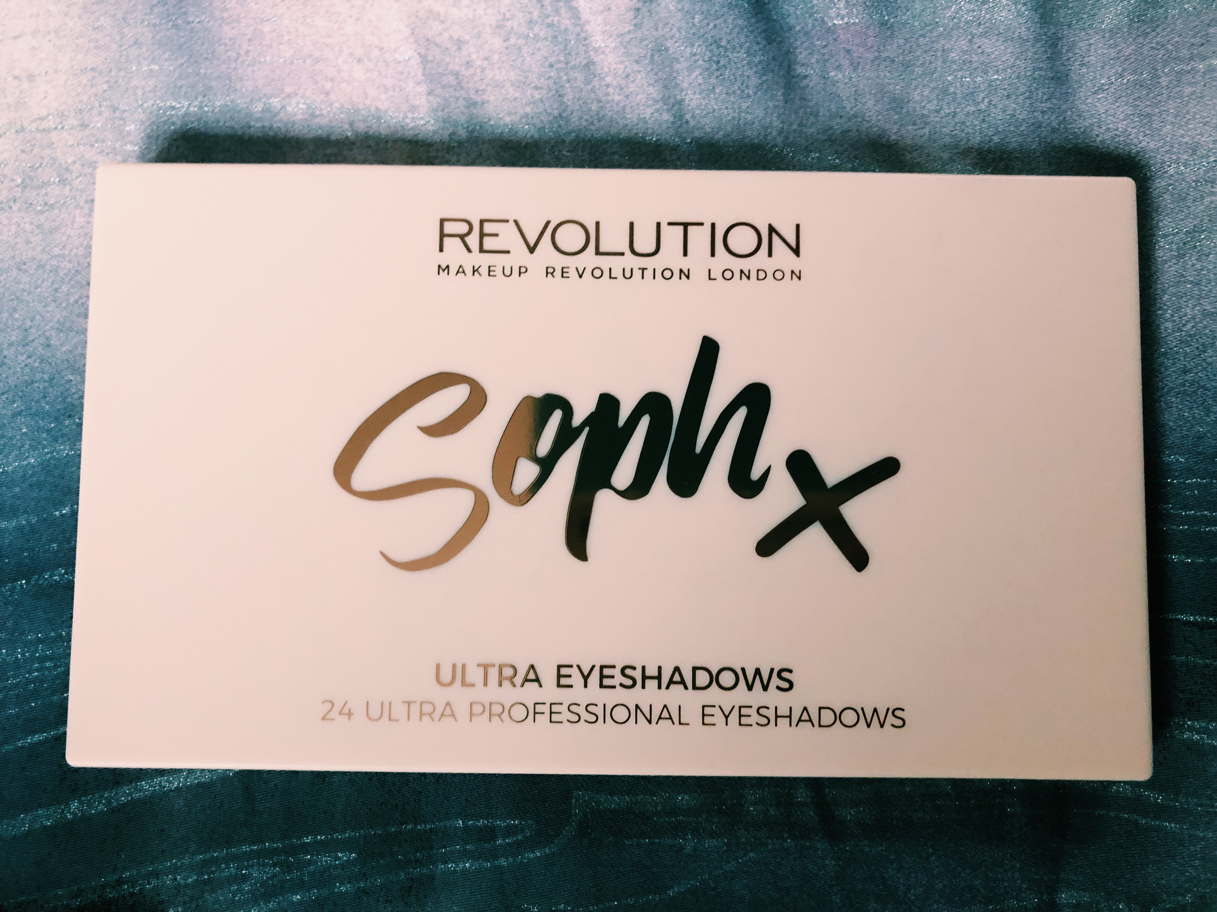
A lot of people have said this palette is very similar to the Anastasia Beverly Hills Subculture palette (I’ve also reviewed this) with it’s autumnal selection of shades, oranges, coppers and reds galore! I wish I had been using this through October/November as the colours are perfect for that time of year. The palette is mainly muted and warm however, there’s also some pops of colour, a bright yellow and a shimmery green. The palette includes 9 foils/shimmers and 7 mattes. I think it’s such a unique combination of colours which makes me even more excited to mess around with it. It seems there was an attempt to make it smell of peppermint but it actually kind of smells medicinal. Don’t worry though, it’s not really strong it’s just when you stick your nose in up close.


IMG_1403

So here’s the first row…

  • Sugarcoated: A light champagne-gold foil/shimmer – Perfect for halo looks or inner corners. It’s super creamy but it takes a couple of goes to pick up a lot of pigment.
  • Engaged: A prosecco meets brown foil/shimmer – Super pretty and pigmented. It was easy to pick this one up and swatch it. I reckon this would look lovely all over the lid.
  • Tea: A pink-brown matte – I use this as a transition shade as it’s so simple and blends beautifully. It’s creamy and although subtle, it’s buildable.
  • Lust: A blue to brown foil/shimmer – This might be my favourite shade in the palette, it’s so unique and I’ve never owned a shadow like this (it really reminds me of the shade ‘Petrol‘ in the Soph x Palette which I reviewed a couple of days ago if you fancy having a peek)
  • Poison Ivy: A dark forest green matte – This is the shade I’m most disappointed with. It’s very patchy (you can see if you look closely in the photo) and I struggled to swatch it let alone blend it on my lids. It’s definitely buildable you just have to put some more work into this one.

    IMG_1413

The second row…

  • Secret: A rich warm brown matte – I love this shade, it’s really creamy feeling and it is great for warm smokey eye looks which I do all the time.
    Worlds Apart: A red matte with pink and purple undertones – This one felt slightly more chalky but it still swatched well after I applied a couple of layers. I would most likely use this for autumnal looks but probably for festive ones too as it’s so rich and warm.
  • Distorted: A copper foil/shimmer with orange undertones – I am a sucker for anything gold or copper and this immediately lured me in.  The quality of this shade, keeping in mind it’s in a palette sold in drugstores, is INSANE. It’s so pigmented and gorgeously creamy.
  • Rivals: An emerald green foil/shimmer – This shadow isn’t as creamy as Distorted and it’s slightly chalky/powdery feeling but it’s so pigmented and it still applies and blends really well. It’s the perfect shimmery green for festive makeup looks as there’s definitely some flecks of gold in it too!
  • Interupted: A cup of tea brown/nude matte – (Yes it’s spelt without a double ‘r’ so I’m not sure if this is a typo on the palette or intentional) So far I’ve used this as a transition shade in the crease or as a base for other shadows. It’s very soft and creamy feeling and it’s buildable too if you want it to stand out a little bit more. It’s just a bit too similar to my skin tone so it doesn’t show up that much on me.

Compromise: A brown foil/shimmer – At first I didn’t find this to be that pigmented but after another layer it was gorgeous. The texture was creamy as well which I love as it just makes applying and blending so much easier. I like that this is a warm toned shimmer too – right up my street!


IMG_1414
The third and final row…

  • Awaken: A dark chocolate brown matte – Just like Poison Ivy I found this to be quite patchy but after a little bit more work it was okay. It’s warm toned too which I’m all about.
  • Disturbance: A bright yellow-gold foil/shimmer – Super pigmented and such a cool unique shade, I’ve never owned a bright yellow before either so I’m going to enjoy experimenting with this.
  • Commotion: A turquoise blue foil/shimmer – Turquoise is my favourite colour anyway so I immediately fell in love with this shade when I saw it.
  • High Standards: A champagne-pink nude foil/shimmer – Another pigmented shadow, perfect for halo looks and inner corner highlights. It’s so delicate and pretty looking.

Confession: A pinky-white matte – I’ve been using this as a base after I apply primer/concealer to my lid as it just doesn’t show up that well on me. However, it definitely brightens up my eyes no matter what I’m using it for.


In conclusion, it’s a great palette for the amount that you pay. No, not all of the shades are perfect in one swatch but it is after all, £8.99 so I can understand why this isn’t the case. However, every shade is buildable and can be as intense as you want it to be which makes up for any initial patchiness or lack of immediate pigment. I love the mix of shimmers and mattes which means I can take this palette anywhere and use it for a whole look on it’s own and the inclusion of a massive mirror helps with making it really travel-friendly too. I would recommend this palette to anyone looking to experiment with some coloured eyeshadows or if you would use this kind of palette every day. It’s only £8.99 so if you reckon it’s your kind of thing it’s not a terrifyingly priced product. If you already have this or are planning on buying it, let me know where you stand as I would love to know.

READ MY SOPH X PALETTE REVIEW

READ MY GOLDEN BAR PALETTE REVIEW

N xxxx

Categories
2017 BEAUTY BLOGMAS

MAKEUP REVOLUTION SOPH X PALETTE – REVIEW, SWATCHES & PHOTOS

BLOGMAS DAY 21

Tam Beauty are the company that own Freedom, Makeup Revolution and I Heart Makeup. They’re cruelty free and are based in Britain. You’ll most likely spot their products in your local Superdrug store. I’ve reviewed their Golden Bar palette if you fancy taking a look. When I heard that Soph was collaborating with Tam Beauty’s brand Makeup Revolution to create a palette, I nearly passed out. I have watched Sophie’s videos for years now and she’s come so far I’m so proud to be a subscriber of hers. She is a Youtuber who is known as ‘Sophdoesnails’. She’s extremely down to earth and she’s soooo good at eye makeup looks. She also reviews the latest products in the beauty world, trying out all kinds of brands – affordable and expensive.   I highly recommend that you go and check out her channel here. She also made an announcement video where she goes through each of the shades and explains her choices and reasoning behind the names and colours.

I’ve only just managed to get my hands on this palette so I thought a review was well overdue.


Processed with VSCO with c1 presetLet’s talk about this packaging. It’s a super pretty pastel pink colour that Soph actually designed herself. She’s very artistic (and extremely talented) and she actually painted the watercolour design that features on the packaging. I am loving the rose gold splatters and writing on it too (right up my street as you probably know). I will definitely be keeping the palette in it’s box as it’s just too pretty to throw away.


Processed with VSCO with c1 preset
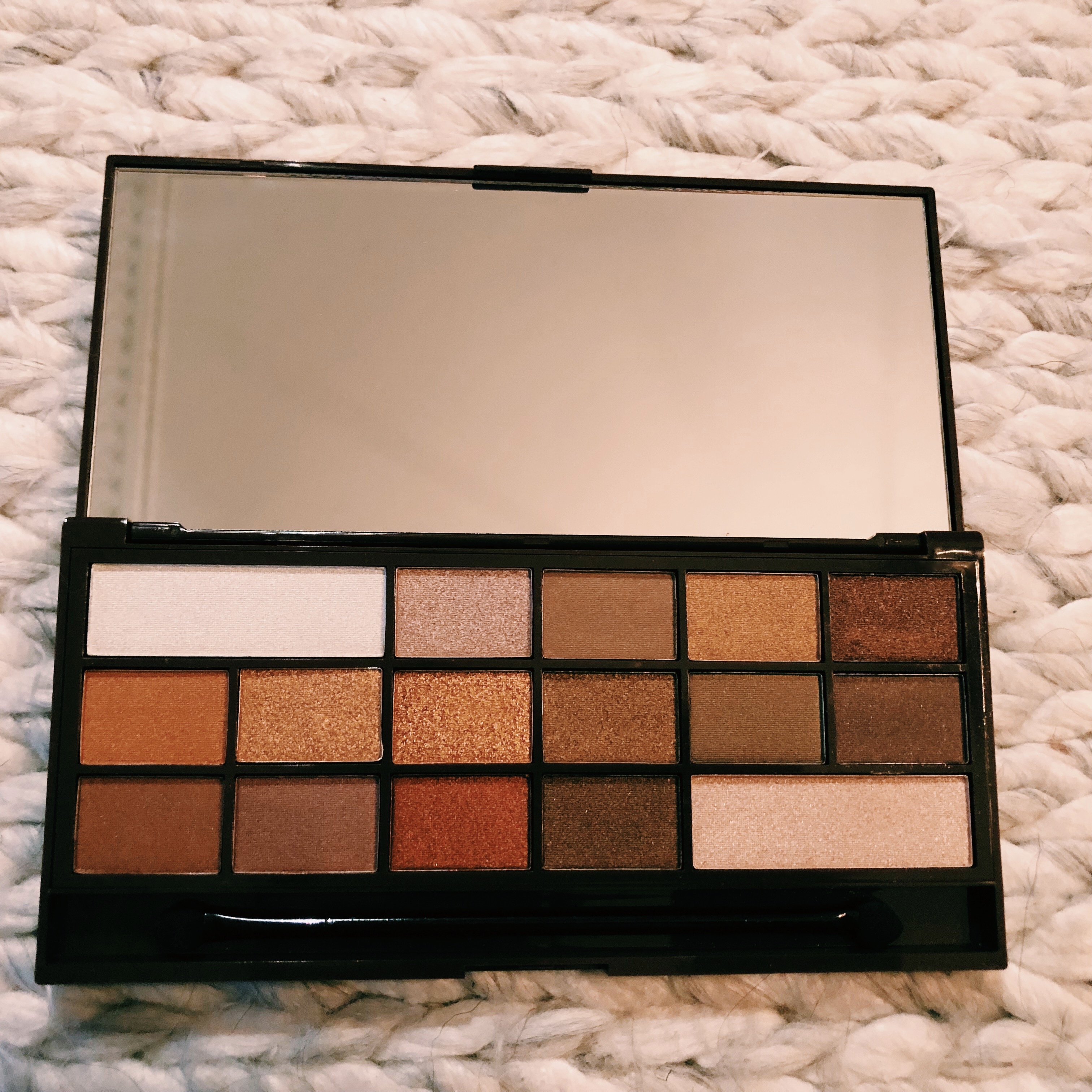
The actual palette itself is a matte nude, pastel peach colour with more rose gold lettering on it. It’s slim and lightweight and it’s also got a very generously sized mirror making it a brilliant palette to travel with or for on the go use.


Processed with VSCO with c1 preset

Processed with VSCO with c1 preset

726DF6D3-AA23-4550-AE78-BA1AC869FB8F.JPG
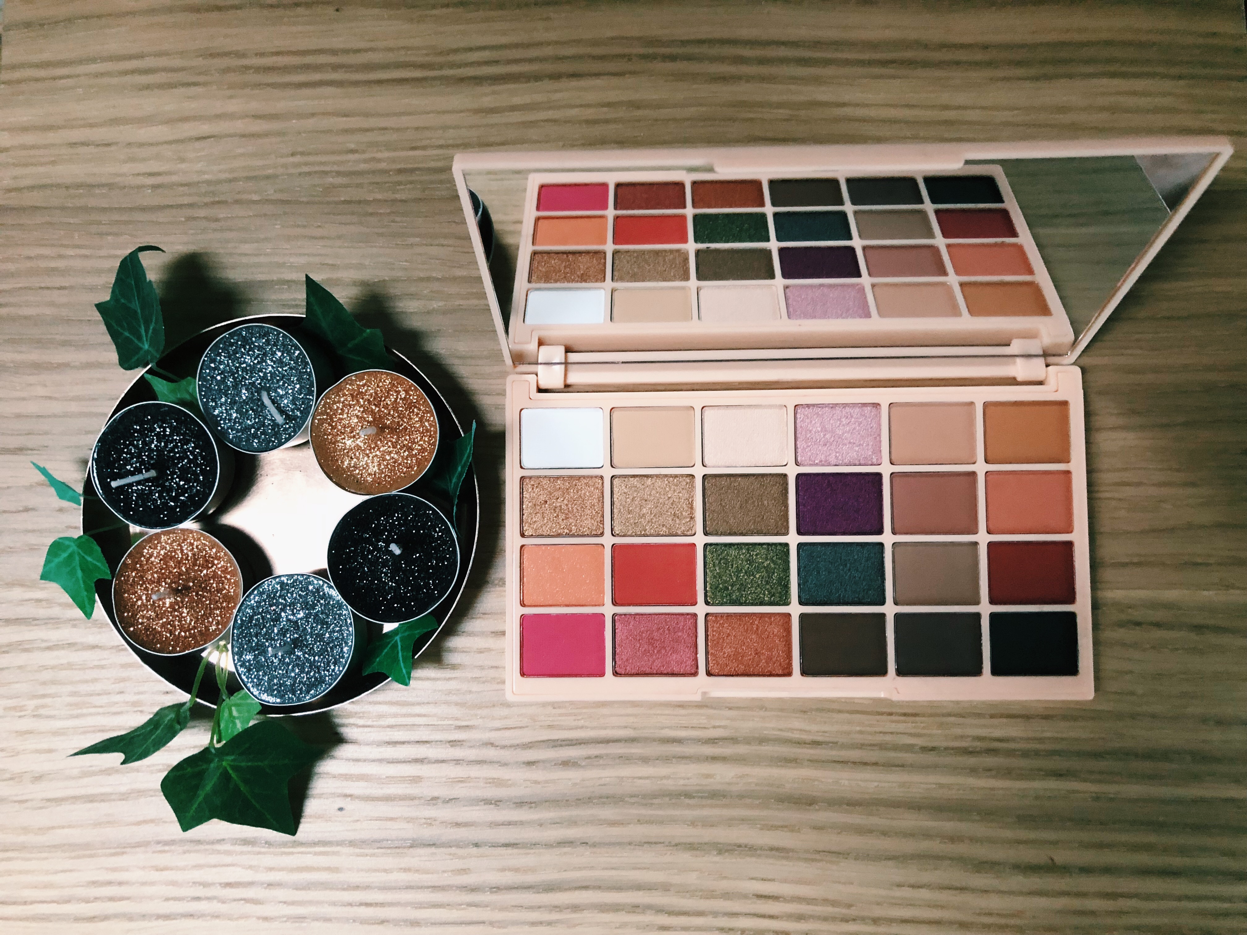
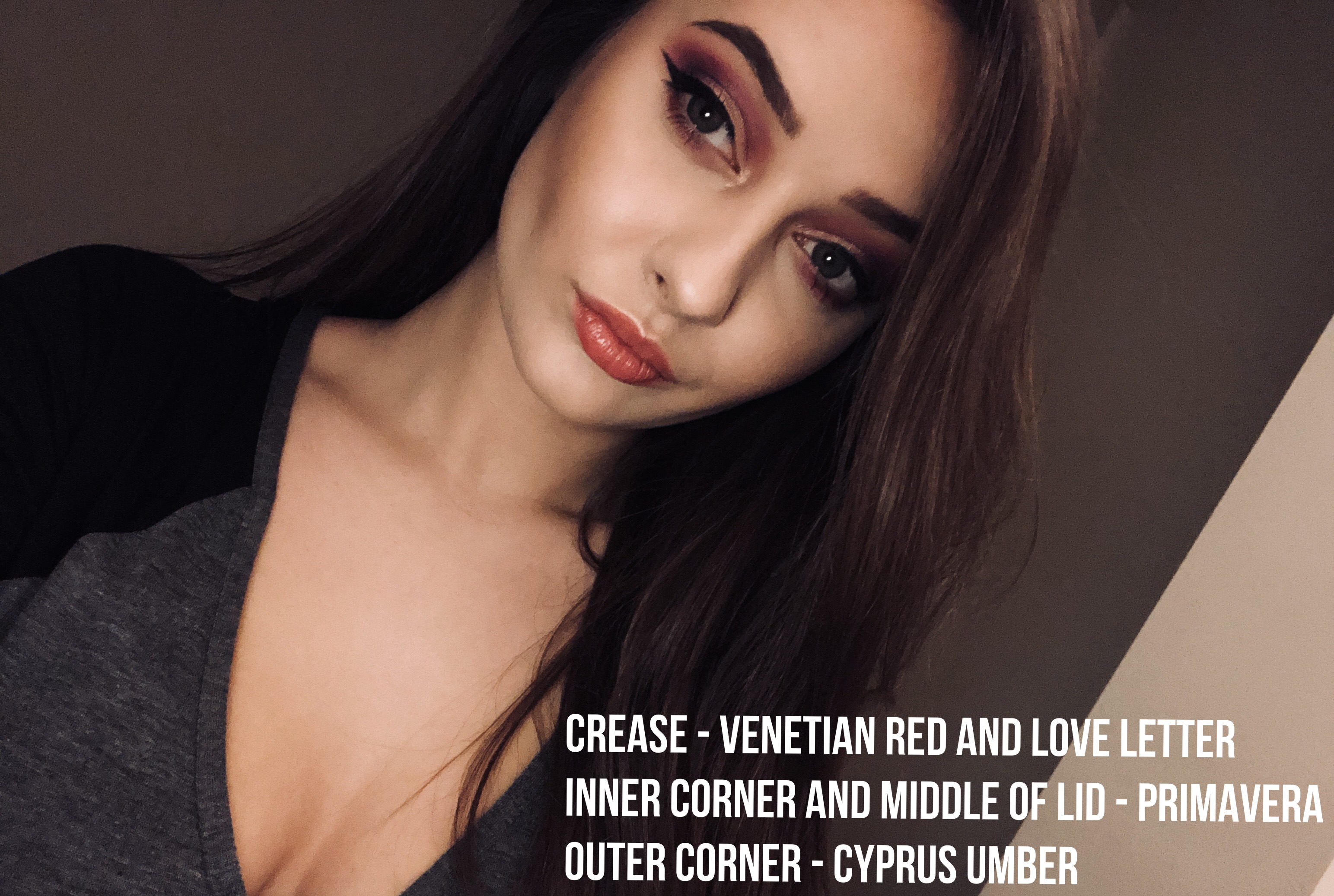
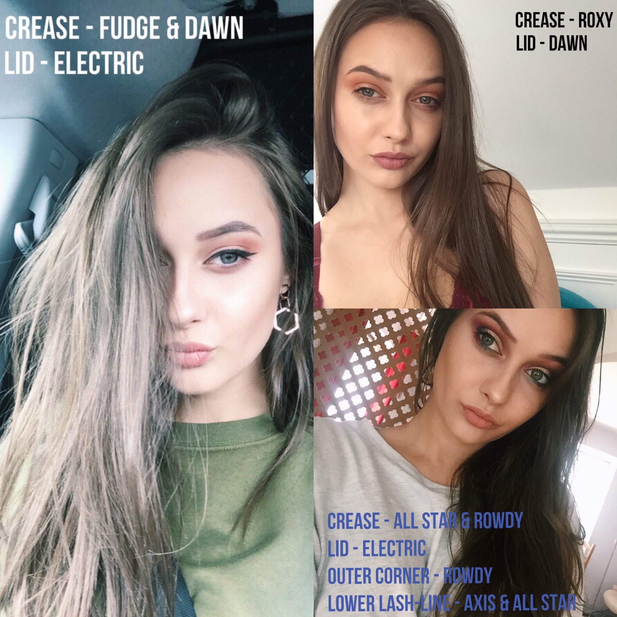
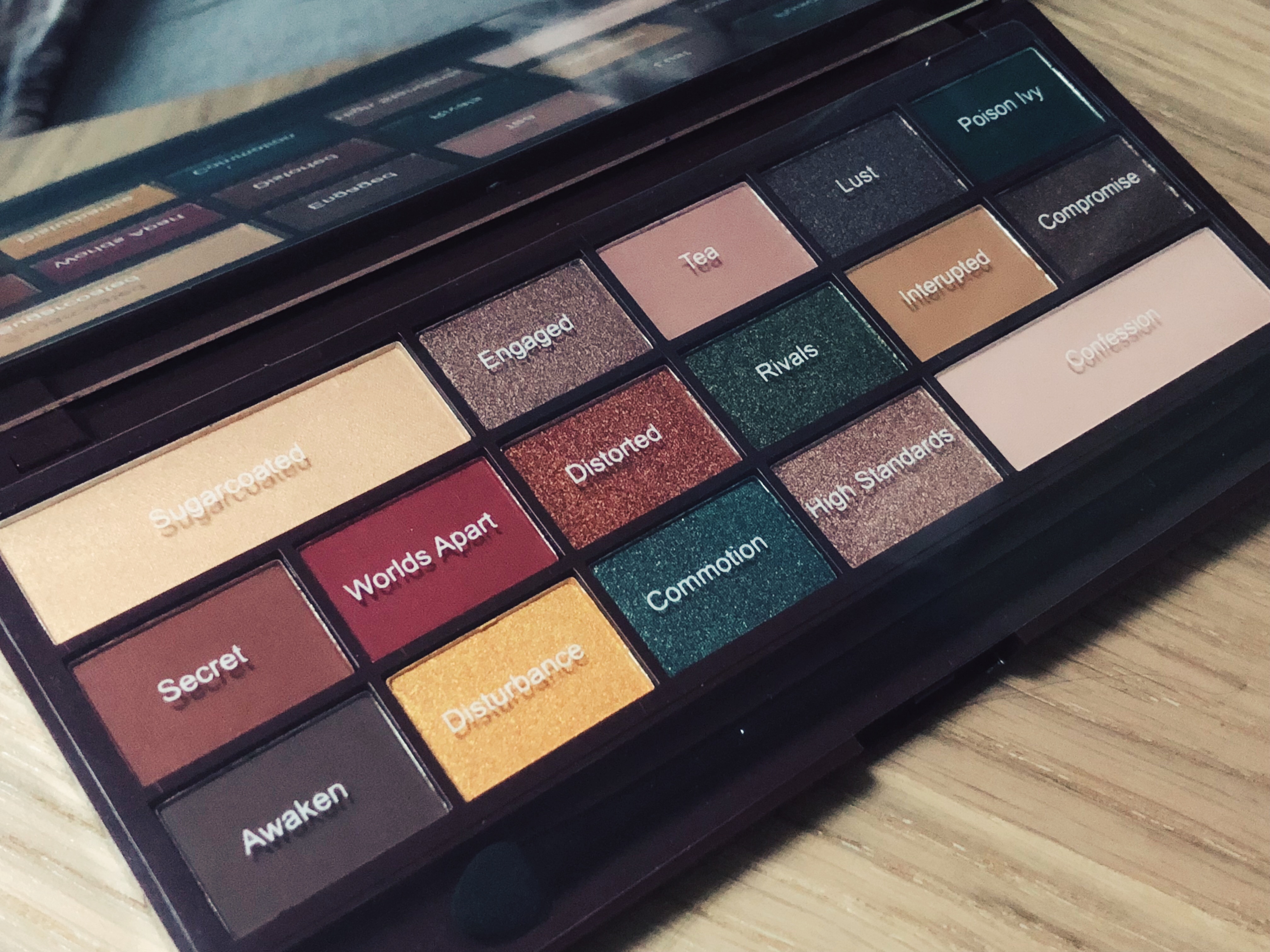
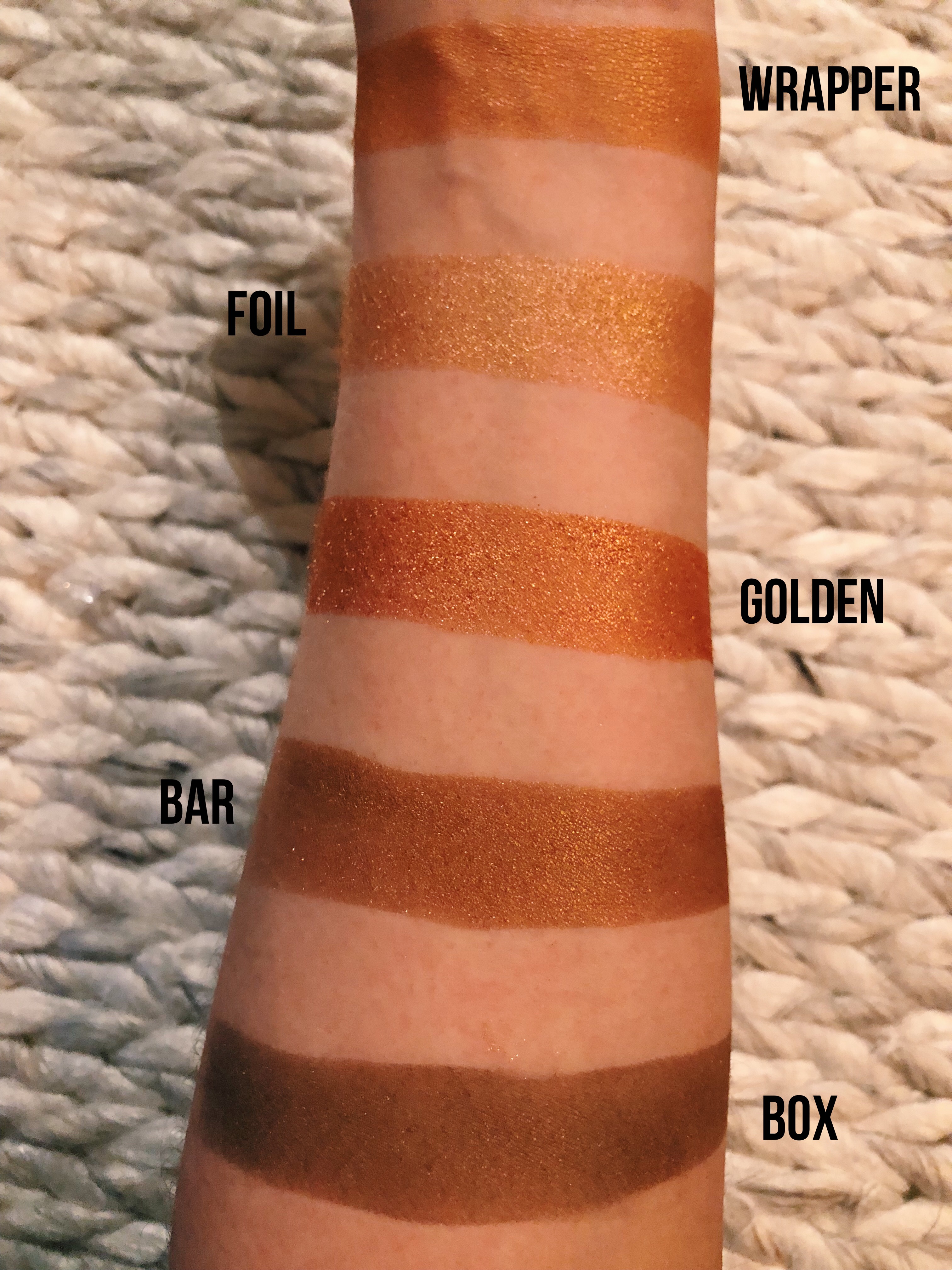
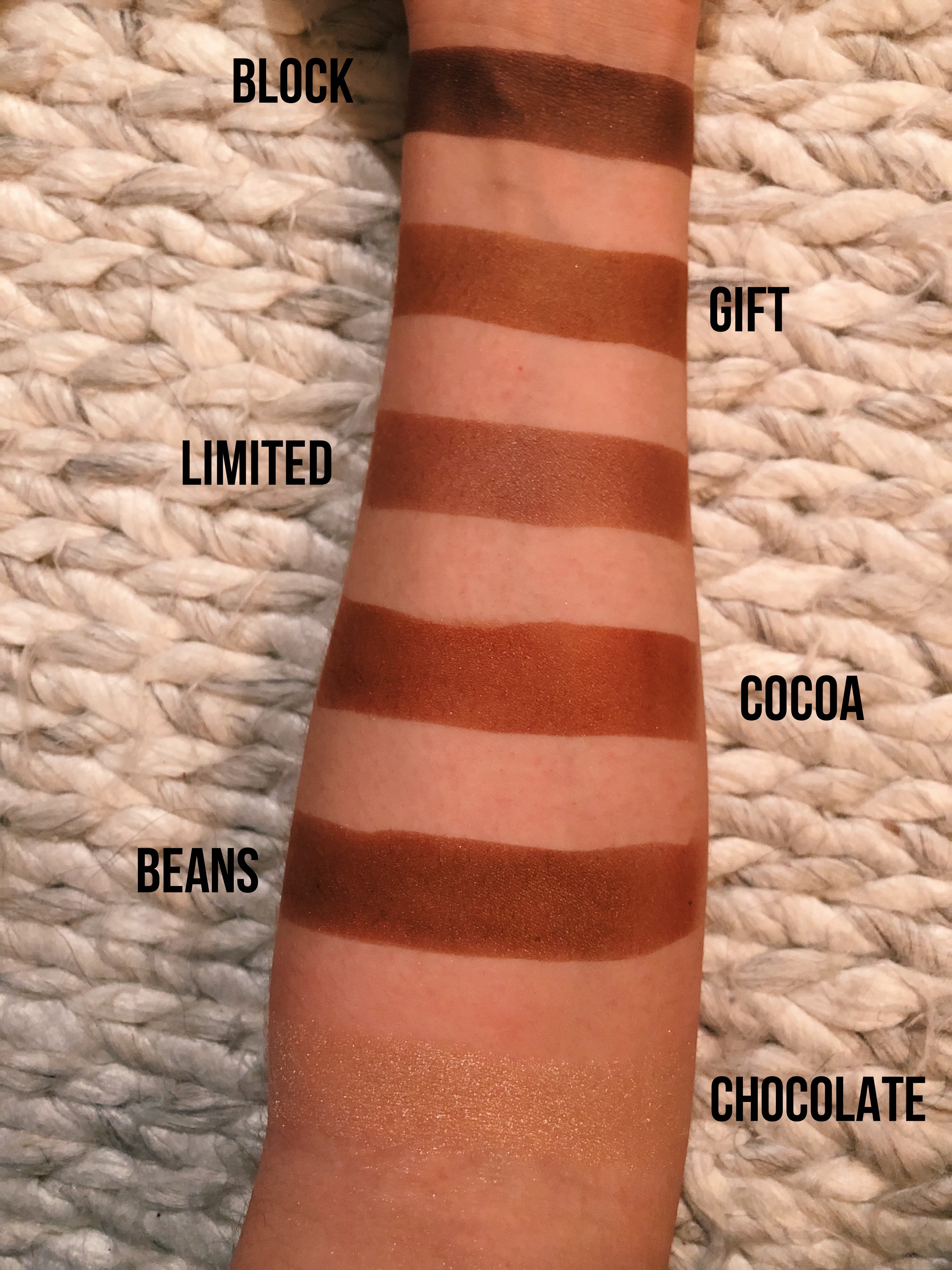
Upon opening the palette you are greeted by 24 pans, 14 of which are matte shadows and 10 are shimmers. As you can see the palette includes a fantastic mix of shades giving you so many  options when it comes to creating looks for every day or even looks for all out glam. There’s rich shimmers, bright pops of colour and even a matte black! What more could you need?! The shadows are all pigmented and buildable so you can be more subtle or go full on. I use a primer to ensure they wear all day long so I would recommend doing the same as you really get the most out of the shades. I would also recommend that you do your eyes before doing the rest of your face as I never learn and get a heavy dusting of shimmer all over my foundation covered cheeks – No thanks.


Processed with VSCO with c1 preset

  • Penguin: A matte white – Quite powdery but is super pigmented for a white shadow.
  • Pancakes: A light neutral beige- Pretty accurate name for the colour actually, it’s a fab transition shade as well.
  • Fairy Lights: A white-gold shimmer – It’s not the most intense shadow in the palette but it’s still buildable and looks lovely for inner corner highlights or on the brown bone.
  • Pink Champagne: A pale pink shimmer – Again this isn’t very intense but it’s certainly buildable and looks so pretty on the inner part of the lid or even all over it.
  • Iced Coffee: A matte warm tan/neutral – Another perfect name. It really does look like the colour of iced coffee. I love using this to warm up the crease as a transition shade.
  • Cuppa Tea: A medium matte warm brown – I also love using this shade to warm up my eyeshadow looks.

660D5C47-DFDE-460F-8962-5F52D4F4E854

  • Grow Old: A coppery-gold shimmer – This is so beautifully pigmented, I love it! I use this shadow all the time, it’s so warm and pretty.
  • Sparks Fly: A gold shimmer – The perfect gold shadow, it’s a must in any collection. It’s so pigmented and looks so gorgeous on the lids when the light catches it. I love using this for halo looks too.
  • Smokey Bronze: A dark smokey bronze metallic shimmer – You know me, I love anything bronze so I really enjoy using this shade. It’s great for smoking out shimmery looks.
  • Mixed Berries: A purple berry-toned shimmer – I’ve always loved using fun and bold colours within my every day makeup looks, so I was so happy to see this shade included in the palette. It’s also super pigmented too!
  • Tiramisu: A neutral matte medium brown – Again a great shadow for the crease as a transition shade. I also enjoy using this for more natural makeup looks too as it’s not too intense and can be blended out very easily.
  • Peaches: A warm matte peach – This is so creamy and pigmented. I love how rich and warm this shade is too. I can’t wait to use this in summer when I’m creating more orangey/gold looks.

576A5C0A-3D66-4897-BFC1-64CA19BC9766

Cloudberry: A matte light orange – This definitely has some subtle shimmer to it. It’s so pigmented and gorgeous I’m so happy this shade was included! Again, this will be perfect for warm toned looks in summer. I love that she named this because of the Moomin books too!

Pumpkin: A matte orange with red undertones – This shade surprised me so much when I swatched it. It’s so creamy and it’s extremely pigmented, I barely had to press on the pan to pick up what I did.

Pine Tree: An emerald green metallic shimmer – I can’t get over this shade. I am a lover of all things green and khaki as it’s a colour that seems compliment my skin tone so I was so excited about this colour being in the palette. It’s so unique and different from anything else that I have. I have really enjoyed using this for festive looks as it’s the perfect Christmas green in my opinion. It was the tiniest bit chalky to swatch but this didn’t cause any issues when applying.

Petrol: An iridescent metallic blue shimmer with brown undertones – I was really intrigued by this shade as I originally thought it was a blue shimmer. It’s actually a blue to brown shimmer. I was so surprised at how creamy feeling this shadow was. This is so unique, I’ve never owned an eyeshadow like this before!

Pug: A matte grey-brown taupe – Another shade that’s perfect for using in the crease or as a transition shade.

Danger: A red matte – I am a sucker for warm toned shadows so this is right up my street.


IMG_1394

  • Strawberry Sweets: A matte warm strawberry pink – This is such a stunning shade. I like using this for my more bold coloured looks.
  • Festive Flame: Metallic red with orange undertones – Again this is a shade that’s so perfect for festive makeup looks. 
  • Copper Coin: A true copper metallic shimmer with orange undertones – I LOVE THIS SHADE. It’s absolutely gorgeous and so pigmented for a drugstore shadow. Yes Soph!
  • Mugcake: A dark neutral matte brown – I have been using this to darken my outer v and it works a treat. It’s also warm toned which I am all about.
  • Rosewood: A dark cool toned brown with pink and purple undertones – I enjoy using this when I want a more cool toned but dark look.

Nightmare: A matte black – Finally a black shadow included in a colourful palette! It’s so fab for adding some drama to my eye looks. Perfect for a dark and dramatic smokey eye.


In conclusion, this palette is absolutely worth buying. For the price and the range of shades it’s just such good value. There’s so many different shades for every kind of look that you could wish to create and because there’s a mixture of mattes and shimmers you can create looks using only this palette. Some of the shades require a couple of layers to build up the colour payoff but of course, this is more than okay for a drugstore palette that only costs £10. I am so impressed that this was created by Soph and it’s the first thing she’s created – what an achievement! You can get the palette from Superdrug in stores and online and on Tam Beauty’s website.

I will be reviewing her highlighter palette soon so keep an eye out for that! If you’ve tried either of Soph’s products I would love to hear your thoughts in the comments!

N xxxx

Categories
2017 BEAUTY BLOGMAS

I HEART REVOLUTION: GOLDEN BAR PALETTE – REVIEW, SWATCHES & PHOTOS

BLOGMAS DAY 19

Superdrug is my favourite place to go when hunting for new (affordable) makeup. They nearly always have at least one display of the TAM Beauty make up brands, Makeup Revolution, Freedom Makeup and I Heart Makeup. I am such a huge fan of these products as they’re always of such high quality and yet they’re priced affordably – what more could you want?

The beauty community has definitely been talking about the I Heart Revolution palettes and rightly so! They’re becoming more and more popular after they launched a collection of dupes for the Too Faced Chocolate Bar palettes. They even duped the Sweet Peach palette (I will be comparing the two in a review soon!). The latest palette from this fabulous brand is the Golden Bar Palette. You can most likely buy this from your local Superdrug store or order it from their site online. TAM Beauty ship internationally so you can also order it on their website.


Processed with VSCO with c3 preset

I fell in love with this palette as soon as I saw it, the packaging certainly sucked me in – TAM Beauty knew exactly what they were doing! All of the palettes in this collection are designed to look like chocolate bars however this one caught my eye when I noticed the metallic gold packaging. It’s a fricking gold chocolate bar! I also loved the melting chocolate on the front of the palette, it reminded me slightly of the Kylie Cosmetics packaging.


Processed with VSCO with c1 preset

Not a bad view huh? Featuring 16 shades, this palette was a steal at only £9, especially if you consider the ridiculously expensive Too Faced palettes (£40). The Golden Bar palette may not be exactly the same, however, it’s extremely similar and it’s certainly giving them a run for their money. In my opinion, if you can purchase a highly pigmented palette for even the price of a more expensive one, you’re onto a winner. There’s also a very generously sized mirror covering the entire lid, making this a great palette to travel with. The one thing that I didn’t enjoy about the packaging, was the plastic overlay that had the shade names on it. I would much rather have a palette with the names printed below each shade, making life that little bit easier, especially for tutorials or reviews like this one. Another thing to keep in mind that also let me down slightly is that there are no matte shades. This means a full look can’t really be completed as there is nothing to use as a transition shade so you’d need to use another palette.


IMG_0986

Collection: A cool icy white shimmer –  I love using this for inner corner highlights and under my brows! I sometimes even dot above my lips for a more defined cupid’s bow.

Ribbon: A light pink champagne-shimmer – I would say this is one of the more subtle shades but it’s certainly buildable. I sometimes use a setting spray to intensify it which works perfectly!

Edible: A muted taupe-brown shimmer – In my opinion, this is the least pigmented shadow in the palette. I like the colour for a more subtle hint of brown in my crease but it’s no way near as pigmented as some of the other shades. Again, if you use a setting spray it can intensify it.

Tablet: A dark bronze/gold shimmer – I love using this shadow as it’s darker than the other gold shimmers in the palette so it’s perfect for a less blinding look (I’m all down for full-on lightbulbs on the lid though)

Wrapped: A red/purple toned brown shimmer – I love using this to slightly smoke out my outer lid, however, it’s a shimmer shade of course so it’s not as intense as a matte shadow would be.


IMG_0989

Wrapper: A warm orange/yellow gold with brown undertones – I often use this shade with warm toned shadows to create a red toned look. The orange undertones also meant I could use it for Autumnal looks as well!

Foil: A golden shimmer – I often use this in the centre of the lid as it’s just such a gorgeous shimmer. I used this for a halo smokey eye look the other day and it did a fab job!

Golden: A rich golden shimmer – This is my favourite shadow in the palette. It’s just so insanely pigmented, it’s INCREDIBLE. I can’t believe this came in a palette that costs £9…? It really does show that you don’t need to break the bank to own some crazily pigmented shadows.

Bar: A bronze shimmer with olive-green undertones – I tend to use this shade less as it’s not as blinding or rich as the other gold shades however it’s still a unique colour to have in a palette.

Box: A khaki shimmer – I love this shade, it always looks nice on the lid with a smokey outer corner. I’m a fan of any coloured shadows, especially khaki as I already wear so much of this colour (90% of my wardrobe).


IMG_0995Block: Taupe/dark brown shadow with purple undertones – I use this all the time to add some drama to my eye makeup looks, it’s another great shadow for intensifying the outer lid and creating a smokey eye.

Gift: A milk-chocolate brown shimmer – This is what I would call the perfect chocolate shimmery brown shadow. It’s quite a warm shade too so I like using it for red/orange toned looks but it looks good as part of an everyday look as well.

Limited: A musky pink/purple shimmer with light brown undertones – I absolutely adore this shade, it’s such a gorgeous mixture of pink and purple and of course, it’s shimmery! It looks even better when applied with a setting spray.

Cocoa: A rich red/burgundy shimmer – I am loving using this shade for red smoky eyes which is fab for festive makeup looks!

Beans: A medium-brown shimmer – This is a pretty similar shade to Block, however, I prefer it. It’s lighter and easier to blend into a more everyday look. It’s slightly darker than Limited which makes it better for a smokey eye.

Chocolatier: A light nude/prosecco shimmer with cool undertones – I was pretty disappointed with this shade. Yes, it’s pigmented however it’s so chalky and powdery so getting your brush to pick up the right amount is difficult. It still looks great on the lid, especially for a halo look or inner corner highlights.


Overall, I think this palette is SUCH good value, given how pigmented each individual shadow is. I also have to mention how well the shadows last, they don’t crease and I don’t even use a primer which speaks volumes. The packaging is also amazing and of high quality, unlike some of my cardboard based palettes. I love the variety of colours that this palette offers for such a low price. The negatives of this palette, for me, was the fact that the shade names weren’t printed inside and that there were no matte shades so I can’t use it on its own. However, I would recommend this to anyone looking to build their collection of shimmer shadows as they’re all great quality and very pigmented.

Let me know if you would like reviews of any of the other bits in this collection as I own most of it!

N xxxx


Categories
2017 BEAUTY BIRCHBOX BLOGMAS

BIRCHBOX DECEMBER 2017: MATTHEW WILLIAMSON – REVIEW

Birchbox is a UK beauty subscription service that sends beauty boxes to their subscribers containing 5 goodies every month. You don’t have to worry about lifelong commitments or any contracts, you can cancel anytime with a monthly subscription – no fuss whatsoever! The monthly subscription costs only £10 per month! You can edit your beauty profile on their site in order to ensure you get sent products that are suitable for your skin/hair type and personal preferences. Birchbox is so great for discovering new brands and products. I have been subscribed to Birchbox for over a year now and I look forward to receiving their boxes every month. I’ve gone on to buy lots of the things I’ve received because I have loved them so much. Every box you receive is beautifully packaged, some months are designed and inspired by artists and companies. One month the box was created and designed in partnership with Oliver Bonasand I use it to store makeup in as it’s so beautiful!

VSCO Cam-1-5.jpg

This month, Birchbox teamed up with British fashion designer Matthew Williamson. The box is truly the epitome of luxe design and it’s so perfect for this time of year. I feel like December is a month that for some people, can be really stressful. Many seem to forget to take a minute to relax and pamper themselves and this box has definitely motivated me to do just that!


So let’s take a look at the first item…

NATURAL ROSE PIC 1.jpgvsco-cam-3-3.jpg
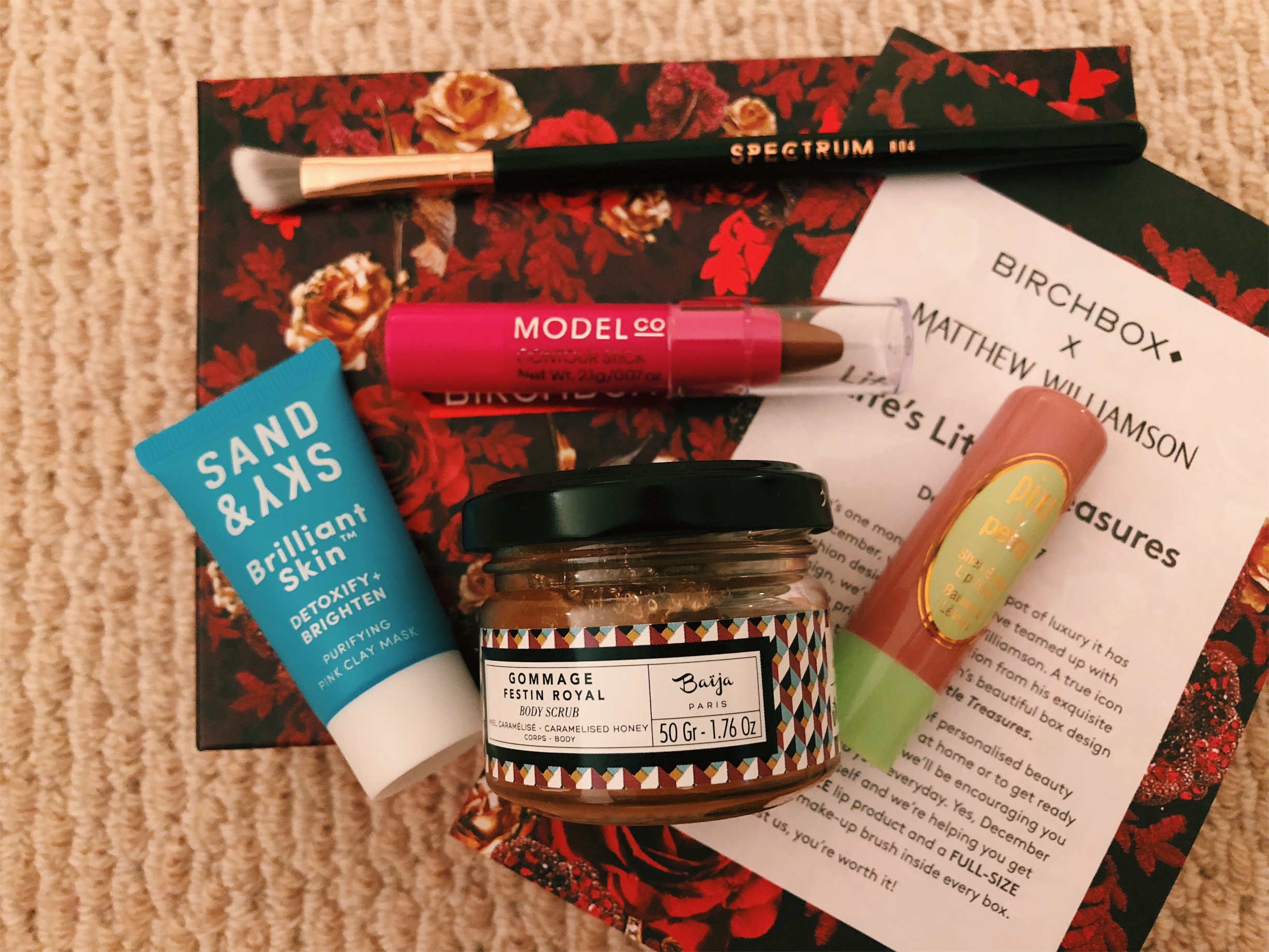
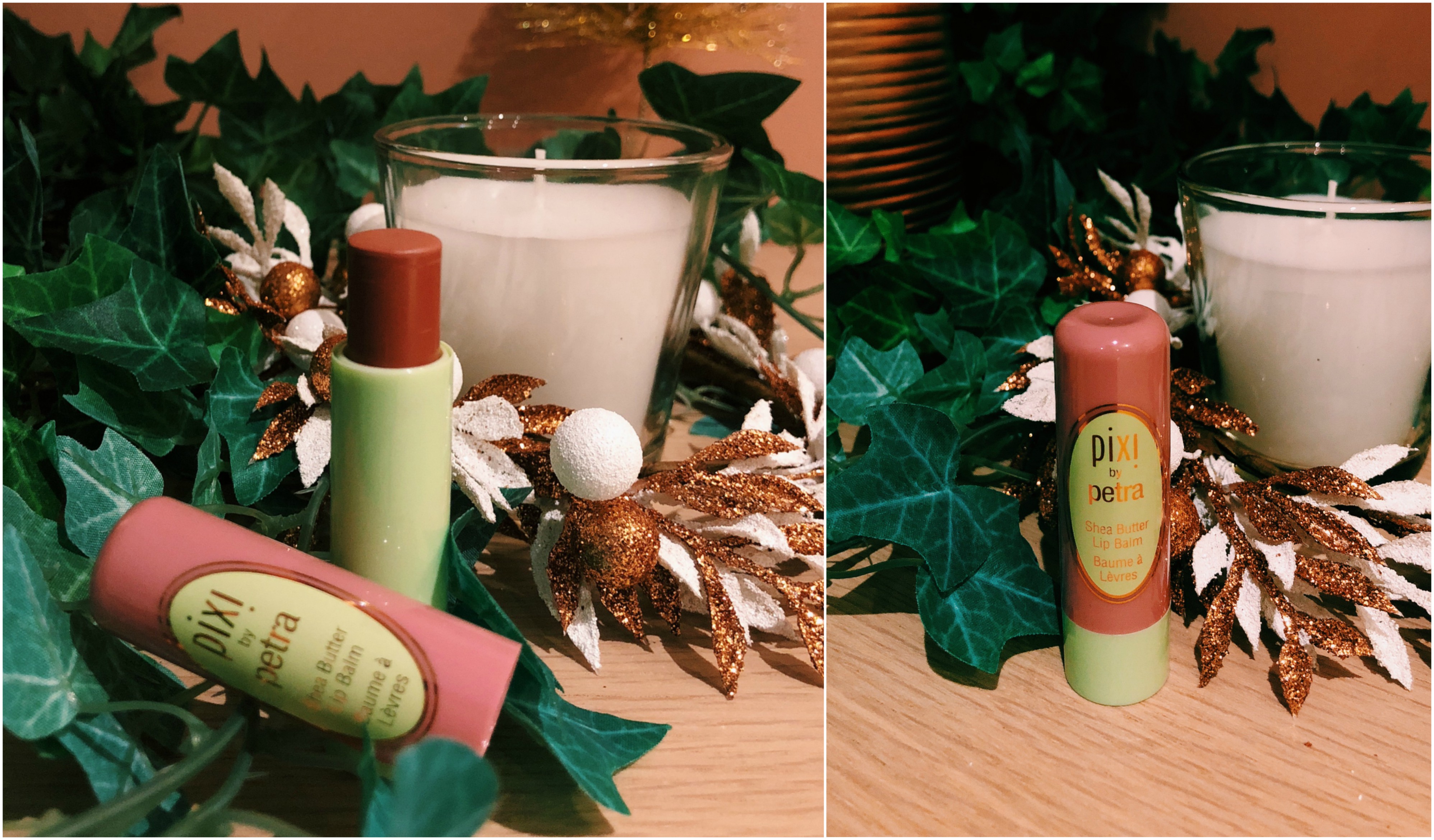
(FULL SIZE) Pixi – Shea Butter Lip Balm in Natural Rose : £8

I actually already own a Pixi Shea Butter Lip Balm in the shade Honey Nectar which I love, so I was super excited when I saw another one in my December box! It adds the perfect amount of colour without drying my lips out completely, however for some reason I don’t feel like it’s as moisturising as my previous lip balm by Pixi. I would have liked a more nourishing product for this time of year as this is when my lips are chapping like there’s no tomorrow. I will definitely still use it, just not if my lips are in need of help. Natural Rose is a gorgeous nude-pink shade, perfect for more natural looks.  The packaging has a vintage feel to it which is adorable and it’s the perfect size to keep in your handbag.


BAIJA PARIS.jpg Baïja ParisCaramelised Honey Body Scrub : £14.90 (via the Birchbox shop) 

I had never heard of this brand before but after looking on their website it’s clear that they sell lots of other beautiful products too. This body scrub smells INCREDIBLE, if you imagine freshly made caramel or fudge – something along those lines. It’s made up of 97% natural ingredients which I love as I feel it would be a real treat for my skin. It’s perfect for exfoliating and scrubbing away dry and dead skin to make you feel fresh and moisturised. I cannot wait to have a cosy pamper night in with this!


MODELCO PIC.jpgModelCoContour Stick : £13 (via the Birchbox shop)

I am not blessed with chiseled cheeks so I’ll happily fake it until I make it. I was so happy to see this contour stick in my December box. For the last couple of years I have been completely hooked on the Barry M contour cream sticks (which I will be including in my every day makeup items post – coming soon!) however, I’m so excited to try something new. The one that I currently use is quite cool toned which sometimes doesn’t work for a warm summery look. This product seems nice and warm toned which will be perfect for Summer and natural holiday makeup. I also love that the end is pointed which means contouring can be done with precision. When I was swatching the product I was surprised at how creamy it was and how well it blended! This is something I look for in contouring sticks as I’m not a fan of streaky cheeks and I like products that blend like a seamlessly. I use a dewy foundation and this would glide perfectly over it to create a healthy and glowing makeup look.


vsco-cam-15-1.jpgSand & SkyBrilliant Skin Purifying Clay Mask£39.90

Is it just me or are there some strong Nip+ Fab vibes from this packaging? This product particularly caught my eye as I love a good face mask on pamper nights. The product is claimed to detox, invigorate and brighten your complexion (yes please).  The main ingredient is pink Australian clay which apparently draws impurities out from the skin. The product also contains soothing aloe vera and pore tightening pomegranate.


VSCO Cam-11-2.jpg (FULL SIZE)Spectrum CollectionsB04 Angled Blender Brush£4.99

I practically squealed when I saw this brush poking out from beneath the other products. I always say you can never have too many blending brushes so this one will be going straight into my collection. I love that it’s angled so that you can be precise with your shadows. The colour of the brush also had me drooling as anything gold or rose gold always catches my eye and matches my aesthetic in my bedroom.


Overall I think this box is worth the money that I paid for it (£10) as the products are all very luxurious this month and there are two full sized products included which together have a total value of £13! Let me know if you are subscribed to Birchbox and what you thought of this box or if you are subscribed to any other beauty boxes, I would love to know!

Go ahead and use my link (here) to subscribe and you will get £5 off your first Birchbox! 

Categories
2017 BEAUTY BLOGMAS

ANASTASIA BEVERLY HILLS MODERN RENAISSANCE PALETTE REVIEW & SWATCHES

BLOGMAS DAY 12

Hey Everyone,

I hope you’re all doing well! Today I’m reviewing one of the true gems in my collection, the Anastasia Beverly Hills Modern Renaissance palette. It’s actually one of my favourite palettes, as I mentioned in my review of its sister Subculture! I’ve included photos and swatches so that you can get an idea of the quality of the shadows   – please excuse any wonky lines, arms don’t tend to make the perfect base! Keep scrolling to hear my thoughts…

BD24708F-4F8B-459D-9723-43144FFA6ED6.JPG

Processed with VSCO with m6 preset

The palette is an essential in my collection. It contains 14 beautiful warm neutrals and berry tones which add a stunning pop of colour. It’s mostly a matte palette, with 11 matte shades and 3 metallic shades. It also comes with a soft dual-ended blending brush which actually does a fab job. I’m not usually a fan of  brushes that come with palettes as I like to use my own, however, I’ve ended up using the brush pretty much every day!


16DEECC0-C3E1-4CDE-9C18-36B53ACD358C.JPG

Tempera – A light nude matte with peachy tones – I use this for highlighting underneath my brows and in the inner corners of my eyes! It’s not a shimmery kind of highlight but it’s a clean shade that definitely brightens up any area that it’s applied to. I always use it as a base too.  It’s silky soft and easy to blend.

Golden Ochre – A matte and a muted beige/yellow colour with olive tones – It’s the colour of the perfect (my idea of perfect) cup of tea! It’s the perfect shade for a simple and natural makeup look but it also works out to be a great transition shade if you’re packing some colour in there too.

Vermeer – Iridescent champagne shimmer  –  Such a lovely light shade to put on the inner corner of the lid as it’s a shimmery rose-quartz. It’s got slightly warm/peachy undertones to it too so it’s nice to build up, on the lid. The iridescent sheen of it catches the light which makes it gorgeous for nights out.

Buon Fresco – A matte lilac/mauve – I flipping love this shade. It’s so pretty on the eye and it’s perfect to pair with some pinks and reds! It works so well with the other shades in the palette.

Antique Bronze –  A shimmery brown with rusty red undertones – This is such a gorgeous colour, perfect for festive makeup looks and even in Autumn actually. I tend to wear darker makeup at that time of year (lots of browns, bronzes and coppers)

Love Letter – A raspberry pink matte  This makes the best pink smokey eye ever and I use it so much! It’s a perfect berry tone for the winter months too. It’s slightly dusty but with a few swatches it’s buildable!

Cyprus Umber – A dark coffee brown matte – I use this almost every day to add some drama to the outer corner of my lid, I love it! It’s so pigmented too.


72528884-8782-4104-9405-764EABB03C1E.JPG

Raw Sienna – An amber matte with golden undertones – I love using this in the crease for more natural eye looks.

Burnt Orange – A deep orange matte – Slightly more of a rich orange shade than Raw Sienna. I tend to use this if I need to warm up my makeup looks – it’s great for Autumn in that sense!

Primavera – Shimmery gold dust with a metallic finish – This is my favourite shade in the whole palette, it is PERFECT for putting in the middle of the lid for a spotlight look or for an inner corner highlight. It’s nicely pigmented and is even more intense when used with setting spray. You could probably use it as a highlighter too, it’s fabulous!

Red Ochre – A burnt, rusty red matte –  I love using this for festive looks to add a pop of red to my eye looks. Colourpop offer a fab dupe for this shade called Popular Demand. I’ve found it takes a bit of building up though so maybe apply it a couple of times to make it slightly less sheer!

Venetian Red – A warm red with a matte finish – Again, fabulous for festive makeup looks. Everyone needs some red shadows in their life!

Warm Taupe – A matte grey with purple undertonesI’m not getting the warmth from this shade that I expected! I’m also not using it all that much as it just doesn’t look that great on me. It’s still lovely and pigmented though!

Realgar – A reddy-brown matte A rusty red matte shade with subtle warm undertones, really pigmented yet so buttery and easy to blend out. It has subtle warm undertones too.


Image-1.jpg


I would definitely recommend this palette to those that love using warm tones and enjoys creating more neutral looks but aren’t afraid to use a pop of colour every now and again. For a palette that features mostly matte shadows, they all apply fantastically and are buttery and easy to blend. I have yet to experience any issues with blending out any of the shades. No shades have become patchy either, which to me suggests that every shade was created with very high quality in mind. It’s one of the most pigmented palettes I own, you merely have to tap the shadows lightly and you’ll have picked up plenty. In my opinion, it’s worth every penny as the shadows are of such high quality and there’s a fantastic variety of shades included in the palette. It’s a really versatile palette as it can be used for daytime and nighttime looks If you’re more adventurous with shadows.

I hope you enjoyed my review of this palette and found it helpful if you were trying to make your mind up about it! Below, you’ll find links to my reviews of the other palettes in the collection and I’ve also liked my social media below so come and say hi, I’d love to hear from you!

Read my review of the Subculture palette

Read my review of the Prism palette

TWITTER | FACEBOOK | INSTAGRAM | PINTEREST  

N xxxx

Categories
2017 BEAUTY BLOGMAS MAKEUP

ANASTASIA BEVERLY HILLS SUBCULTURE​ PALETTE {REVIEW & SWATCHES}

BLOGMAS DAY 8

After the huge success of the Anastasia Beverly Hills Modern Renaissance Palette, (take a look at my review) everyone was expecting great things when it’s “sister” the Subculture palette was released. The palette sparked lots of debate within the beauty community. There was lots of discussion surrounding the choice of colours, as they are pretty bold. I managed to convince myself that I can rock shades like this but I can understand why some people were terrified when they saw a mustard yellow.

I decided that I had to try this controversial product for myself and I bought myself the Subculture palette during summer, as I was wearing lots of bold eye looks during these months and thought this palette would be perfect for just that! It retails at £43 on their website *distant screams from my bank account* The packaging is made from a beautifully soft and a flocked teal coloured, crushed velvet material which definitely makes it feel more expensive, almost identical to the MR palette. There are 14 shades (11 mattes and 2 metallics and 2 duo chromes) A majority of the shades are warm and muted with some retro 70s vibes (YES PLEASE). When looking at the shadows all together, it reminds me of mid-century modern interiors, I LOVE IT. The shades are also quite grungy and autumnal in that there are some mustard yellows and khaki greens with some coppers and golds too.


Processed with VSCO with c3 preset

  • Axis – “Ultra matte sage green” Teal/Turquoise has always been my favourite colour so I was delighted to see this shade in the palette. I love it, it’s an unusual colour and it’s just SO pigmented. I wouldn’t recommend going in too hard with your brush as you might look like you have a black eye (been there, done that unfortunately) If you do anything but tap it lightly, you could probably paint a picture with the amount of shadow you will pick up so be careful!
  • Mercury – “Ultra Matte Slate Grey” I was a bit disappointed when I saw this shade as it just looked so dull compared to the others. However when I swatched it I was pleasantly surprised. It’s a cool toned grey with what I reckon to be lilac undertones (see picture with flash) and it looks super pretty in the crease when blended out.
  • All Star – “Ultra Matte Vintage Wine” I love a good plum coloured eyeshadow. I have green eyes so pinks and purples really make them pop. I love using this in the crease as it’s so pigmented yet blends out so beautifully.
  • Adorn – “Metallic Bronze” This could be my favourite shade. It’s SO pretty and when it catches the light it’s absolutely stunning. It’s so rich in pigment and looks even better when a setting spray is used.
  • Destiny – “Ultra Matte Sage Green” I LOVE this shade, it’s a dark khaki green which is one of my favourite colours. Surprisingly it applies with very little fall out if you’re gentle when you apply it. I love using this in my outer corner for added intensity. I do find if you pack too much on however, it can become quite patchy when blending it out so apply sparingly. I would say that is the case with most dark matte shadows though, it’s all in the blending!
  • Dawn – “Ultra Matte Sand” I actually really like this shade even though it’s pretty simple. It has subtle muted peach undertones which make it a nice shadow to use for a more natural look. I use this as a transition shade most of the time as it blends like a dream.
  • Cube – “Duo Chrome Pink Pearl” My least favourite shade. It’s just not pigmented enough for me. At first I thought it looked gorgeous but upon using it I just got a sort of weak pink sheen. It seems to have a sort of skin on it that means it’s quite chalky too. I would’ve preferred just a plain pearly white shade so I could at least use it for inner corner highlight or on my brown bone.

Processed with VSCO with c3 preset

  • Rowdy“Ultra Matte Blackened Purple” I love using this shade to smoke out different looks, it can change up your makeup 0-100 real quick, from a study session in the library to GET ME TO DA CLUB.
  • EdgeUltra Matte Gold Mustard” I was originally terrified to touch this, I mean, it’s a YELLOW. However, I really enjoy using it now. I love the colour anyway so I just braved it and it’s not too bad! It’s nice to put in the inner part of the lid and it’s easy to blend into a darker shade (I’ve used New Wave to warm it up in the outer corner of the lid)
  • Untamed“Ultra Matte Tarnished Green” This is a smokey green with undertones of turquoise/teal and is lighter than axis but still just as pigmented. SO pretty.
  • New Wave – “Ultra-matte citron orange” I was also kind of scared to use this shadow but it’s truly gorgeous. At first, I thought it was another yellow but it’s actually a warm matte orange shade. I used this lots during summer to create warm toned looks which it was PERFECT for!
  • Fudge“Ultra Matte Warm Bronze” I love using this for smokey eye looks. It adds that extra bit of drama to your lid. It’s a warm brown with red undertones.
  • Electric“Duo Chrome Lime-Gold” This is such a unique shadow. It’s so quirky and looks great on a night out but I actually wear it during the day too. It’s mainly gold however it has gorgeous flecks of green that jump out at you when it catches the light.
  • Roxy“Ultra Matte Muted Coral” I love this shade, it’s such a pretty colour to use as a transition shade in the crease or as a base on your lid. It’s actually a great shade for summer as it’s got some flirty pink/ apricot undertones that really compliment green/blue eyes.

    Here are some looks that I’ve managed to create with this palette (apologies in advance, I’m no expert)

Image-1-3


I don’t think there’s a problem with fallout or kick back if you’re gentle with the shadows. I would say all but one of the shades (cube) are nicely pigmented. I would strongly suggest just lightly tapping the shadows as opposed to swirling your brush around the pans as this picks up a small amount of colour that you can blend easily and build up if you want more of a bold look. I would also suggest using a setting spray with the metallic shades in the palette, to make them hella sparkly – the difference is amazing! I wouldn’t recommend this palette to those that enjoy the safety of neutral toned shadows. I would say it’s a palette for the more experimental individuals out there however some shades, for example Electric, Fudge and Adorn could be used to make a really pretty more “natural” look but if there’s only a few shades in here that take your fancy, it’s probably not worth paying the hefty price.

BUY IT HERE

I hope you enjoyed this review and let me know in the comments what you think about this palette or if you’ve found any great dupes!

N xxxx

TWITTER | FACEBOOK | INSTAGRAMPINTEREST  


Categories
2017 BEAUTY BLOGMAS

MY MAC LIPSTICK COLLECTION

BLOGMAS DAY 7

Before I begin, I just want to say a massive thank you for the support you have given me for my last post, it’s been so overwhelming.  I can’t explain how much it meant to me to receive messages and comments from people I’ve known for years and also people I’ve never met saying how much the post helped them or how it had opened their eyes which was exactly my intention. Once again, thank you so so much x

My MAC lipstick collection has grown a fair bit this year and I thought I would share my favourite lippies with you! Arguably, MAC’s lipsticks are what they are most well known for and that’s how I was drawn in. They usually retail at around the £15 mark which can be pricey for some so I will also be doing a drugstore favourites post for Blogmas so some more affordable alternatives will be included within that! However, I would really recommend keeping an eye on the MAC sales as they sometimes sell amazing products at reduced prices and they go really quickly!


VELVET TEDDY-2

This is my favourite lipstick. It’s matte and it’s nude – what more could a girl want?! I always say I’m going to wear more red lipstick every year but it never happens, I always drift back towards more neutral tones. I’m not sure when the craze for this shade started but I totally understand why now! Velvet Teddy is a deep-toned beige and is one of the best nude matte lipsticks that I have ever tried. It stays on for hours and dries smoothly without completely drying me out. I wear this pretty much every day.

TESTOSTERONE.jpg

This is one of two darker lipsticks that I wear and I’m not sure you could even call this “dark” actually. I would describe the shade as a warm coral. This lipstick has the most beautiful semi-sheer and almost wet look finish to it which normally I wouldn’t opt for but I’ve really warmed to it! It makes my lips look super smooth and dewy which is great for when I feel like a prune during winter! I was lucky enough to grab this in the Black Friday sale for roughly £11. It’s unfortunately not available to buy online anymore but they could bring it back, you never know!


MUSCU-LINITY.jpg

I also bought Muscu-linity in the Black Friday sale hence why it looks so shiny and new! It’s a muted beige-brown and because it’s one of MAC’s lustre lipsticks, it has a gorgeous natural sheen to it. Although it’s not as pigmented as some of my other lipsticks, it’s definitely buildable if you want more coverage. It doesn’t stay on as long as a matte lipstick either, however, as it’s not your typical ‘high-maintenance’ colour, it’s easy to quickly top up on when you’re on the go. Unfortunately, this is also not available online.


TAUPE.jpg

This was actually my first MAC lipstick, kindly bought for me by my boyfriend as a gift to cheer me up and that, it certainly did! Taupe is a warm brown shade and it’s in the MAC matte lipstick range. It’s a gorgeous nude that I found to be perfect for autumn. It’s really pigmented and long lasting which I also love if I’m wearing it on a night out.


SPIRIT.jpg

Spirit is a pinky-warm brown with a satin finish. It’s rich in colour and dries semi-matte and still leaves my lips feeling moisturised. I love wearing this colour during the sunnier months for a less intense and more natural look.


MOCHA.jpg

Mocha is a peachy-brown shade and I absolutely love it. It’s probably my second favourite lipstick that I own. The pinky undertones make it a more healthy looking nude shade in the sense that it doesn’t wash me out. I also think that it’s a shade that can be worn all year round as it’s hydrating for Winter and gives a gorgeous dewy look for Summer!


DIVA.jpg

Diva is a pretty bold choice for me as it is an intense reddish-burgundy. Surprise surprise, it’s another matte lipstick! I originally thought it would make me look washed out, however with a bit of bronzer and blush, I’m good to go. It’s such a great shade for Autumn and Winter.

I’ve always enjoyed being nosey and seeing what other people have in their makeup bags etc or what collections they own so I thought why not try a post of that kind myself? I hope you guys enjoyed this post, I’m sure in a years time, I will have added a few more to the collection so another post may be necessary! Let me know what MAC lipsticks you swear by in the comments as I’m always looking for an excuse to get some more!

N xxxx

TWITTER | FACEBOOK | INSTAGRAM | PINTEREST

Categories
BEAUTY MAKEUP

BOBBI BROWN HIGHLIGHTING POWDER REVIEW

Hey Everyone,

I hope you’re all doing well! Today I’m going to review the Bobbi Brown highlighting powder in the shade Sunkissed Glow. My boyfriend gave it to me as an anniversary present just over a month ago and I’m in love (he’s alright too I suppose). It’s actually the first product that I’ve tried from Bobbi Brown, so this will be a first impression!


The highlighting powder retails at £35, which may sound horrifying but for a high-end brand, that’s somewhat timid. Trust me, google Tom Ford and Hourglass… For anyone that drools over luxurious and sleek packaging, you will practically want to frame this product. It’s also a mirrored compact too, meaning you can glow on the go!


Processed with VSCO with c1 preset

The highlighting powder itself, fits into a perfect little square of golden shimmery goodness. I love the grid-like markings – it looks so luxurious and almost too good to use. When applied, it gives adds the most beautiful, bronzed glow to my skin. It looks quite natural compared to some of the more luminous highlighters out there and I quite like that. Sometimes you don’t want the satellites to spot you glowing all the way from Earth. It’s not necessarily blinding but it’s certainly buildable. I like being able to choose the intensity of my glow, as it gives me some control over it before it gets too much – we’ve all been there. It’s definitely more of a summery shade, I doubt I will be using it much during the colder months. I just find that it compliments a tan so much. When I went away during summer, all I wore on my face was some bb cream and highlighter and this product would have been perfect!


befunky-collage-13.jpg

Above on the left is what the highlight looks like with flash from a distance and on the far right the highlighter without flash (top) and with flash (bottom)


If you want to feel like you’re using a expensive product, this is definitely worth trying. It feels so luxurious to apply and it looks even better on. The fact that it doesn’t appear cakey or chalky goes to show that it’s a high quality product, I hate it when highlighters do that. If you’re looking for a bronze gold beam of light in your makeup bag and you have the cash to splash on it, I would recommend giving this one a go! They also have some other shades in the range if you want to find something that really compliments your skin tone.

N xxxx

TWITTER | FACEBOOK | INSTAGRAM | PINTEREST

Categories
LIFE

A New Chapter

I am incredibly excited to start this blog. I have always loved being creative and enjoyed sharing my ideas and experiences with other people, so I believe this is a great platform to go ahead and do just that! I have a huge love for blogs and I am an avid reader of all things beauty and lifestyle. I hope that this blog can be similar to those that I love, in that I will be discussing all things makeup and beauty related whilst also covering a bit of lifestyle and fashion. I will be regularly reviewing beauty and makeup products, as well as sharing my own looks that I have created (however, I am no beauty guru- this isn’t me claiming to be) There will also definitely be some good old haul posts as I am TERRIBLE at restraining and ignoring the very sensible friends that say “you don’t need that”.

On a slightly more serious note, as fun and creative as blogs can be, I have personally found them to be really comforting when I have been struggling with my own mental health. There is something super reassuring about having a blog to catch up on or a YouTuber that kept me up to date with their lives, especially when you’re feeling lonely or isolated. I hope that my blog can be that happy little half an hour every now and then for someone else.

I’ll leave it here as I have some mac and cheese worryingly close to exploding in the oven.

However, I will be back soon with another post ready for you!

N xxxx

TWITTER | FACEBOOK | INSTAGRAM | PINTEREST