Categories
2018 BEAUTY BLOGMAS MAKEUP

MY FAVOURITE FESTIVE LIPSTICKS

Hey Everyone,

Welcome to Blogmas Day 1! I can’t believe we’re already here, it seems like yesterday that I was writing last year’s Blogmas content. I thought I would kick it all off with a post about my favourite lipsticks to wear over the festive period. It’s like I evolve from being nude and neutral-loving to dark and dramatic in the space of a season. I used to practically sprint away from anything red and now it’s a totally different story!

This post contains affiliate links


1E580C44-5793-4C30-A730-9B9DFDB3B530.JPG

MAC – Retro

First up, we have Mac’s Retro. My dad actually bought me this one last Christmas! This tends to be my transition lipstick from Autumn to Winter. It’s a muted peachy-pinky brown so I’m still getting to wear something that I’m used to but at the same time it’s darker than my usual go-to shades. I love that it has a satin finish to it as it’s non-drying but still really pigmented. A cheaper dupe for this is Sephora’s Labyrinth City!


02C070E7-4266-43F7-8A03-DD9E20F0DB5F.JPG

Illamasqua – Vixen

This is the beautiful Vixen in Illamasqua’s Lava Lips range! I originally picked it up because I was so intrigued by the marbled design however, upon trying it out, it quickly became one of my Winter favourites. The colours blend so well together to create a vibrant and intense pinky-red. It’s slightly different every time I use it and that’s why I love it! The finish, again, is satin, which keeps my lips feeling soft and moisturised. The packaging is also so sophisticated and sleek – I love everything about this lipstick! I can’t find any dupes for this as it’s just so unique!


74433206-D5C1-4E66-9CCE-ACBA3D1178D1.JPG

Anastasia Beverly Hills – Rogue

Here we have one of Anastasia Beverly Hill’s matte lipsticks in the shade RogueIt’s a dark brownish red that fulfils all my festive lipstick desires! It has warm undertones, which is why I enjoy wearing it at this time of year. It may be frosty outside, but my lips will stay rosy for as long as possible thank you very much. Not only is it really pigmented, but it’s ultra-matte formula ensures that it stays on all day.

4B97E591-9B6F-4DC7-8248-94EE2A18EDF4.JPG

Urban Decay – Plaid

This is one of Urban Decay’s lipsticks from their Vice range in the shade Plaid. I chose it because at this time of year I can’t resist deep berry tones! It’s a cool pinky-red with  a sheer finish so it’s hydrating and always makes me look so healthy! Although the texture is quite thin, it’s still pigmented and it’s buildable if I ever wanted something slightly more intense.


C25D4FAD-9FE4-43B9-AA5F-FF8A39DB5C07.JPG

MAC – Persistence

A Peachy cinnamon shade, absolutely perfect for this time of year! It’s also perfect for anyone that doesn’t want to wear anything really dark or dramatic. It has warm, reddish-orange undertones, so although it’s almost a brown, it’s actually really flattering on and I’m still staying within my comfort zone! I love a matte lip in Winter too, especially with the amount of hot chocolates I get through every day, I need something that doesn’t budge! However, it can be a tiny bit drying, so I always make sure my lips are moisturised before applying it.


Processed with VSCO with c1 preset

I really hope that you enjoyed my first Blogmas post of 2018! My makeup routine completely changes over winter, so I’m always curious as to whether or not anyone else’s does too! Let me know in the comments what your winter beauty staples are! Tomorrow’s post is a HUGE gift guide that I’ve been working on for ages! I’ve included all kinds of bits and pieces to suit lots of different price ranges, so make sure you come back at 6pm to have a read!

TWITTER | FACEBOOK | INSTAGRAMPINTEREST 

N xxxx


Categories
BEAUTY MAKEUP

ANASTASIA BEVERLY HILLS – SOFT GLAM PALETTE {REVIEW & SWATCHES}

Hey Everyone,

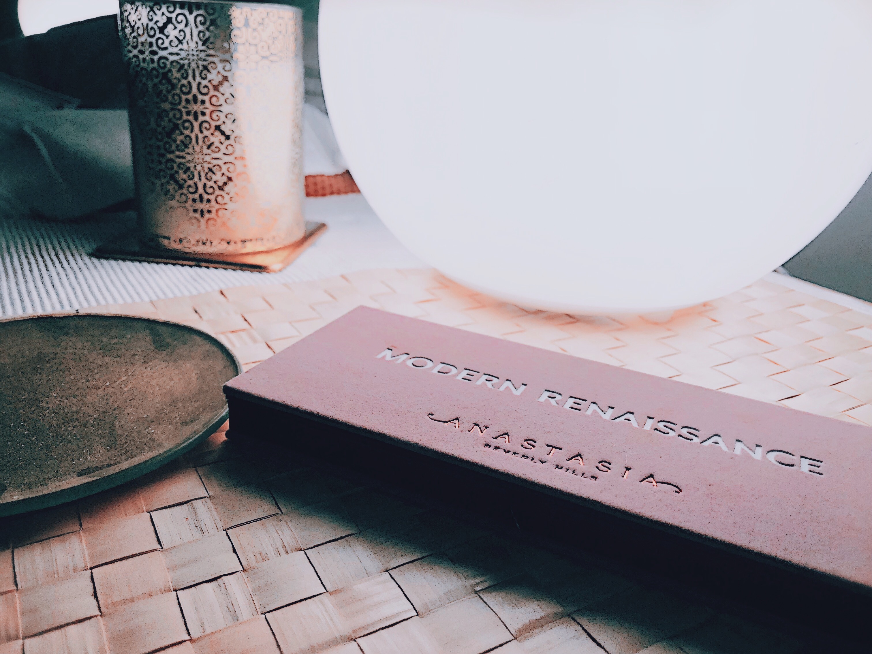
I hope you’re all doing well! Today’s post is all about the latest addition to the Anastasia Beverly Hills family of eyeshadow palettes, Soft Glam. Since their cult favourite, Modern Renaissance, the ABH palettes have been somewhat of a collectors item within the beauty community. I have to say, they are some of the best palettes that I’ve ever used so I’m sure you can guess which direction that this review is going to go in…

This palette contains affiliate links


Anastasia Beverly Hills Soft Glam Palette Review & Swatches

As soon as I saw a picture of the palette online, I knew it would be full of neutrals and warm-toned shades. The name “soft glam” sounds loike a combination of subtlty and sophistication, which is right up my street! As much as I love embracing my crazy inner MUA, sometimes I love to keep it simple! I’m drawn to nudes and neutrals just as much as I am to vibrant and dramatic colours, so I know that I will still really enjoy using this palette. It seems to me that this is the kind of palette you can take anywhere and you’re good to go – which is ideal for people that travel a lot! The packaging, as expected, has the same gorgeous velvety exterior as the other ABH paletes, which I absolutely love! It looks and feels so luxurious and it’s so much nicer than the usual plastic and cardboard most other brands use. The only slightly “hmmm” part about this palette, is the price tag. At £43, it’s a rather expensive addition to any makeup collection. The question being, is it worth it?


Anastasia Beverly Hills Soft Glam Palette Review & Swatches

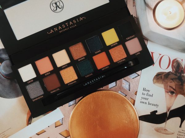
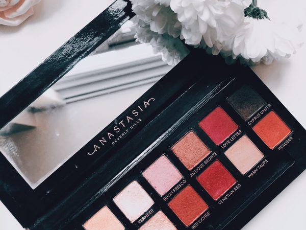
The palette contains 14 beautiful shades, including essential mattes to stunning shimmers. Just like I thought, the shades are warm-toned and neutral, perfect for both day-time looks as well as night-time glam. They’re also the kind of shades that can work all year round, meaning you can easily get your money’s worth when it comes to usage! So many looks can be created with this palette, from elegant and understated to bold and glamorous. There is a slight overlap with some of the shade from the Modern Renaissance palette (Tempera, Burnt Orange and Cyprus Umber), which is kind of frustrating as I paid a lot of money in the hope that this palette would be a totally new addition to my collection, however, I do love all three of those shades and I’m quite glad to have some replacements. I’ve been wearing the shadows for a couple of weeks now and I have reviewed every single one below!


Anastasia Beverly Hills Soft Glam Palette Review & Swatches

Tempera – Ultra-matte beige with warm undertones – One of my favourite base shades ever. I always use this before I apply anything else to my lids. It always makes my eyes look bigger and brighter, and it compliments any shadow that I wear it with. It’s velvety soft and yet it’s so richly pigmented, I don’t know how they do it. It blends like a dream without losing any coverage either, 10/10! 

Glistening – Iridescent gold with orange undertones – This shade doesn’t have the same “wow” factor that the other shimmers do as it’s not as pigmented. It blends out to be quite sheer on me, however when applied with a wet brush, I can build it up a fair bit. However it’s a shame it isn’t more intense. I guess the palette is called “soft” for a reason though, right? It’s probably the ideal shimmer for someone that prefers a subtle look. 

Orange Soda – Ultra-matte pastel peach – How gorgeous is this shade? I can see myself wearing this all year round as I love warm toned shadows! It’s pigmented and blends really well too. It tends to fade after a while so I like to combine it with other shades or just use it as a subtle transition into something darker. 

Rose Pink – Rose gold/copper with warm undertones – Now we’re talking, this shade is right up my street! I love anything rose gold – especially when it comes to makeup! It’s pigmented but can sometimes be difficult to apply so I like to use a good base as well as setting spray to help it along a bit.

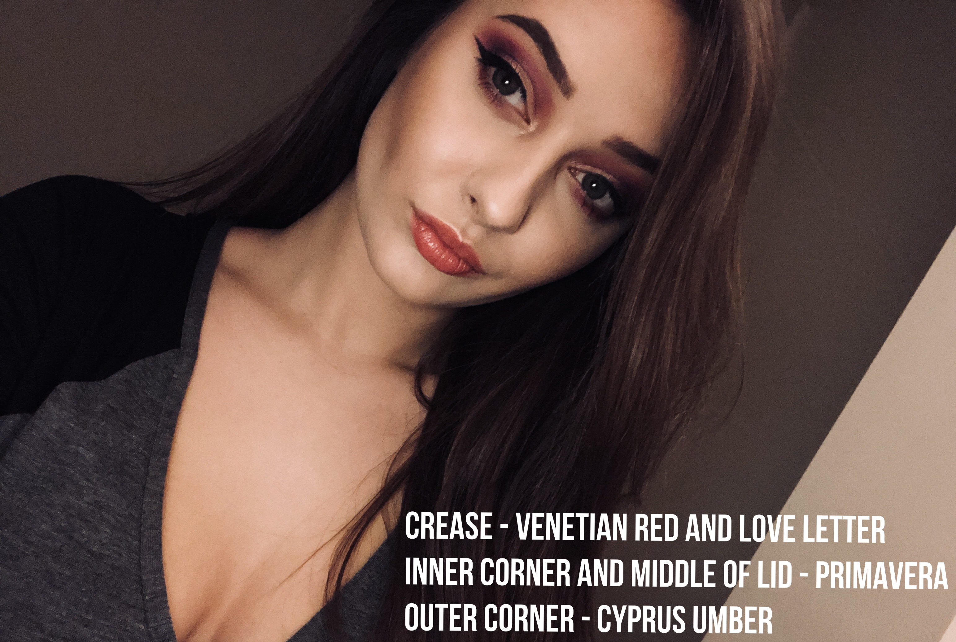
Sultry – A medium-dark coppery chocolate brown – YES – I love this shade! The colour payoff is amazing and it adds a touch of drama to any look. I love using this on the outer part of my lid to create some depth. I nearly always use it with a damp brush to make it more intense. 

Bronze – Metallic bright bronze-gold – The sparkle that this shade gives off is amazing, I feel so glam when I’m wearing it and I always get compliments whenever I have it on. It’s so bright that it makes me look ten times more awake! Again, I tend to apply it with a wet brush, which always intensifies the payoff.

Mulberry – Ultra-matte deep mulberry/plum – The formula is velvety soft and it blends beautifully. I was worried it would be patchy but it was totally fine and applied evenly.


Anastasia Beverly Hills Soft Glam Palette Review & Swatches

Dusty Rose – Ultra-matte dusty mauve – I love this shade. It’s so elegant and even on it’s own looks lovely. It’s super pigmented and it applies evenly too. I reckon it’s the perfect springtime shade and would also look gorgeous in summer. I don’t actually own any shades quite like this either, so I’ve really enjoyed experimenting with it over the last couple of weeks.

Fairy – Multi-dimensional bright yellow-gold – Isn’t that the perfect name for this shade? It’s so soft and gentle and yet so pigmented and bright! I’ve been wearing this almost every day and I blooming love it. I always apply it on top of a concealer instead of a primer to intensify the brightness and it works a treat!

Burnt Orange – An ultra-matte deep orange – This shade is so pigmented! I didn’t even have to try to get it to swatch well either! It blends really well so I love using this in the crease as a transition shade and also on it’s own for a more subtle look. 

Sienna – Ultra-matte earthy brown with red undertones – I love this shade! I’m getting some strong autumnal vibes, so as soon as September rolls around, I can see myself wearing this a lot! 

Rustic – Ultra-matte cinnamon brown – I think browns are the shades that I reach for the most! Rustic blends out for a subtle look but can also be built ip up to be quite bold too. I love wearing this on it’s own with a tiny bit of shimmer on the lid. However, as lovely as it is, you may be able to see in the photo above, that it darkened in random places, which made it look a little bit patchy. 

Cyprus Umber – Ultra-matte dark coffee brown – I feel like I’m repeating myself here but it’s another brown shade that I reach for all the time! This shade comes in so handy for adding a bit of depth to a look or for creating a smokey eye. Also, I have to say that the pigmentation is insane too, I’m very impressed. 

Noir – Ultra-matte carbon black – I love it when palettes include black shades! There was a time where I used to wonder how they could ever be used, whereas now I’m using them all the time. Just like Rustic, it can turn a day-time look into night-time glam in seconds. I often blend this along my lower lashline to make my eyes look bigger and brighter. It’s not as creamy as the other mattes in the palette, so it takes a bit more work to blend out. 


I actually really like this palette. I was a bit worried that it would be a tad too subtle for me as I tend to go for shades that I can go all out with. However although the shades are mainly neutral, are all rich in pigmented and with that comes the option to go all out if I wanted to, or I can keep it simple. That’s why I like this palette, it gives you the freedom to create what you want and even just looking at it, I can see so many different combinations! Some of the shades needed a bit of help from primers and wet brushes but I didn’t expect them to be as intense as some of the shades in their other palettes, as after all, it’s been named “soft” for a reason. I’m experimenting with the whole “less is more” idea, so I reckon this palette will come in handy when trying to create some more natural looks. I also think that ABH have been working on their matte formulas as they all felt velvety to the touch (more so than usual) and blended out beautifully. However, a couple of the mattes seemed to darken slightly in random places which isn’t ideal for a high-end palette. My main issue with this, is that I paid a lot of money for this palette, so in all honesty, any flaws aren’t going to go down well. If you’re going to charge a lot, the quality needs to be as close to flawless as possible.

So in conclusion, I like it! It’s a fantastic palette and I’m glad that I added it to my collection. It’s not perfect but it’s pretty close! The weird dark patches with some of the matte shades are a bit annoying but I can get over that as I’m able to use the shades and still get my money’s worth. I can see myself taking this on holiday with me as well as using it in winter so in my opinion it’s a palette that can be used all year round. Not only does it come with 14 gorgeous shades that can create so many different looks, but it also comes with a generously sized mirror, making it ideal to travel with for on-the-go use. Not everyone wants to go for the perky pinks or the vibrant violets, so I would recommend this palette to anyone that’s looking for something more delicate with a hint of glamour too.

Check out the Soft Glam palette here!

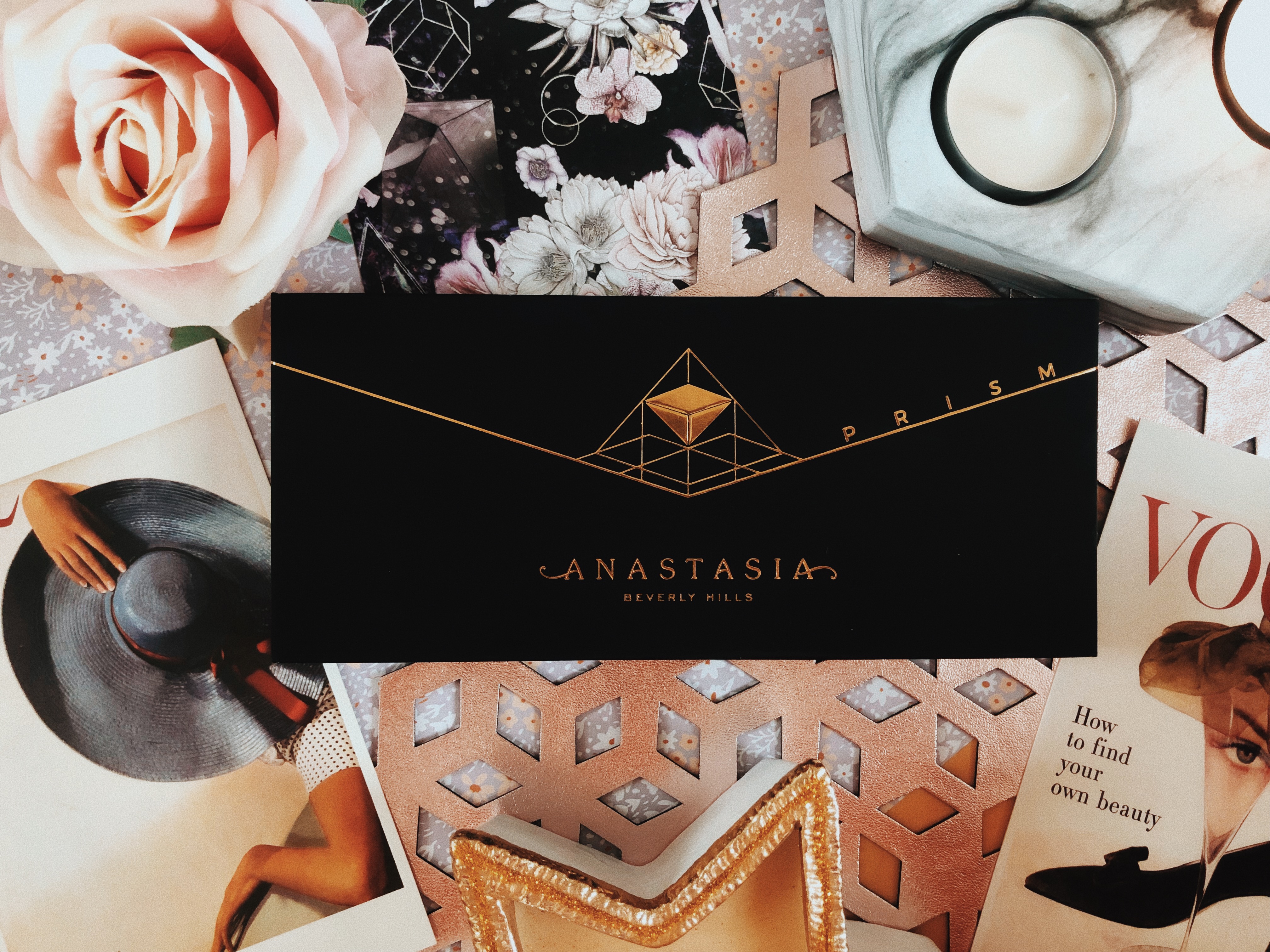
Want to know what the other Anastasia Beverly Hills palettes are like? Check out my reviews of Modern Renaissance, Subculture and Prism palettes to find out!

TWITTER | FACEBOOK | INSTAGRAMPINTEREST 

N xxxx

Categories
BEAUTY

ANASTASIA BEVERLY HILLS PRISM PALETTE {REVIEW & SWATCHES}

Hey Everyone,

I hope you’re all doing well! I’m trying to get organised before I go on holiday to Mallorca in a week. I have a list of things to do that just keeps growing every day, no matter how much I seem to get done! I have lots of exciting content scheduled to go up for you guys whilst I’m on holiday so if you aren’t subscribed, make sure that you are so that you get notified with every new post! At the end of every post, I link all of my social media so that you can see what I’m up to in-between posts, I’d love it if you gave me a follow – come and say hey!

Today I’m going to be reviewing the Anastasia Beverly Hills Prism palette! I know some of you will be thinking “didn’t this come out last year?” and you’d be right in thinking that! It did come out ages ago, however, I only just caved and bought it so I thought I would post a review! There’s just something so collectable about the ABH palettes, I feel like I need them all. I know lots of you are makeup lovers too, so if any of you are considering purchasing the palette, keep reading!

This post contains affiliate links

0CF815FF-71D4-42A3-AA3A-D44C7F9AEB54.JPG

I already own two ABH palettes (Modern Renaissance & Subculture) so I reckon I have some knowledge about the quality of their eyeshadows and what to expect. You may be familiar with the high price tags, however for those that aren’t, they usually retail at £43. Just like the others, the Prism palette is covered in a beautiful crushed velvet material featuring a gold geometric design. There’s something so luxurious about this packaging, it partially justifies that price tag.


Processed with VSCO with c8 preset

Processed with VSCO with c8 preset

Processed with VSCO with c8 preset

The Prism palette contains 14 shades including some ultra-matte, duo chrome and metallic pigments. It’s definitely a palette for those that enjoy experimenting with bold and bright colours! I bought it purely because of the variety that it offers – think of how many unique looks that can be created from these 14 shades! The palette comes with a dual-ended soft blending brush which actually does a fab job. There’s a generously sized mirror for on-the-go use which makes it perfect for travelling with.  It’s also the kind of palette that can work all year round for lots of different occasions. For example, we’ve got bright pops of colour for Spring and Summer and the darker neutrals and shimmers for Autumn and Winter. Just looking at it makes me want to be creative! I love that the shades are all labelled too as I always lose this flimsy sheets that some palettes come with. Want to see some swatches? Keep reading…


60B0498E-16AE-4F12-A893-BE5DBE55E038.JPG

LucidA duo chrome with warm gold undertones and flecks of pink- I love using this as a brow highlight or for my inner corners. It can sheer out on the lid so I’d recommend applying and building it with setting spray on your brush.

EdenA pink/coral matte with warm orange undertones – Very pigmented. It’s almost fluffy to touch! So smooth and easy to apply.

UnityA light beige/nude matte – Slightly too dark to use as a base shade for me but I use this if I want to add a really natural bit of depth added to my eye makeup. I’m usually not that fussed about these kind of shades, they’re not the most interesting but handy to have in a palette. It’s also pretty pigmented and it swatched beautifully.

SphinxA metallic bronze with warm orange undertones – This is a pigmented shadow however I’ve used better. I like my bronze and golds to be blinding and this takes a few applications to achieve that. It’s not sheer but it’s also not full coverage.

OsirisA midnight blue/purple shimmer with flecks of silver – It’s nice to have a cool shimmer shadow within the palette, which is what I meant when I talked about the variety that this palette has to offer. This shade was very easy to swatch and blend out as it’s very buttery and soft.

SphereA bright yellow matte with green undertones– I was really excited about this shade when I first saw it. I love using bright colours in my inner corners to add some drama so this seemed like the perfect shade (I know it looks like a mustard yellow but it’s much brighter than that). It’s not the most pigmented and it can sort of blend into a sheer base on the lid which isn’t what I was hoping for. It’s buildable but I was hoping for a more pigmented matte. I’ve been using it to blend warm shades together and I reckon I’ll get some more use out of it during the Autumn months.

ObsidianA deep black matte – I’m just not a fan of this shade, it’s my least favourite in the palette. It was difficult to move around when swatching and on the lid, plus it was semi-sheer and patchy in some places. For the price of the palette, this should’ve been much better than it was.

D16073D9-2BDF-484E-8452-816CD3C41795.JPG

DimensionDuo chrome grey/silver shimmer with pink flecks – I love this shade. It’s so pigmented! It blends like a dream and it barely takes any effort to achieve full coverage. I like how unique this shade is too, it’s unlike any other shadow that I’ve come across, so I’m happy to pay a little extra for something new in my collection. It was quite dry which made fallout a slight issue when applying. I tend to use setting spray when applying shimmer shadows as not only do they apply better but they last longer too!

Parallel – A warm and dark chocolate brown matte – Everyone needs a shade like this in their life. They’re so handy for making any look smokey and dramatic. I use this shade all the time to darken any look for some nighttime glam! It’s pigmented and blends out pretty well for such a dark shade. 

PyramidA metallic yellow gold – Now we’re talking. This shade is fab! I love using this all over my lid – it’s too pretty to only use a tiny bit of it so I go all out! It’s also the kind of gold that works all year round for any occasion so you definitely get your money’s worth.

ThroneMetallic dark blue with flecks of green – I’m unsure about this shade. It’s pigmented and it looks pretty but I think it’s a bit too dark and it just doesn’t look very flattering on me. If it was a little bit lighter I reckon I’d use it all the time.

SaturnTerracotta Matte – I’m a big fan of warm shades pretty much all year round. I use them almost every day as I find they’re the most flattering for my skin tone. This shade is exactly what I look for in every palette I buy – I get so much use out of it!

EternalMetallic Copper – My favourite shimmer shadow in this palette! I just love a copper shade and although I have a stupid amount of them, it’s always nice to get a new one every once in a while. It’s so creamy and buttery that it blends beautifully across the lid.

LureAshy lilac matte –  I’ve somehow managed to forget to swatch this shade – I’m so sorry! However, I have been wearing it so I can still review it for you, there just isn’t a swatch photo! I wear lots of pinks and purples so I’m always looking for new shades to create these looks. This lilac is so beautiful! I was worried it would be powdery after feeling the texture of it in the pan however it’s nicely pigmented and it looks beautiful on the lid or in the crease.


There we have it ladies and gents – the Anastasia Beverly Hills Prism palette! The packaging is gorgeous, I love the dramatic combo of black and gold as well as how the box itself is more matte than the others in the series. It feels so luxurious and I guess that’s one reason why I’m happy paying more than usual. The range of colours included is amazing! I like paying for palettes that are different from the rest and the Prism palette really stands out in that sense. So many different looks can be created from these fourteen shades. The shadows themselves are very nice quality. There are one or two that I would tweak and I think that the price should be lower if there are going to be shades lacking in pigment. However a majority of the shades are extremely pigmented and apply beautifully. I would really recommend this palette to anyone that is looking to be creative with their eye makeup. It’s definitely a palette for those that aren’t afraid to experiment with colour however if you’re looking for something more subtle, this probably isn’t the one for you! What do you think of this palette? Let me know in the comments below! Want to see what I’m up to in-between posts? Check out my social media below! I’ve also put links below to my reviews of the other palettes in this series!

READ MY REVIEW OF THE MODERN RENAISSANCE PALETTE

READ MY REVIEW OF THE SUBCULTURE PALETTE


TWITTER | FACEBOOK | INSTAGRAM | PINTEREST  

N xxxx


Categories
2017 BEAUTY BLOGMAS

ANASTASIA BEVERLY HILLS MODERN RENAISSANCE PALETTE REVIEW & SWATCHES

BLOGMAS DAY 12

Hey Everyone,

I hope you’re all doing well! Today I’m reviewing one of the true gems in my collection, the Anastasia Beverly Hills Modern Renaissance palette. It’s actually one of my favourite palettes, as I mentioned in my review of its sister Subculture! I’ve included photos and swatches so that you can get an idea of the quality of the shadows   – please excuse any wonky lines, arms don’t tend to make the perfect base! Keep scrolling to hear my thoughts…

BD24708F-4F8B-459D-9723-43144FFA6ED6.JPG

Processed with VSCO with m6 preset

The palette is an essential in my collection. It contains 14 beautiful warm neutrals and berry tones which add a stunning pop of colour. It’s mostly a matte palette, with 11 matte shades and 3 metallic shades. It also comes with a soft dual-ended blending brush which actually does a fab job. I’m not usually a fan of  brushes that come with palettes as I like to use my own, however, I’ve ended up using the brush pretty much every day!


16DEECC0-C3E1-4CDE-9C18-36B53ACD358C.JPG

Tempera – A light nude matte with peachy tones – I use this for highlighting underneath my brows and in the inner corners of my eyes! It’s not a shimmery kind of highlight but it’s a clean shade that definitely brightens up any area that it’s applied to. I always use it as a base too.  It’s silky soft and easy to blend.

Golden Ochre – A matte and a muted beige/yellow colour with olive tones – It’s the colour of the perfect (my idea of perfect) cup of tea! It’s the perfect shade for a simple and natural makeup look but it also works out to be a great transition shade if you’re packing some colour in there too.

Vermeer – Iridescent champagne shimmer  –  Such a lovely light shade to put on the inner corner of the lid as it’s a shimmery rose-quartz. It’s got slightly warm/peachy undertones to it too so it’s nice to build up, on the lid. The iridescent sheen of it catches the light which makes it gorgeous for nights out.

Buon Fresco – A matte lilac/mauve – I flipping love this shade. It’s so pretty on the eye and it’s perfect to pair with some pinks and reds! It works so well with the other shades in the palette.

Antique Bronze –  A shimmery brown with rusty red undertones – This is such a gorgeous colour, perfect for festive makeup looks and even in Autumn actually. I tend to wear darker makeup at that time of year (lots of browns, bronzes and coppers)

Love Letter – A raspberry pink matte  This makes the best pink smokey eye ever and I use it so much! It’s a perfect berry tone for the winter months too. It’s slightly dusty but with a few swatches it’s buildable!

Cyprus Umber – A dark coffee brown matte – I use this almost every day to add some drama to the outer corner of my lid, I love it! It’s so pigmented too.


72528884-8782-4104-9405-764EABB03C1E.JPG

Raw Sienna – An amber matte with golden undertones – I love using this in the crease for more natural eye looks.

Burnt Orange – A deep orange matte – Slightly more of a rich orange shade than Raw Sienna. I tend to use this if I need to warm up my makeup looks – it’s great for Autumn in that sense!

Primavera – Shimmery gold dust with a metallic finish – This is my favourite shade in the whole palette, it is PERFECT for putting in the middle of the lid for a spotlight look or for an inner corner highlight. It’s nicely pigmented and is even more intense when used with setting spray. You could probably use it as a highlighter too, it’s fabulous!

Red Ochre – A burnt, rusty red matte –  I love using this for festive looks to add a pop of red to my eye looks. Colourpop offer a fab dupe for this shade called Popular Demand. I’ve found it takes a bit of building up though so maybe apply it a couple of times to make it slightly less sheer!

Venetian Red – A warm red with a matte finish – Again, fabulous for festive makeup looks. Everyone needs some red shadows in their life!

Warm Taupe – A matte grey with purple undertonesI’m not getting the warmth from this shade that I expected! I’m also not using it all that much as it just doesn’t look that great on me. It’s still lovely and pigmented though!

Realgar – A reddy-brown matte A rusty red matte shade with subtle warm undertones, really pigmented yet so buttery and easy to blend out. It has subtle warm undertones too.


Image-1.jpg


I would definitely recommend this palette to those that love using warm tones and enjoys creating more neutral looks but aren’t afraid to use a pop of colour every now and again. For a palette that features mostly matte shadows, they all apply fantastically and are buttery and easy to blend. I have yet to experience any issues with blending out any of the shades. No shades have become patchy either, which to me suggests that every shade was created with very high quality in mind. It’s one of the most pigmented palettes I own, you merely have to tap the shadows lightly and you’ll have picked up plenty. In my opinion, it’s worth every penny as the shadows are of such high quality and there’s a fantastic variety of shades included in the palette. It’s a really versatile palette as it can be used for daytime and nighttime looks If you’re more adventurous with shadows.

I hope you enjoyed my review of this palette and found it helpful if you were trying to make your mind up about it! Below, you’ll find links to my reviews of the other palettes in the collection and I’ve also liked my social media below so come and say hi, I’d love to hear from you!

Read my review of the Subculture palette

Read my review of the Prism palette

TWITTER | FACEBOOK | INSTAGRAM | PINTEREST  

N xxxx

Categories
2017 BEAUTY BLOGMAS MAKEUP

ANASTASIA BEVERLY HILLS SUBCULTURE​ PALETTE {REVIEW & SWATCHES}

BLOGMAS DAY 8

After the huge success of the Anastasia Beverly Hills Modern Renaissance Palette, (take a look at my review) everyone was expecting great things when it’s “sister” the Subculture palette was released. The palette sparked lots of debate within the beauty community. There was lots of discussion surrounding the choice of colours, as they are pretty bold. I managed to convince myself that I can rock shades like this but I can understand why some people were terrified when they saw a mustard yellow.

I decided that I had to try this controversial product for myself and I bought myself the Subculture palette during summer, as I was wearing lots of bold eye looks during these months and thought this palette would be perfect for just that! It retails at £43 on their website *distant screams from my bank account* The packaging is made from a beautifully soft and a flocked teal coloured, crushed velvet material which definitely makes it feel more expensive, almost identical to the MR palette. There are 14 shades (11 mattes and 2 metallics and 2 duo chromes) A majority of the shades are warm and muted with some retro 70s vibes (YES PLEASE). When looking at the shadows all together, it reminds me of mid-century modern interiors, I LOVE IT. The shades are also quite grungy and autumnal in that there are some mustard yellows and khaki greens with some coppers and golds too.


Processed with VSCO with c3 preset

  • Axis – “Ultra matte sage green” Teal/Turquoise has always been my favourite colour so I was delighted to see this shade in the palette. I love it, it’s an unusual colour and it’s just SO pigmented. I wouldn’t recommend going in too hard with your brush as you might look like you have a black eye (been there, done that unfortunately) If you do anything but tap it lightly, you could probably paint a picture with the amount of shadow you will pick up so be careful!
  • Mercury – “Ultra Matte Slate Grey” I was a bit disappointed when I saw this shade as it just looked so dull compared to the others. However when I swatched it I was pleasantly surprised. It’s a cool toned grey with what I reckon to be lilac undertones (see picture with flash) and it looks super pretty in the crease when blended out.
  • All Star – “Ultra Matte Vintage Wine” I love a good plum coloured eyeshadow. I have green eyes so pinks and purples really make them pop. I love using this in the crease as it’s so pigmented yet blends out so beautifully.
  • Adorn – “Metallic Bronze” This could be my favourite shade. It’s SO pretty and when it catches the light it’s absolutely stunning. It’s so rich in pigment and looks even better when a setting spray is used.
  • Destiny – “Ultra Matte Sage Green” I LOVE this shade, it’s a dark khaki green which is one of my favourite colours. Surprisingly it applies with very little fall out if you’re gentle when you apply it. I love using this in my outer corner for added intensity. I do find if you pack too much on however, it can become quite patchy when blending it out so apply sparingly. I would say that is the case with most dark matte shadows though, it’s all in the blending!
  • Dawn – “Ultra Matte Sand” I actually really like this shade even though it’s pretty simple. It has subtle muted peach undertones which make it a nice shadow to use for a more natural look. I use this as a transition shade most of the time as it blends like a dream.
  • Cube – “Duo Chrome Pink Pearl” My least favourite shade. It’s just not pigmented enough for me. At first I thought it looked gorgeous but upon using it I just got a sort of weak pink sheen. It seems to have a sort of skin on it that means it’s quite chalky too. I would’ve preferred just a plain pearly white shade so I could at least use it for inner corner highlight or on my brown bone.

Processed with VSCO with c3 preset

  • Rowdy“Ultra Matte Blackened Purple” I love using this shade to smoke out different looks, it can change up your makeup 0-100 real quick, from a study session in the library to GET ME TO DA CLUB.
  • EdgeUltra Matte Gold Mustard” I was originally terrified to touch this, I mean, it’s a YELLOW. However, I really enjoy using it now. I love the colour anyway so I just braved it and it’s not too bad! It’s nice to put in the inner part of the lid and it’s easy to blend into a darker shade (I’ve used New Wave to warm it up in the outer corner of the lid)
  • Untamed“Ultra Matte Tarnished Green” This is a smokey green with undertones of turquoise/teal and is lighter than axis but still just as pigmented. SO pretty.
  • New Wave – “Ultra-matte citron orange” I was also kind of scared to use this shadow but it’s truly gorgeous. At first, I thought it was another yellow but it’s actually a warm matte orange shade. I used this lots during summer to create warm toned looks which it was PERFECT for!
  • Fudge“Ultra Matte Warm Bronze” I love using this for smokey eye looks. It adds that extra bit of drama to your lid. It’s a warm brown with red undertones.
  • Electric“Duo Chrome Lime-Gold” This is such a unique shadow. It’s so quirky and looks great on a night out but I actually wear it during the day too. It’s mainly gold however it has gorgeous flecks of green that jump out at you when it catches the light.
  • Roxy“Ultra Matte Muted Coral” I love this shade, it’s such a pretty colour to use as a transition shade in the crease or as a base on your lid. It’s actually a great shade for summer as it’s got some flirty pink/ apricot undertones that really compliment green/blue eyes.

    Here are some looks that I’ve managed to create with this palette (apologies in advance, I’m no expert)

Image-1-3


I don’t think there’s a problem with fallout or kick back if you’re gentle with the shadows. I would say all but one of the shades (cube) are nicely pigmented. I would strongly suggest just lightly tapping the shadows as opposed to swirling your brush around the pans as this picks up a small amount of colour that you can blend easily and build up if you want more of a bold look. I would also suggest using a setting spray with the metallic shades in the palette, to make them hella sparkly – the difference is amazing! I wouldn’t recommend this palette to those that enjoy the safety of neutral toned shadows. I would say it’s a palette for the more experimental individuals out there however some shades, for example Electric, Fudge and Adorn could be used to make a really pretty more “natural” look but if there’s only a few shades in here that take your fancy, it’s probably not worth paying the hefty price.

BUY IT HERE

I hope you enjoyed this review and let me know in the comments what you think about this palette or if you’ve found any great dupes!

N xxxx

TWITTER | FACEBOOK | INSTAGRAMPINTEREST